
Artboard. Lime-voltage designer's tabletop.
- Design tools
- Light theme
- 8 colors
- 2 typefaces
Artboard Studio reads as a designer's toolshed laid out on a white tabletop — clinical canvas, high-contrast near-black type, and a single lime-green voltage that makes active states feel switched on. The system is overwhelmingly light and spacious, with confidence coming from tight tracking on large display type rather than weight or color. Buttons lean outlined rather than filled, borrowing the near-black as their stroke so primary actions feel like ink stamps on paper rather than glossy pills. Category surfaces (phone, apparel, packaging) are coded with soft pastel washes — peach, sky, mint — so visual variety arrives as color-coded cards, not gradients or shadows.

Artboard design system

Brand2
Primary text, ghost/outline action borders, filled dark buttons — near-black with a faint green undertone carries both editorial type and CTA strokes
Brand accent, active states, highlight tags, energetic punctuation — the single chromatic accent that gives the white canvas its electric charge
Accent3
Category card accent — warm pastel surface for color-coded product groupings
Category card accent — cool pastel surface for color-coded product groupings
Category card accent — fresh pastel surface for color-coded product groupings
Neutrals3
Muted helper text, secondary icons, neutral badge borders, low-emphasis UI chrome
Hairline dividers, subtle surface edges, low-contrast separators
Page canvas, card surfaces, button fills — the foundation everything sits on
Try a pairing
Pick any two colors from the palette to check whether text stays readable on top.
Aa
Paper White on Midnight Ink
18.80 : 1 contrast
- Body textPasses AA 4.5
- Large textPasses AA 3
- StrictPasses AAA 7
More DESIGN.md files. Same web, different personalities.

099 SUPPLY
Design tools
70Materia
Design tools
Aaply
Design tools
Anacuna
Design tools
Andrei Rybin
Design tools
Awwwards
Design tools
B—Line
Design tools
Brand
Design tools
Canva
Design tools
Claude Type
Design tools
Control
Design tools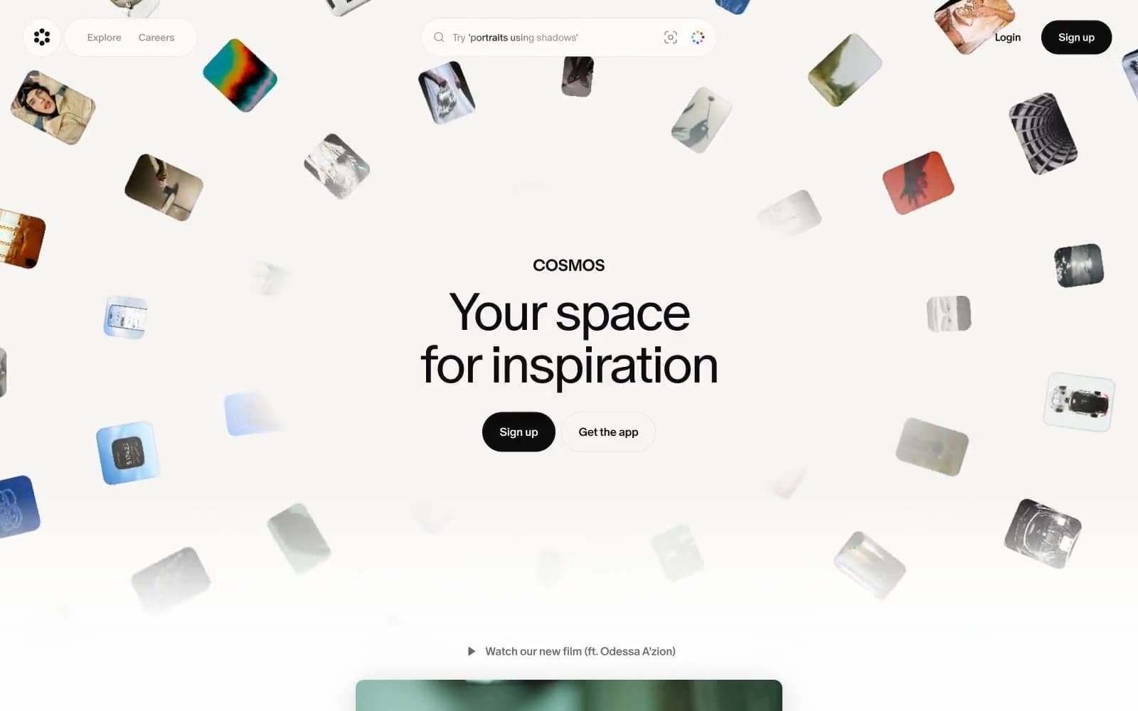
Cosmos
Design tools


