
Volume. Editorial restraint on paper-white canvas, the chrome is invisible, the imagery is the only color.
- Media
- Light theme
- 9 colors
- 1 typeface
Volume reads as an editorial gallery for design publications: full-bleed photographic campaigns with whisper-light Messina Sans headlines floating over image backgrounds. The chrome itself is nearly invisible — paper-white canvas, charcoal type, hairline borders, and a small set of pill-shaped status tags that carry the only chromatic punctuation. The extreme light weights (300/350) and tight negative tracking create a refined, magazine-page atmosphere where negative space and imagery do the heavy lifting. Every surface favors restraint and breathing room, letting the projects — not the interface — command attention.
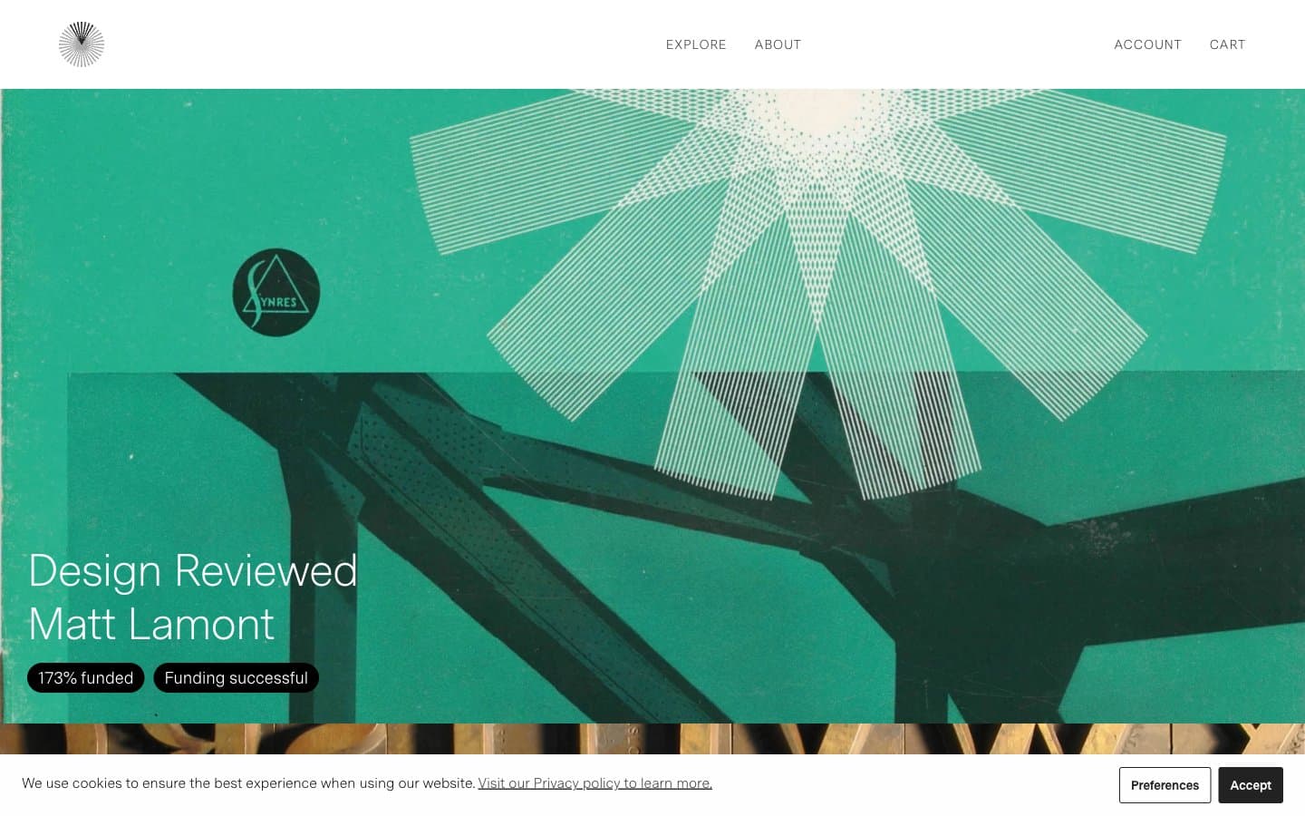
Volume design system

Accent3
Orange wash for highlight backgrounds, decorative bands, and soft emphasis behind content
Accent — alert and availability tags, sits between Ember and Brick in the warm surface stack
Red wash for highlight backgrounds, decorative bands, and soft emphasis behind content
Neutrals6
Occasional deep surface for emphasis blocks, SVG fills
Primary text, nav, footer text, dark pill tags (funded, successful) — the workhorse near-black that grounds every layout
Secondary text, hairline borders on cards, images, and inputs — the quiet structural neutral
Tertiary text, subtle borders, disabled or muted states
Light placeholder text, decorative dividers on dark surfaces
Page canvas, card surfaces, text on dark/image overlays — the dominant background across all sections
Try a pairing
Pick any two colors from the palette to check whether text stays readable on top.
Aa
Void on Ember
5.86 : 1 contrast
- Body textPasses AA 4.5
- Large textPasses AA 3
- StrictFails AAA 7
More DESIGN.md files. Same web, different personalities.
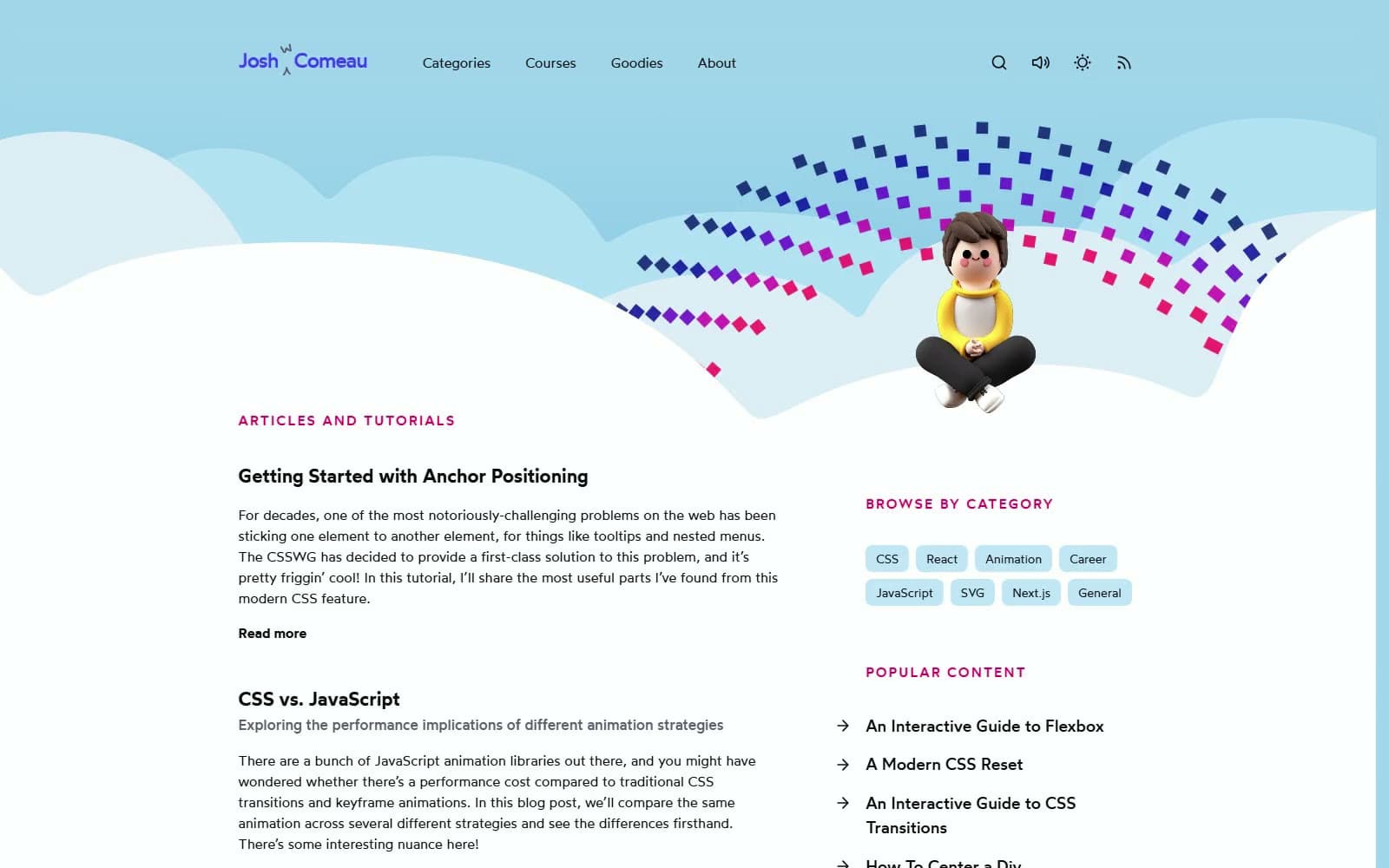
Josh W. Comeau
Media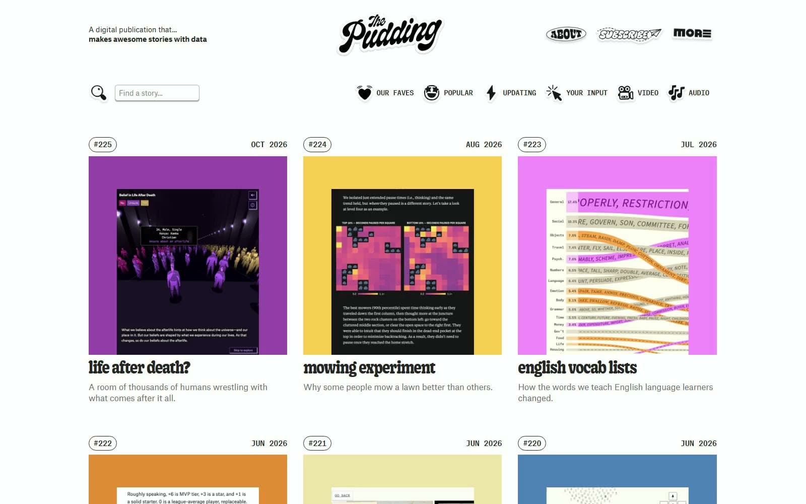
The Pudding
Media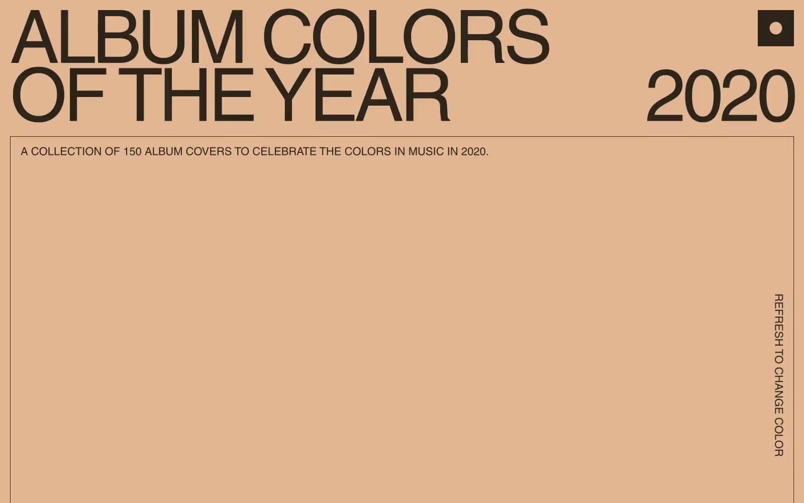
2020
Media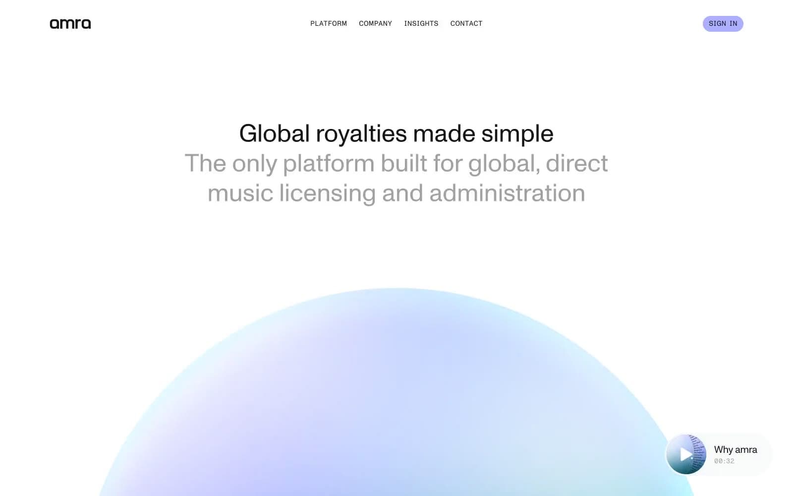
amra
Media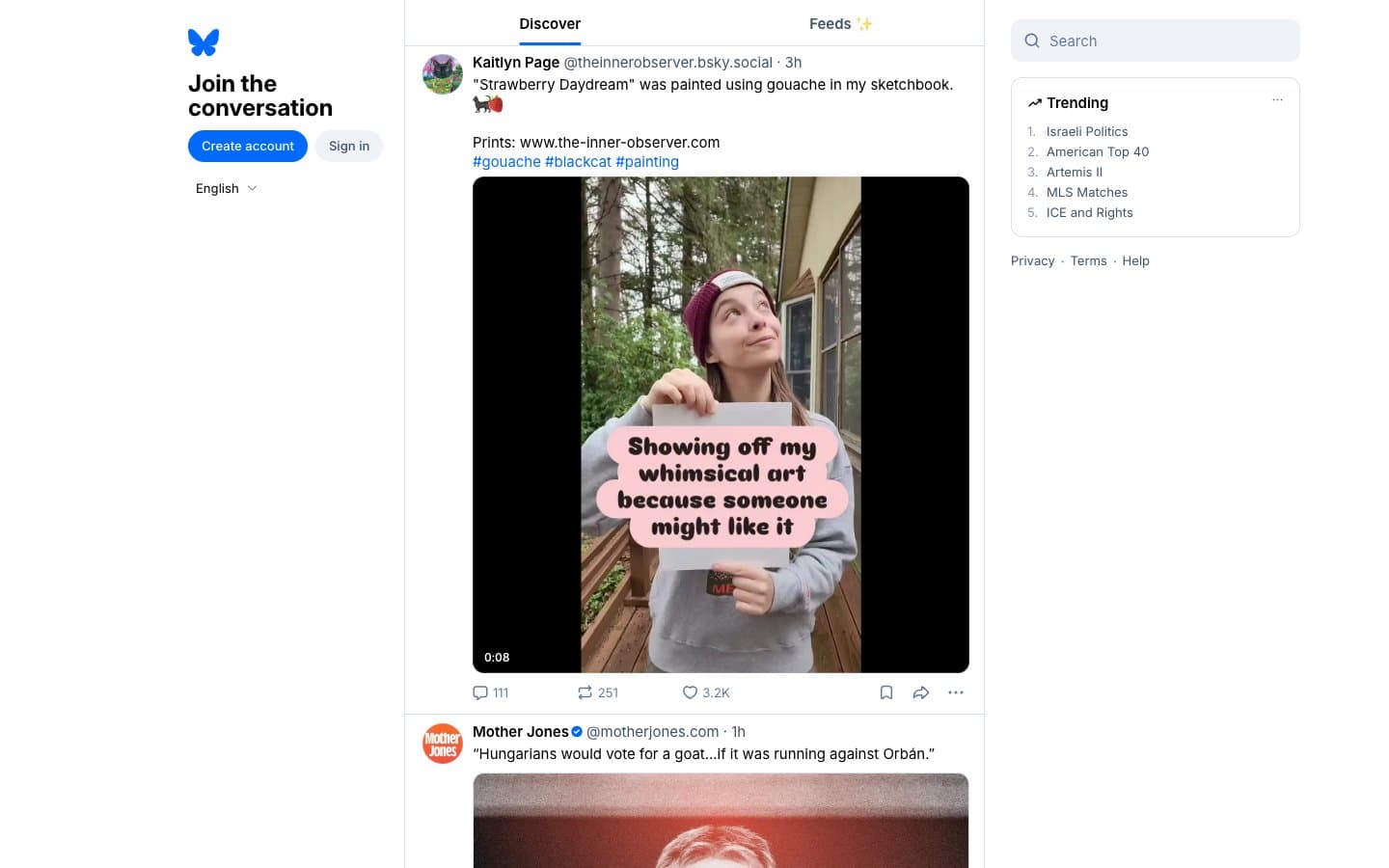
Bluesky Social
Media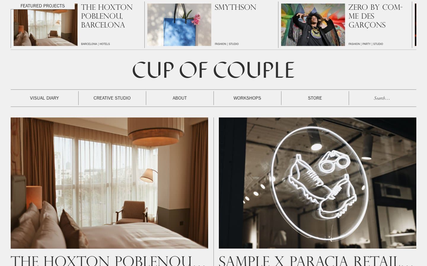
Cup of Couple
Media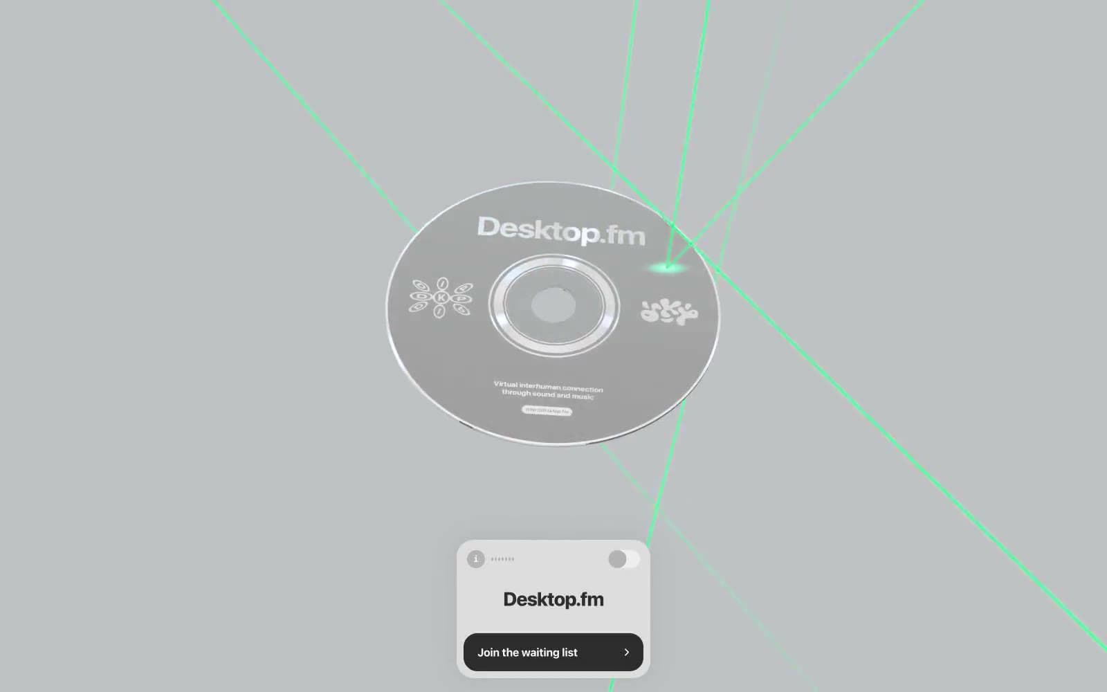
Desktop.fm
Media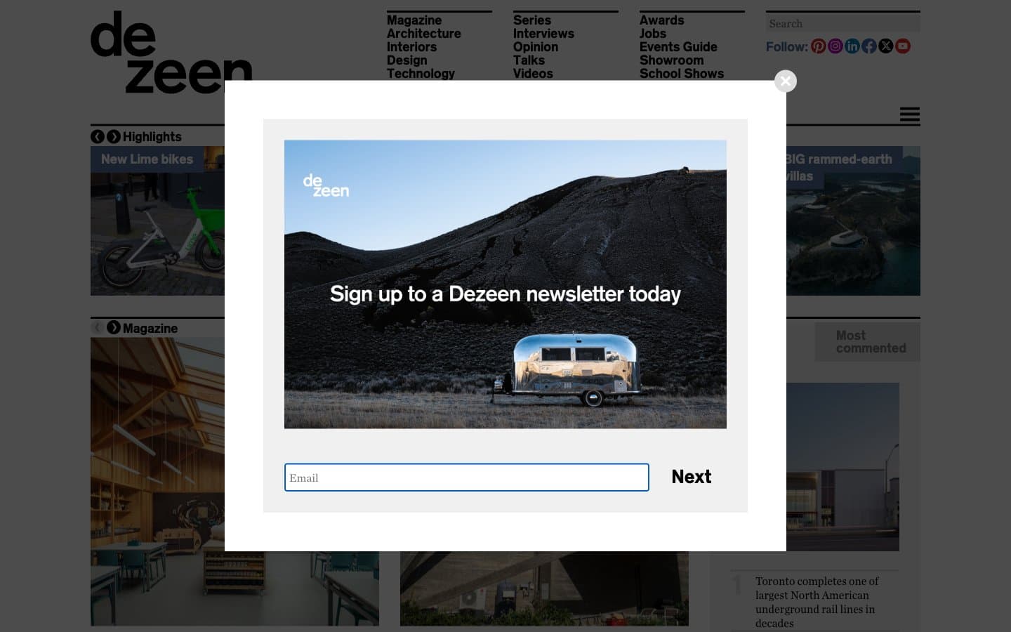
Dezeen
Media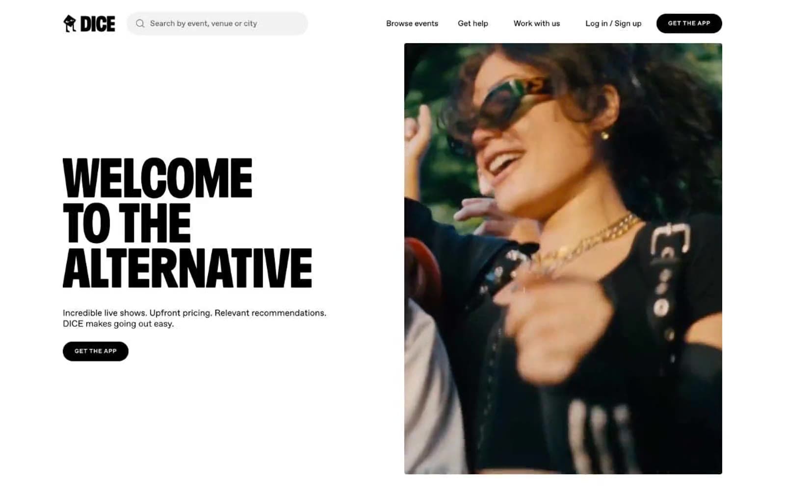
DICE
Media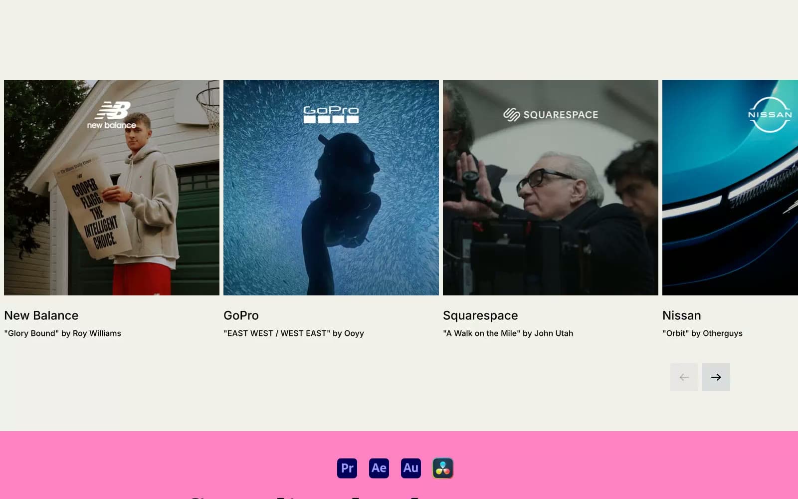
Epidemicsound
Media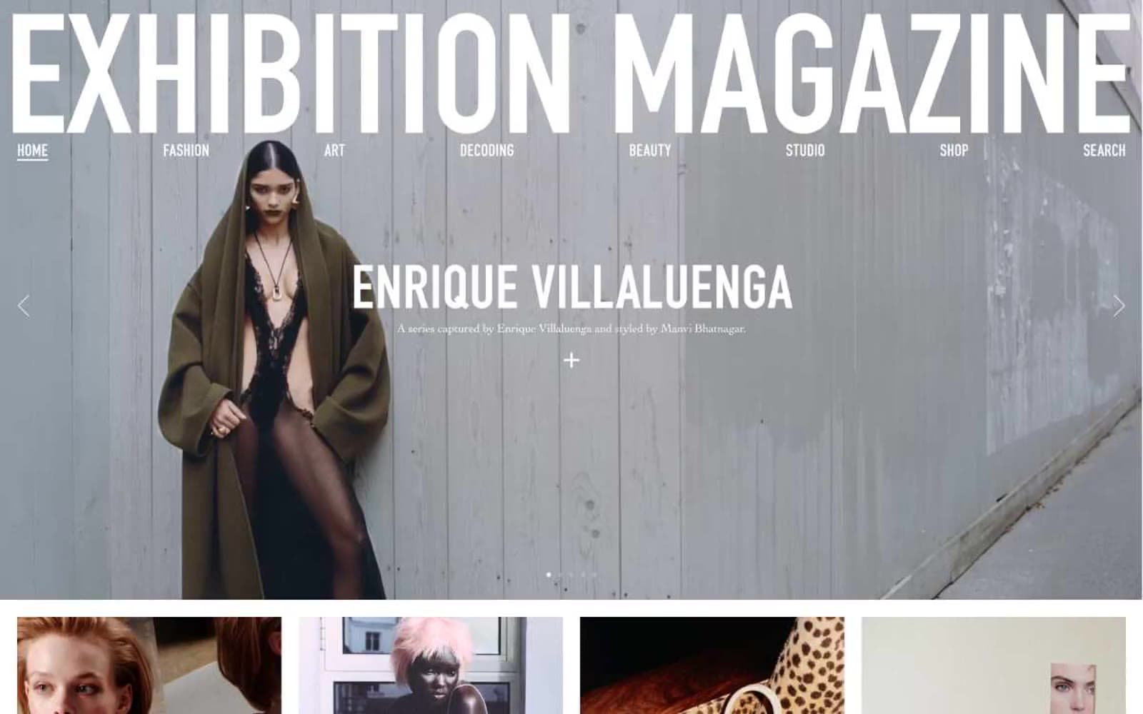
Exhibition Magazine
Media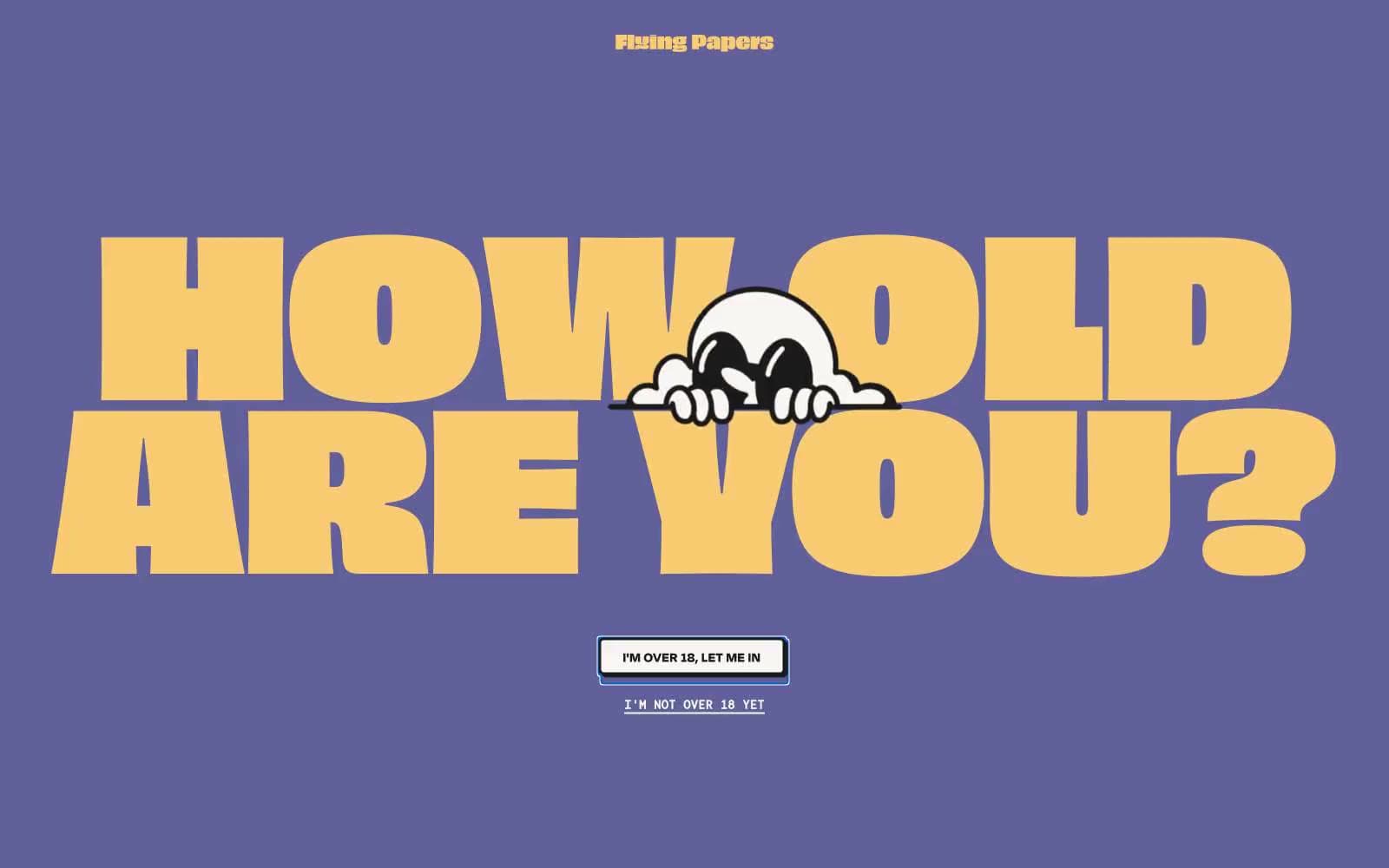
Flying Papers
Media


