
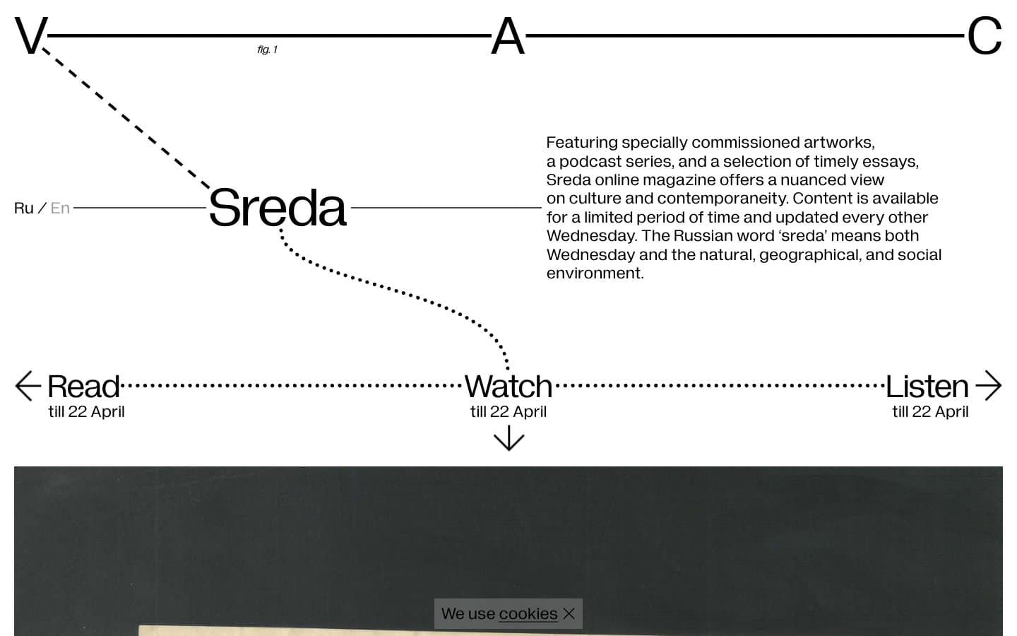
V–A–C Sreda. Pencil-thin connectors link floating type against a white field, like a curator's wall label meets a constellation chart.
- Media
- Light theme
- 3 colors
- 3 typefaces
V–A–C Sreda reads as a white-cube exhibition catalog translated into the browser: pure black ink on a white field, with thin dotted and dashed lines connecting headlines, captions, and navigation arrows like a hand-drawn constellation map. The composition is deliberately diagrammatic — type elements sit at variable positions linked by hairline rules rather than sitting inside conventional containers, and every UI surface is borderless and shadowless. Typography does all the structural work through two custom faces (Diagramatika Display for oversized markers, Diagramatika Text for prose), both held at weight 400, which keeps the system flat, editorial, and resistant to visual decoration. Color is never used as ornament; the only chromatic role is the faint #999999 that recedes for helper metadata. Density is comfortable and the rhythm is generous, with content floating in white space and connected by ruled connectors rather than boxed into cards or panels.
V–A–C Sreda design system

Neutrals3
Neutral form states, badge text, and quiet UI feedback where color should stay understated. Do not promote it to the primary CTA color
Faded helper text and secondary metadata — recedes so primary content carries weight
Page canvas, card surfaces, and the only background color used across the system
Try a pairing
Pick any two colors from the palette to check whether text stays readable on top.
Aa
Paper White on Ink Black
21.00 : 1 contrast
- Body textPasses AA 4.5
- Large textPasses AA 3
- StrictPasses AAA 7
More DESIGN.md files. Same web, different personalities.

Josh W. Comeau
Media
The Pudding
Media
2020
Media
amra
Media
Bluesky Social
Media
Cup of Couple
Media
Desktop.fm
Media
Dezeen
Media
DICE
Media
Epidemicsound
Media
Exhibition Magazine
Media
Flying Papers
Media


