
V–A–C. Gallery wall on a drafting table.
- Media
- Light theme
- 3 colors
- 2 typefaces
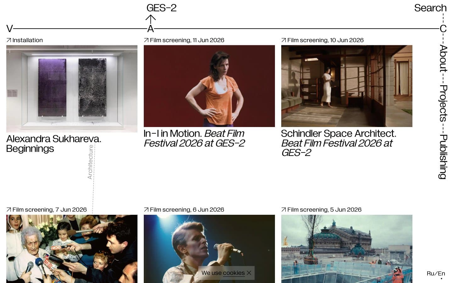
V–A–C reads like a printed exhibition catalog translated to the web: pure white paper, pure black ink, and not a single chromatic pixel. The entire system is achromatic — typography does all the expressive work, and it does so at a single weight (400) across both body and display. The signature is the V—A—C registration line stretching full-bleed across the top of every screen, turning the page header into an architectural measurement mark. Layout is a strict three-column card grid where each card is a museum wall label: full-bleed image, tiny ↗ metadata link, and a tight two-line title — separated by 250px+ of vertical breathing room between rows. No shadows, no rounded corners, no gradients, no accent color. The visual language is the visual restraint.
V–A–C design system

Neutrals3
Primary text, all borders, card outlines, link color, arrow glyphs, V—A—C registration marks
Diagonal category watermarks on cards, subtle decorative strokes — the only third tone in the system
Hairline borders, dividers, input outlines, and card edges on light surfaces. Do not promote it to the primary CTA color
Try a pairing
Pick any two colors from the palette to check whether text stays readable on top.
Aa
Paper on Ink
21.00 : 1 contrast
- Body textPasses AA 4.5
- Large textPasses AA 3
- StrictPasses AAA 7
More DESIGN.md files. Same web, different personalities.

Josh W. Comeau
Media
The Pudding
Media
2020
Media
amra
Media
Bluesky Social
Media
Cup of Couple
Media
Desktop.fm
Media
Dezeen
Media
DICE
Media
Epidemicsound
Media
Exhibition Magazine
Media
Flying Papers
Media


