
Twitch. Stadium scoreboard on parchment.
- Media
- Light theme
- 10 colors
- 2 typefaces
Twitch's design system reads as a dense, utilitarian broadcast console: a light gray canvas (#efeff1) hosts compact white cards (#ffffff) with near-black text (#0e0e10), letting a saturated deep purple (#5c16c5) and a sharp signal red (#eb0400) do all the semantic heavy lifting. The signature is the contrast between information density and visual softness — everything is pill-shaped (9000px radius) for buttons, avatars, tags, and thumbnails, while content cards stay sharp-cornered at 4px to feel like flat broadcast tiles. Typography stays small and quiet (Inter at 11–14px for the entire interface) so that streamer thumbnails and live video remain the visual heroes. The deep, near-violet brand purple is unusually dark for a consumer platform — it carries the weight of a logo, not a decoration — while the lighter Twitch purple (#9147ff) appears on action surfaces like the Sign Up button.
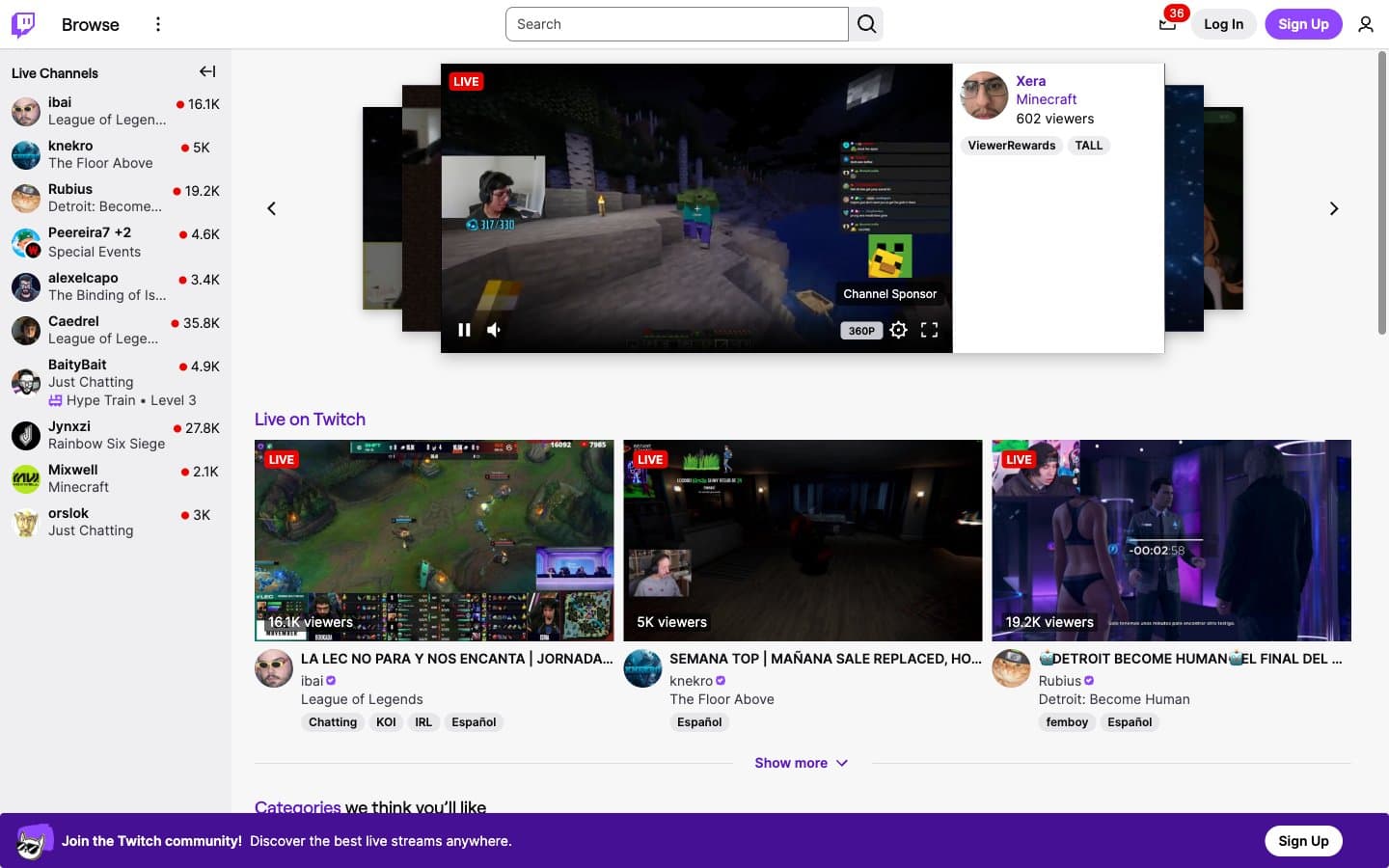
Twitch design system

Brand2
Primary brand color — logo wordmark, link text, active nav icons, decorative accent fills. Unusually dark violet gives the wordmark the weight of a jersey number rather than a SaaS accent
Violet supporting accent for decorative details and low-frequency emphasis. Do not promote it to the primary CTA color
Accent1
Red supporting accent for decorative details and low-frequency emphasis. Use as a supporting accent, not as a status color
Neutrals7
Primary text, icon strokes, dark UI surfaces, featured stream overlays, footer text. Near-black with a faint warm cast
Secondary text, muted nav items, helper labels, inactive controls. The readable-but-quiet middle ground between Dark Matter and the canvas
Subtle border accents, low-emphasis separators where Hairline would be too prominent
Box-shadow tint on elevated cards and popovers — a cool neutral gray rather than pure black
Dividers, card borders, input outlines, table separators. Visible but never structural
Light supporting surface for subtle backgrounds and section separation. Do not promote it to the primary CTA color
Card surfaces, thumbnail frames, button text, input fields, nav bar background. The elevated surface token
Try a pairing
Pick any two colors from the palette to check whether text stays readable on top.
Aa
Pure White on Deep Iris
8.84 : 1 contrast
- Body textPasses AA 4.5
- Large textPasses AA 3
- StrictPasses AAA 7
More DESIGN.md files. Same web, different personalities.
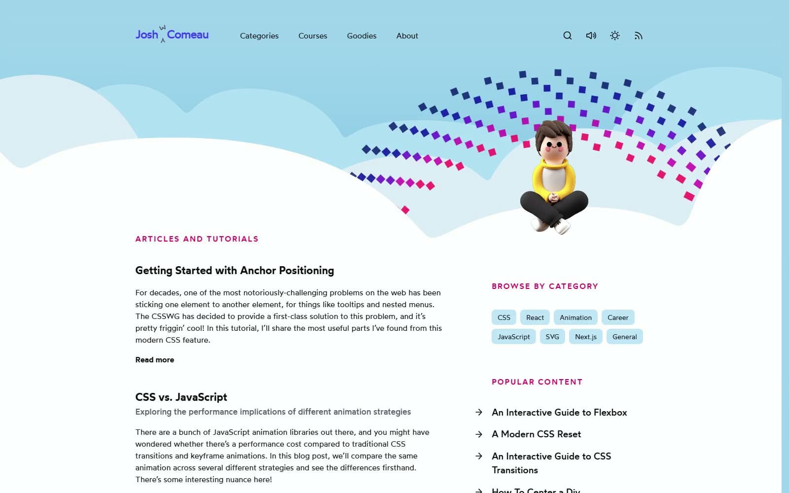
Josh W. Comeau
Media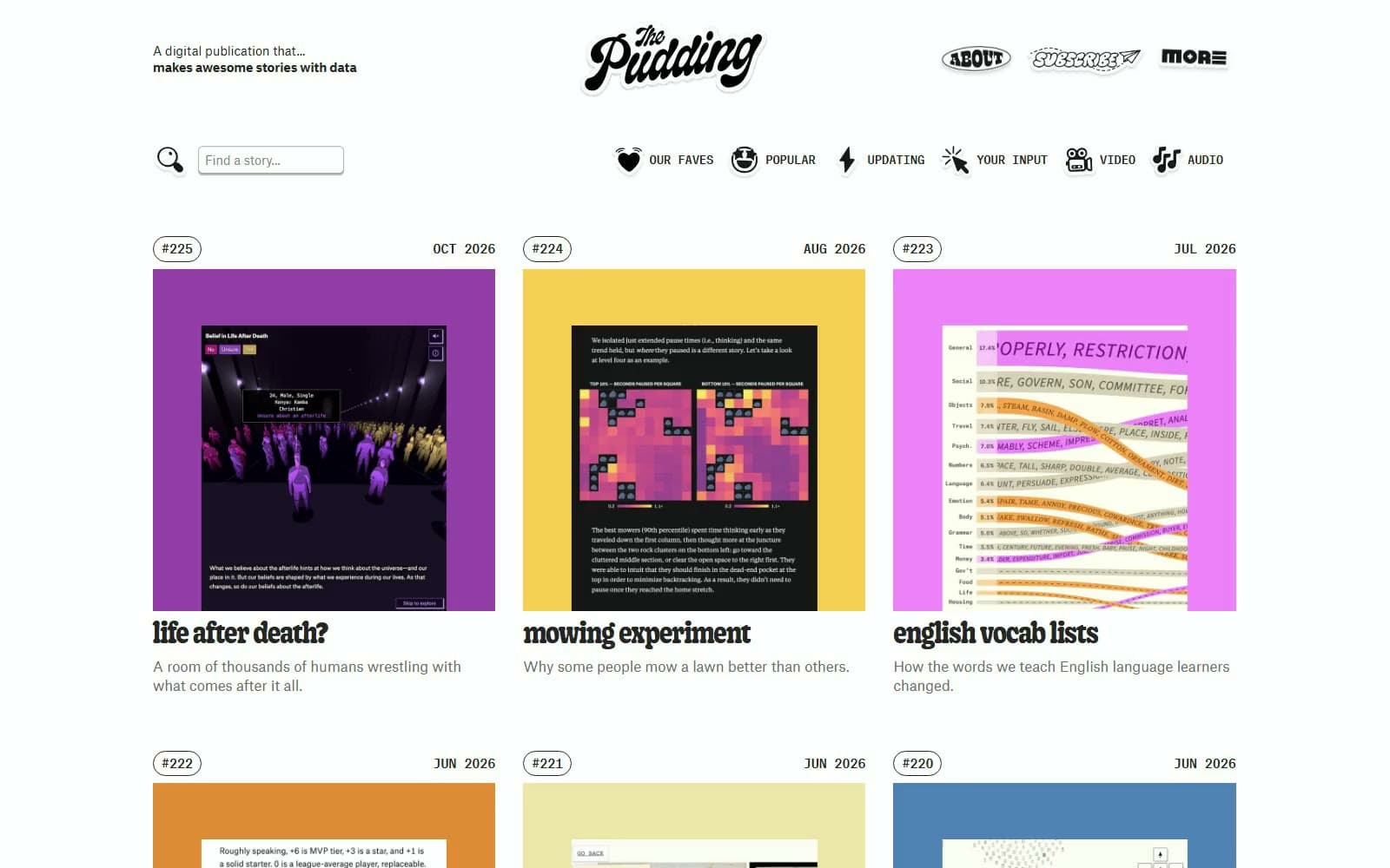
The Pudding
Media
2020
Media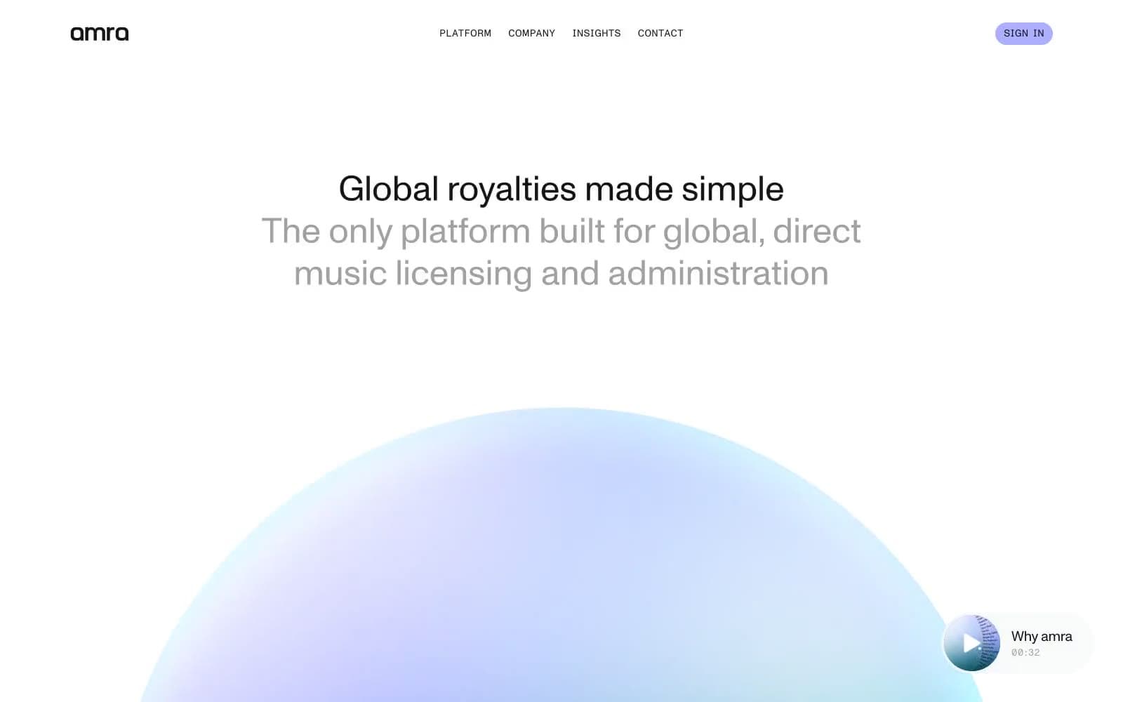
amra
Media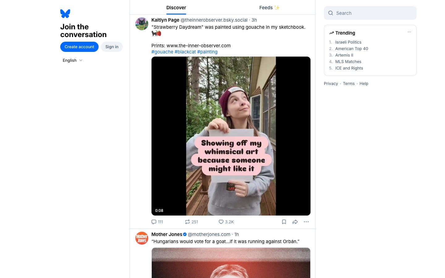
Bluesky Social
Media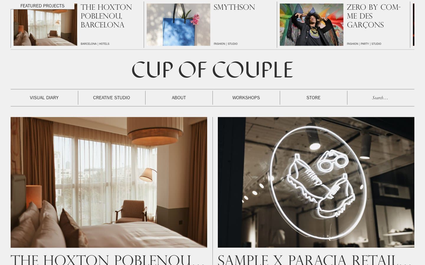
Cup of Couple
Media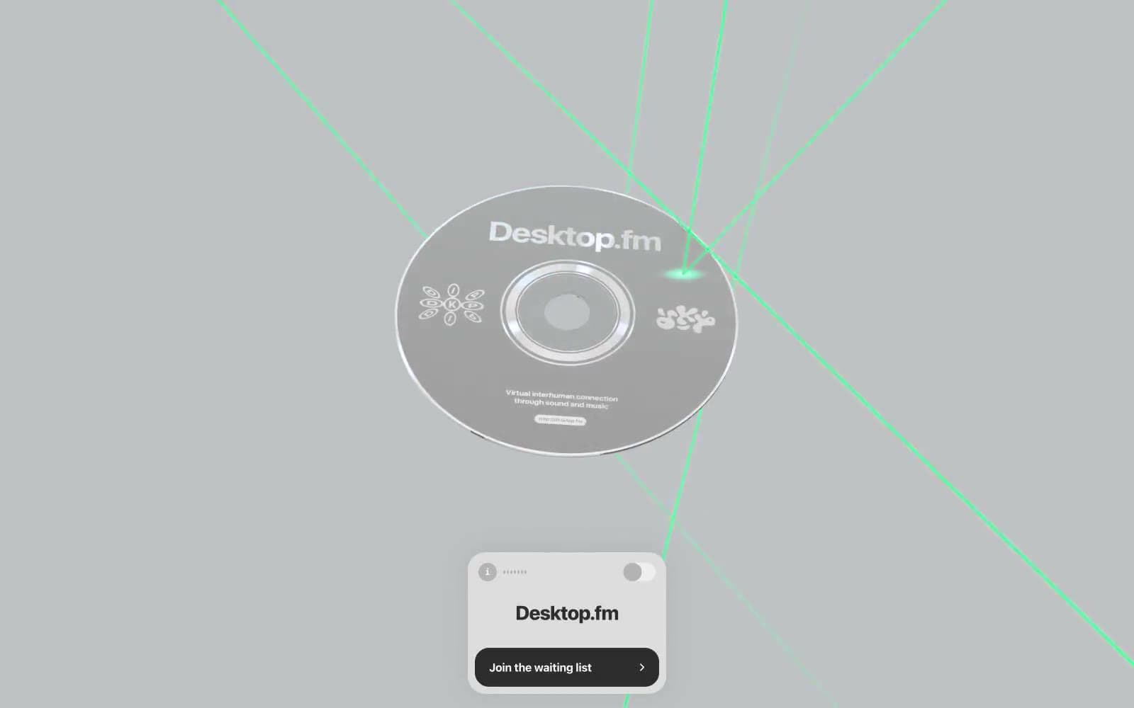
Desktop.fm
Media
Dezeen
Media
DICE
Media
Epidemicsound
Media
Exhibition Magazine
Media
Flying Papers
Media


