
Transform. Stage poster pinned to warm blush paper.
- Media
- Light theme
- 8 colors
- 1 typeface
Transform uses a theatrical broadside language: a warm blush cream canvas carries the entire site while oversized geometric headlines shout in heavy Walsheim weights. The palette is intentionally limited to three loud accents — spotlight magenta, festival violet, and stage orange — deployed like a punk poster printer's ink set, each one earning its place on a flat, unshadowed surface. Depth comes from full-bleed color blocking, not elevation, so sections read like clipped broadsheets stacked on warm paper. Components are weighty and rectangular; only links and a few interactive chips receive the 50px pill radius, making them feel like stickers pressed onto the page. Typography does the emotional work: weight 700–900 at 56–80px carries theatrical volume, while tight -0.02em tracking keeps the heavy forms from sprawling.
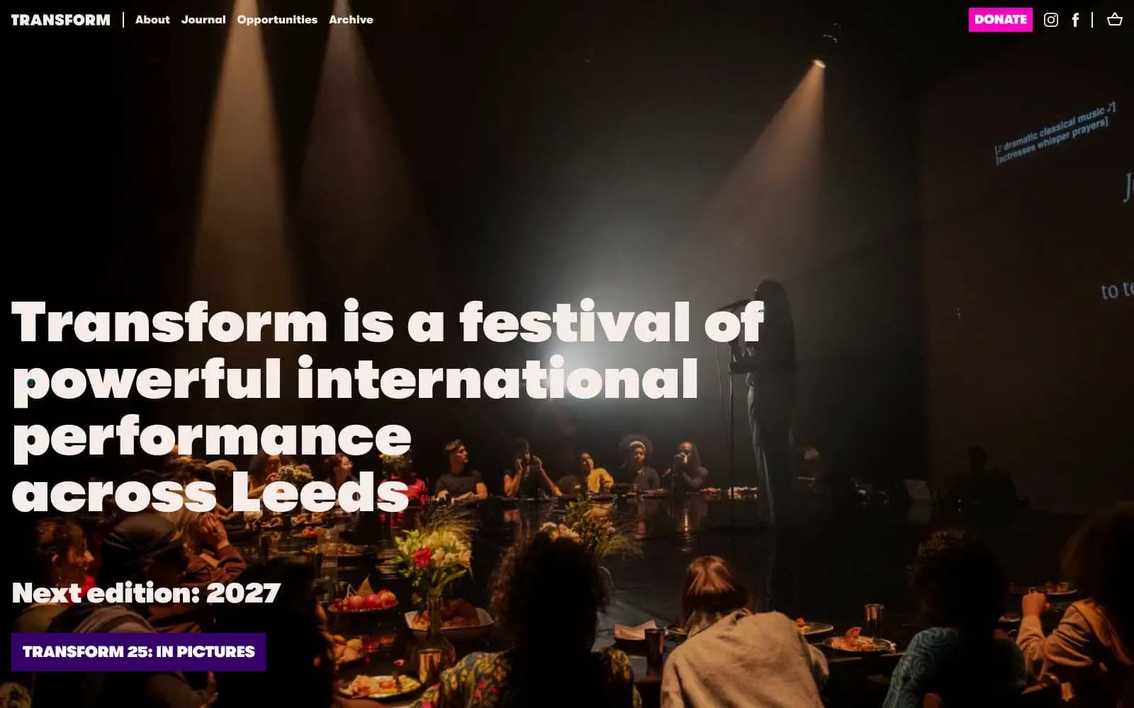
Transform design system

Brand2
Full-bleed section bands, secondary filled CTA, footer background — heavy, immersive, sets the serious stage
Primary filled CTA (DONATE), pull-quote text, heading borders, interactive emphasis — the loudest ink, reserved for moments that demand attention
Accent1
Pull-quote attribution, decorative heading borders — the warm third color that gives the palette a poster-like three-ink depth
Neutrals5
Primary text, section headings, hairline borders, icon strokes
Muted input borders, secondary helper strokes
Alternate card surface when a quieter neutral block is needed
Page background, nav surface, dominant canvas — the warm paper everything sits on
Card surface, dark-section text, button labels on chromatic fills
Try a pairing
Pick any two colors from the palette to check whether text stays readable on top.
Aa
Paper White on Festival Violet
15.60 : 1 contrast
- Body textPasses AA 4.5
- Large textPasses AA 3
- StrictPasses AAA 7
More DESIGN.md files. Same web, different personalities.

Josh W. Comeau
Media
The Pudding
Media
2020
Media
amra
Media
Bluesky Social
Media
Cup of Couple
Media
Desktop.fm
Media
Dezeen
Media
DICE
Media
Epidemicsound
Media
Exhibition Magazine
Media
Flying Papers
Media


