
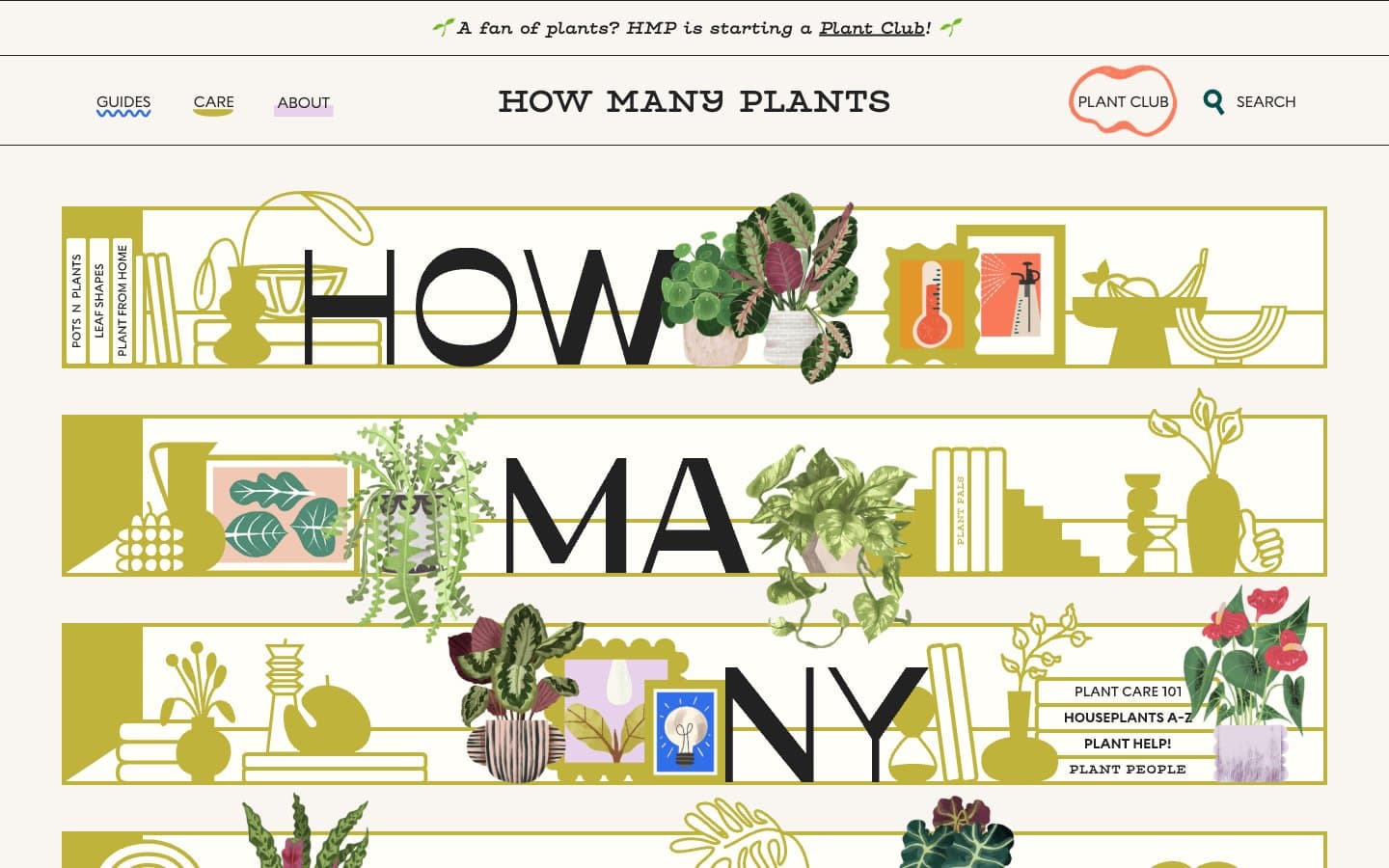
How Many Plants. A illustrated shelf system where the page title sits inside bands of potted plants and brass instruments.
- Media
- Light theme
- 5 colors
- 2 typefaces
How Many Plants is a warm botanical editorial — a cream-paper broadside where a single golden-olive hue carries every illustration, banner, and accent. The hero is built from horizontal illustrated shelves in mustard that interlock with oversized display type, turning the page title into a shelf of plant pots, books, and vases. Surfaces are flat and paper-like; shadows are hard 6px offsets in the mustard itself, not soft drops, giving every decorated element the look of a cut-and-paste collage. The palette is ruthlessly small — cream canvas, black ink, one saturated gold, one dusty lavender, one dark teal — and that constraint IS the identity. Typography mixes a chunky geometric display face with a typewriter secondary, so headings feel poster-like while body copy stays intimate and typewritten.
How Many Plants design system

Brand1
Signature illustration color, hero shelf bands, decorative borders, hard offset shadows, icon fills — the only saturated hue in the system and the brand's defining mark
Accent2
Tab backgrounds, tag pills, soft surface accents — desaturated lilac that cools the warm cream without competing with the gold
Secondary text and accent on lavender surfaces, occasional icon detail — the only dark chromatic in the palette, used sparingly for contrast against light washes
Neutrals2
Primary text, illustration outlines, large display letters, image borders — near-black that feels like a drafting pen rather than pure black
Page background, card surfaces, section bands — the warm off-white that reads as uncoated stock rather than digital white
Try a pairing
Pick any two colors from the palette to check whether text stays readable on top.
Aa
Ink Black on Golden Olive
7.37 : 1 contrast
- Body textPasses AA 4.5
- Large textPasses AA 3
- StrictPasses AAA 7
More DESIGN.md files. Same web, different personalities.

Josh W. Comeau
Media
The Pudding
Media
2020
Media
amra
Media
Bluesky Social
Media
Cup of Couple
Media
Desktop.fm
Media
Dezeen
Media
DICE
Media
Epidemicsound
Media
Exhibition Magazine
Media
Flying Papers
Media


