
Telescope. Editorial pasteboard on cream paper.
- Media
- Light theme
- 5 colors
- 3 typefaces
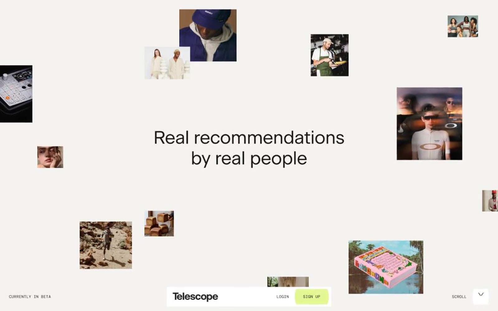
Telescope reads as an editorial fashion magazine printed on warm cream paper: a nearly monochrome world of bone-white canvas, warm near-black type, and full-bleed editorial photography, punctuated by a single vivid lime accent that signals the only interactive surface. The UI is stripped to the bone — no cards, no panels, no decorative chrome — with a fixed bottom bar in mono caps doing all the navigation work and photos floating freely into the headline as if laid out on a pasteboard. Typography does the heavy lifting: a quiet custom serif at generous sizes with tight negative tracking whispers rather than shouts, while the mono labels at 12px are the only typographic texture outside the serif system. Everything is sharp at 2px corners, spacing is generous, and the lime green is rationed — one button, nothing else.
Telescope design system

Brand1
Green wash for highlight backgrounds, decorative bands, and soft emphasis behind content. Do not promote it to the primary CTA color
Neutrals4
Primary text, body copy, headings, borders, and hairline rules. A warm near-black, never pure #000, so the contrast against Bone Paper feels printed rather than digital
Secondary text, meta labels, and subtle borders. The cool counterpoint to Ink's warmth — used when type needs to recede without losing legibility
Page canvas — the warm off-white that reads as paper stock, not screen white. Everything sits on this surface
Surface layer above Bone Paper for inline cards and the bottom navigation bar. Rare — most surfaces stay on Bone
Try a pairing
Pick any two colors from the palette to check whether text stays readable on top.
Aa
Ink on Lime Pulse
15.08 : 1 contrast
- Body textPasses AA 4.5
- Large textPasses AA 3
- StrictPasses AAA 7
More DESIGN.md files. Same web, different personalities.

Josh W. Comeau
Media
The Pudding
Media
2020
Media
amra
Media
Bluesky Social
Media
Cup of Couple
Media
Desktop.fm
Media
Dezeen
Media
DICE
Media
Epidemicsound
Media
Exhibition Magazine
Media
Flying Papers
Media


