
Tailark Pro. A curated component museum.
- Design tools
- Light theme
- 20 colors
- 3 typefaces
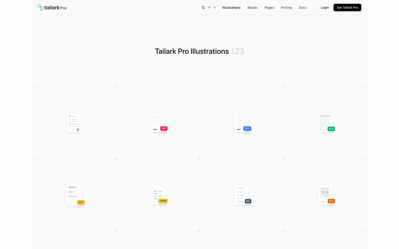
Tailark Pro is a gallery-grade component library interface: near-pure white canvas, hairline-bordered cards, and compact system-sans typography that recedes to let illustrated UI snippets breathe. A single vivid violet (#615fff) anchors the brand across icons, links, and the logo mark, while illustration previews introduce controlled chromatic punctuation — greens, oranges, yellows, reds — as colored tags, icons, and accent fills within the mockups. Surfaces are distinguished by 1px oklab-tinted borders and very soft 3–4 step shadows rather than heavy elevation, producing a flat, architecturally precise rhythm. Components are lightweight, monoline, and unembellished — the aesthetic echoes shadcn/ui and Geist-era Tailwind documentation, treating the white page as a museum wall for the components themselves.
Tailark Pro design system

Brand1
Logo mark, link text, icon accents, brand-colored borders and fills — the single chromatic anchor that signals the brand across an otherwise achromatic interface
Accent12
Green supporting accent for decorative details and low-frequency emphasis. Use as a supporting accent, not as a status color
Green supporting accent for decorative details and low-frequency emphasis. Use as a supporting accent, not as a status color
Yellow supporting accent for decorative details and low-frequency emphasis. Use as a supporting accent, not as a status color
Yellow supporting accent for decorative details and low-frequency emphasis. Use as a supporting accent, not as a status color
Orange supporting accent for decorative details and low-frequency emphasis. Use as a supporting accent, not as a status color
Red supporting accent for decorative details and low-frequency emphasis. Use as a supporting accent, not as a status color
Red supporting accent for decorative details and low-frequency emphasis. Use as a supporting accent, not as a status color
Illustration accent violet, tag variant
Illustration accent purple, tag variant
Illustration accent blue, tag variant
Illustration accent indigo, tag variant
Soft violet surface wash, subtle card highlight
Neutrals7
SVG icon fills, deepest contrast for illustration artwork
Dark supporting neutral for text, icons, and strong contrast. Do not promote it to the primary CTA color
Dark surface for filled buttons and emphasis panels
Secondary body text, descriptions, muted labels, caption text
Tertiary text, meta labels, inactive nav items, placeholder content
Dividers, card borders, input borders, subtle structural separation
Page background, card surface, button surface — the dominant canvas
Try a pairing
Pick any two colors from the palette to check whether text stays readable on top.
Aa
Pure Black on Signal Violet
4.59 : 1 contrast
- Body textPasses AA 4.5
- Large textPasses AA 3
- StrictFails AAA 7
More DESIGN.md files. Same web, different personalities.

099 SUPPLY
Design tools
70Materia
Design tools
Aaply
Design tools
Anacuna
Design tools
Andrei Rybin
Design tools
Artboard
Design tools
Awwwards
Design tools
B—Line
Design tools
Brand
Design tools
Canva
Design tools
Claude Type
Design tools
Control
Design tools


