
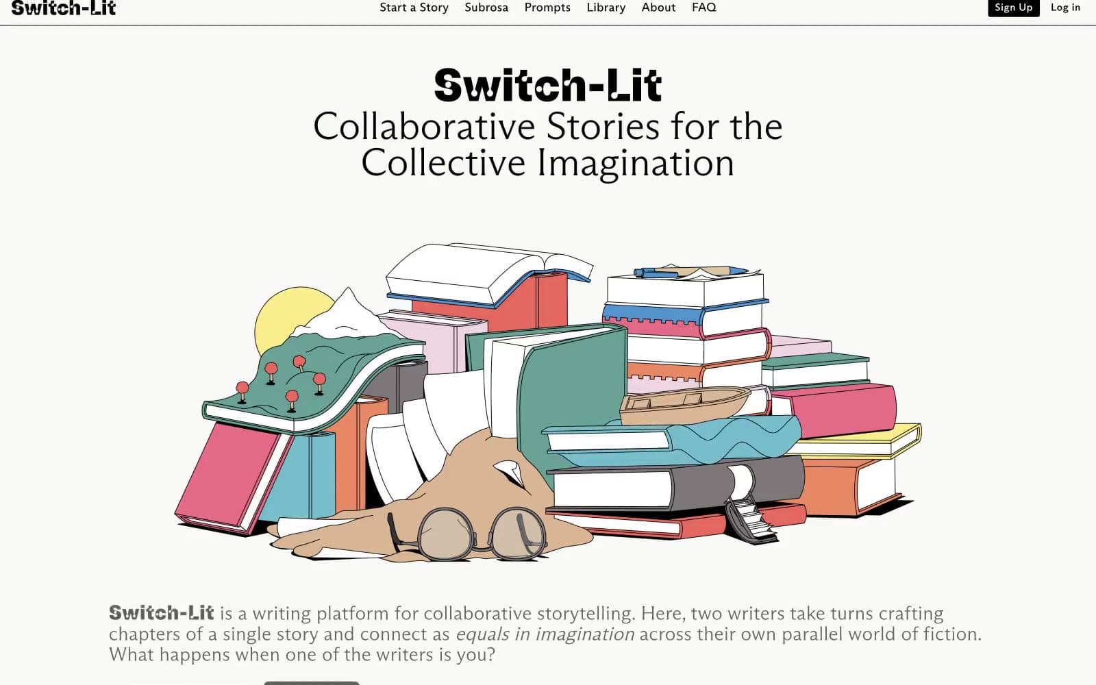
Switch-Lit. Inked editorial grid on cream paper.
- Media
- Light theme
- 9 colors
- 7 typefaces
Switch-Lit is an editorial brutalist system printed on warm cream paper. Every structural element is drawn in a single black hairline — card edges, dividers, icon strokes, button outlines — so the page reads like a typeset manuscript where the grid itself is inked. Typography carries the personality: heavy condensed display type sits next to whisper-light flared serifs, and body copy uses a wide-tracked grotesque that feels typeset rather than typed. Accent color appears as highlighter punctuation — electric lime, cornflower, spring green — used in small swatches on cards and tags rather than as backgrounds for hero sections. The whole effect is closer to a printed literary quarterly than a SaaS product: restrained, opinionated, and deeply typographic.
Switch-Lit design system

Brand2
Primary accent fill on cards, tags, and featured swatches — electric yellow-green that reads as a marker pen swiped across the page
Secondary accent fill on cards, category chips, and illustration swatches — dusty cornflower blue that cools the palette without darkening it
Accent1
Green wash for highlight backgrounds, decorative bands, and soft emphasis behind content
Neutrals6
All borders, body text, headings, icon strokes — the single ink that draws the entire structural system
The only shadow tone used — rgba(0,0,0,0.2) modulated to a neutral mid-gray for the single soft button shadow
Secondary card and button borders where a softer hairline is needed — desaturated green-gray
Icon strokes and fills, button borders on tertiary controls — barely-there gray-green for subordinate elements
Button fill for neutral or disabled states — warm gray-green, almost a shadow of the cream canvas
Page canvas, card surfaces, button text on dark — warm off-white that reads as paper rather than screen
Try a pairing
Pick any two colors from the palette to check whether text stays readable on top.
Aa
Press Black on Highlighter Lime
18.94 : 1 contrast
- Body textPasses AA 4.5
- Large textPasses AA 3
- StrictPasses AAA 7
More DESIGN.md files. Same web, different personalities.

Josh W. Comeau
Media
The Pudding
Media
2020
Media
amra
Media
Bluesky Social
Media
Cup of Couple
Media
Desktop.fm
Media
Dezeen
Media
DICE
Media
Epidemicsound
Media
Exhibition Magazine
Media
Flying Papers
Media


