
Surface. A single 230px word anchors scattered photography against pure off-white, with everything else reduced to a whisper of black type.
- Media
- Light theme
- 2 colors
- 1 typeface
Surface is a print-publication-shaped digital editorial: a bone-white canvas (#f7f7f7) where almost everything is black type, with the layout itself acting as the brand. The visual system is radical in its restraint — no accent color, no borders, no shadows, no gradients, no rounded corners. Instead, personality comes from the type scale (a 230px display weight) and from deliberately placed editorial photography that breaks the grid at angles. Navigation is reduced to a monogram, a wordmark, and a hamburger. Content sections breathe with wide left margins and generous vertical padding, reading like a magazine spread rather than a web product. An AI agent should treat this as a 'design system of absence' — every added element must earn its place against the white field.
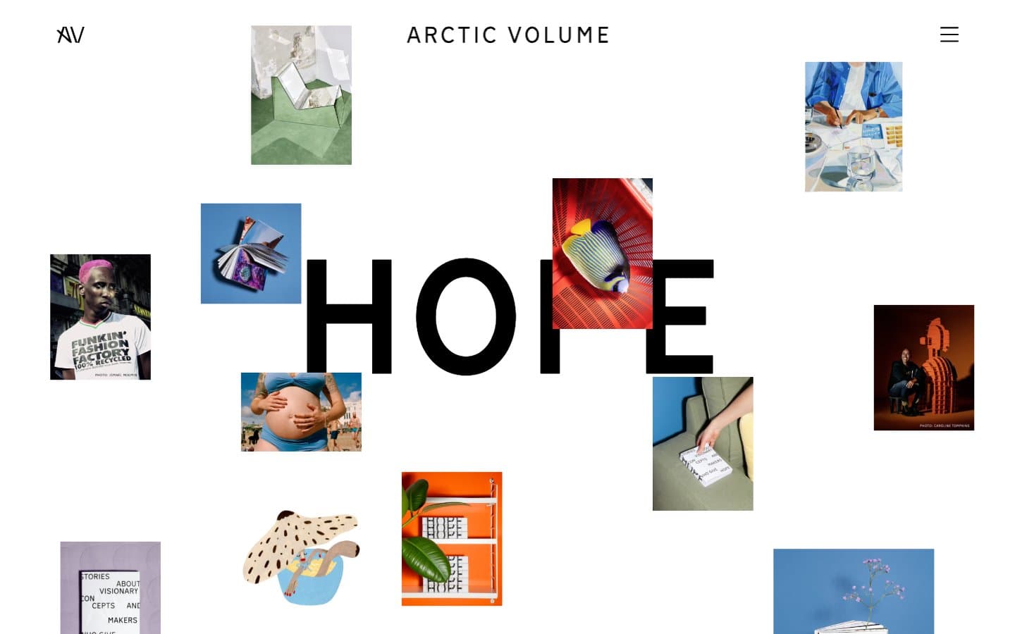
Surface design system

Neutrals2
All text, all borders, all icons, all link states, nav strokes, heading rules — the entire interface communicates in pure black against Bone
Page canvas, card surfaces, section backgrounds — the only non-black color in the system
Try a pairing
Pick any two colors from the palette to check whether text stays readable on top.
Aa
Bone on Pressed Ink
19.60 : 1 contrast
- Body textPasses AA 4.5
- Large textPasses AA 3
- StrictPasses AAA 7
More DESIGN.md files. Same web, different personalities.

Josh W. Comeau
Media
The Pudding
Media
2020
Media
amra
Media
Bluesky Social
Media
Cup of Couple
Media
Desktop.fm
Media
Dezeen
Media
DICE
Media
Epidemicsound
Media
Exhibition Magazine
Media
Flying Papers
Media


