
Substack. Orange ink on a newsroom desk.
- Media
- Light theme
- 10 colors
- 5 typefaces
Substack reads like a well-worn newsroom dashboard — white canvas, warm near-black text, and one loud signal-orange that marks every act of creation. The visual hierarchy is built from density rather than decoration: thin gray rules separate feed items, avatars are small, metadata is muted, and the reader's eye is trained to find the orange CTA, the orange logo, the orange 'Subscribe' link, the orange 'Create' button. Surfaces stay flat and unbounded — no card shadows, no panel chrome — letting the typography (a compact system-ui chrome paired with a custom serif headline face) carry the editorial weight. The signature gesture is restraint in chrome and loudness in one color: a reading app that looks like a publishing tool.
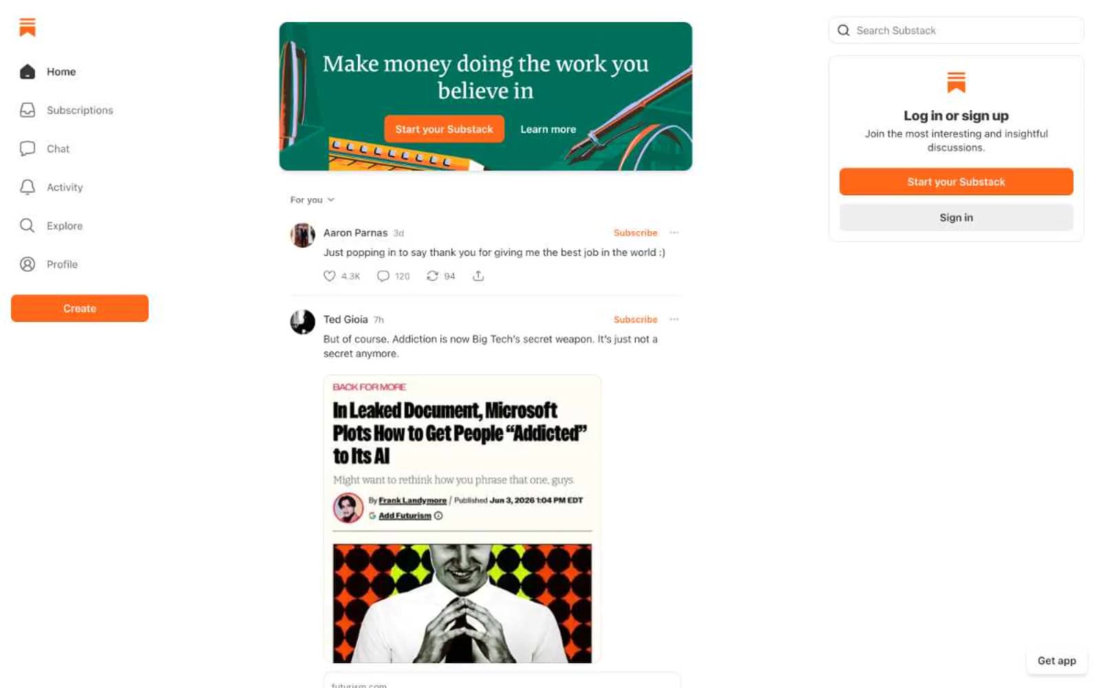
Substack design system

Brand1
Orange supporting accent for decorative details and low-frequency emphasis. Do not promote it to the primary CTA color
Neutrals9
Icon strokes, image overlays, dark accent blocks in promo cards
Secondary text and high-emphasis link hover state; deeper than Ink for code blocks and emphasis blocks
Primary text — body copy, headings, post titles, timestamps, author names; warm-shifted near-black instead of pure #000 for less aggressive reading
Dark mode surface accent or pressed button state — infrequently used but present in the token set
Supporting neutral for secondary UI, dividers, and muted labels. Do not promote it to the primary CTA color
Hairline borders, button outlines, icon strokes, disabled control borders
Divider lines, subtle icon backgrounds, skeleton placeholder fills
Light supporting surface for subtle backgrounds and section separation. Do not promote it to the primary CTA color
Page canvas, card surfaces, input fields, nav background — the dominant surface, occupying the vast majority of the interface
Try a pairing
Pick any two colors from the palette to check whether text stays readable on top.
Aa
Black on Signal Orange
7.21 : 1 contrast
- Body textPasses AA 4.5
- Large textPasses AA 3
- StrictPasses AAA 7
More DESIGN.md files. Same web, different personalities.

Josh W. Comeau
Media
The Pudding
Media
2020
Media
amra
Media
Bluesky Social
Media
Cup of Couple
Media
Desktop.fm
Media
Dezeen
Media
DICE
Media
Epidemicsound
Media
Exhibition Magazine
Media
Flying Papers
Media


