
Subframe. Graphite blueprint on warm vellum.
- Design tools
- Light theme
- 8 colors
- 4 typefaces
Subframe is a monochrome designer's workbench: warm off-white canvas, graphite-black ink, and zero chromatic accent. The entire interface reads as a single material — paper, pencil, and shadow — with one bold typographic gesture: a refined serif display (Instrument Serif) against a systematic sans (Inter) to give editorial gravity to the headlines. Surfaces are flat and bordered, not elevated; depth comes from hairline dividers in #e5e7eb and inset highlights on dark controls rather than drop shadows. Density is generous: wide vertical rhythm (48–64px section gaps), centered max-width layouts, and large breathing room around type. The only color is the contrast between near-white and near-black — making the dark filled button the single loudest element on every page, and the logo strip of grayscale partner brands the only decorative visual rhythm.
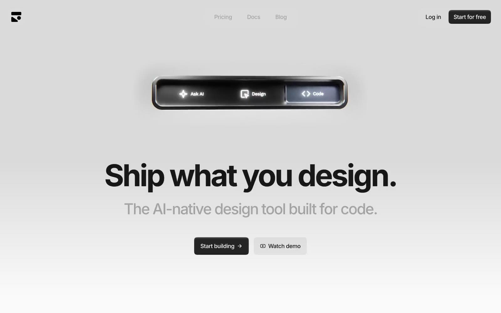
Subframe design system

Neutrals8
Primary body text, headings, icon strokes — slightly cooler than Graphite, reserved for typography not surfaces
High-contrast neutral action fill for primary buttons on light surfaces.
Secondary body text, descriptions, subhead copy
Muted helper text, tertiary metadata, inactive nav items
Mid-tone dividers and section transitions
Dividers, card borders, image frames, icon outlines — the most-used stroke in the system, defines spatial structure
Elevated card backgrounds, secondary surface — sits one step above canvas to create grouping without shadow
Page background, card-on-canvas, light text on dark surfaces — the warm white that carries the entire monochrome system
Try a pairing
Pick any two colors from the palette to check whether text stays readable on top.
Aa
Page Canvas on Ink Black
17.18 : 1 contrast
- Body textPasses AA 4.5
- Large textPasses AA 3
- StrictPasses AAA 7
More DESIGN.md files. Same web, different personalities.

099 SUPPLY
Design tools
70Materia
Design tools
Aaply
Design tools
Anacuna
Design tools
Andrei Rybin
Design tools
Artboard
Design tools
Awwwards
Design tools
B—Line
Design tools
Brand
Design tools
Canva
Design tools
Claude Type
Design tools
Control
Design tools


