
Studio Few. A white gallery where black ink is the only ornament.
- Design tools
- Light theme
- 7 colors
- 10 typefaces
Studio Few is a type foundry where the product is the alphabet, so the design recedes entirely. The interface is pure achromatic: white canvas, black ink, a single mid-gray for inactive controls, and almost no decorative chrome. Every screen is a vertical sequence of full-width specimen rows — a tiny label, two thin slider tracks for size and weight, an outlined Trial button, a solid black View button, and then enormous custom type rendered at 115–158px as the hero. The custom Sterling family carries all UI text at 12–14px, while the specimen displays use the foundry's own faces (Formative, Voyager, Anthro, Blok, ArbeitPro, Apex), each shown solo with no surrounding art. The result feels like a gallery wall: the only thing with visual weight is the letterform itself.
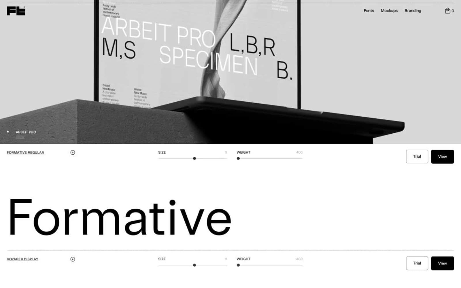
Studio Few design system

Neutrals7
Body text, button fills, hairline borders, slider tracks, active states — the single dominant tone that gives every specimen its anchor
Near-black with a barely-perceptible cool cast — used where pure #000000 would feel flat against the slightly warm page
Secondary surfaces and darker neutral blocks when a row needs more weight than white but less than pure black
Quiet link text and low-emphasis labels
Medium-contrast borders, control outlines, and structural separators.
Subtle surface lift and low-contrast dividers when a row needs to separate from pure white without using ink
Page canvas, card surfaces, input fills, button text on dark fills
Try a pairing
Pick any two colors from the palette to check whether text stays readable on top.
Aa
Paper White on Ink Black
21.00 : 1 contrast
- Body textPasses AA 4.5
- Large textPasses AA 3
- StrictPasses AAA 7
More DESIGN.md files. Same web, different personalities.

099 SUPPLY
Design tools
70Materia
Design tools
Aaply
Design tools
Anacuna
Design tools
Andrei Rybin
Design tools
Artboard
Design tools
Awwwards
Design tools
B—Line
Design tools
Brand
Design tools
Canva
Design tools
Claude Type
Design tools
Control
Design tools


