
Sketch. Serif poetry on pastel paper.
- Design tools
- Light theme
- 15 colors
- 2 typefaces
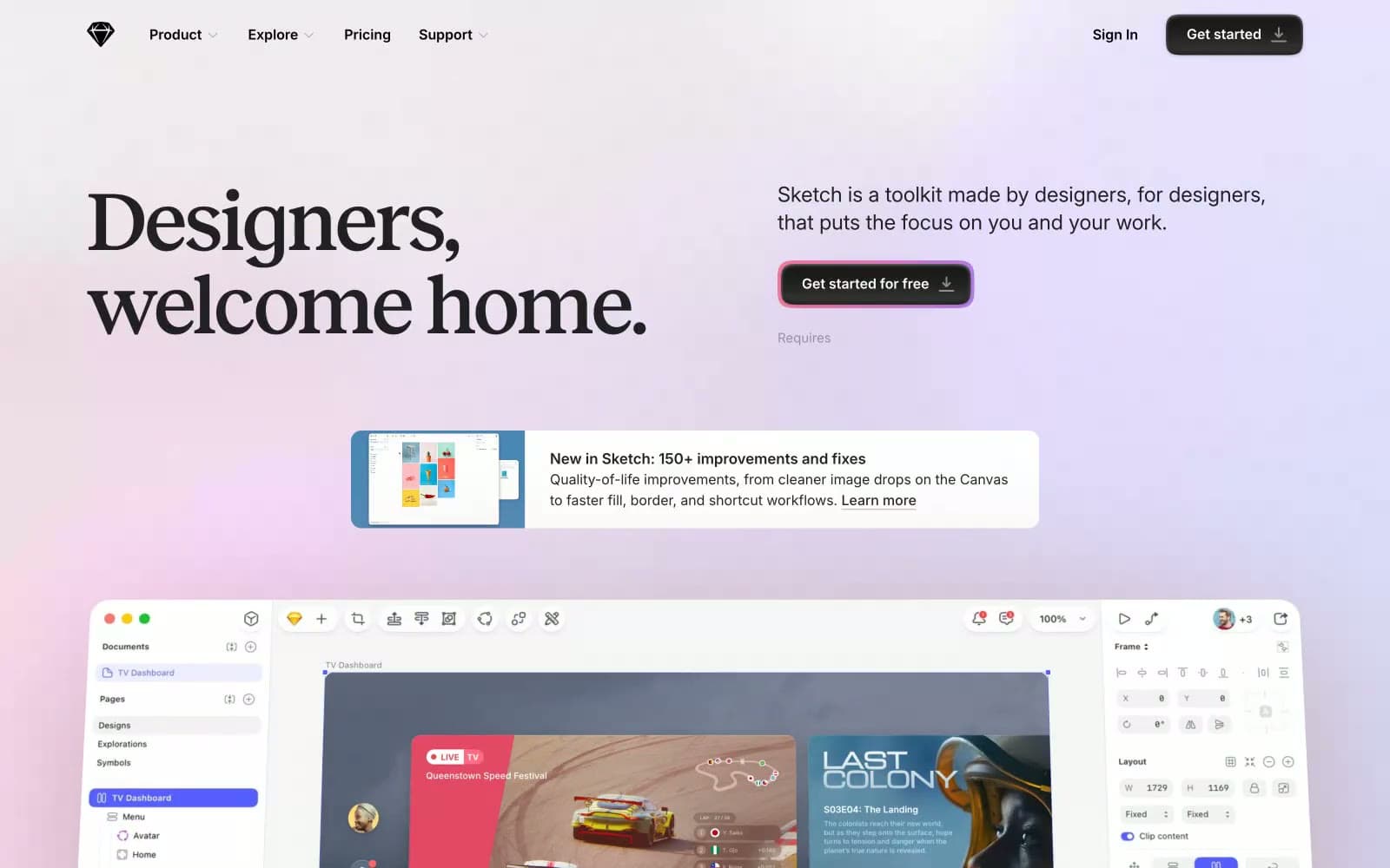
Sketch's design language is a writer's studio reimagined as software: a quiet, nearly grayscale canvas where one warm serif headline and a single soft pink-to-lavender gradient do all the emotional work. The interface itself is restrained — Inter at modest sizes, thin dividers, pill-shaped controls — letting the product (the Sketch app) and the community's quotes breathe. The signature move is the dark pill CTA wrapped in a diffused magenta halo: a button that glows like a desk lamp at dusk, signaling action without shouting. Color is rationed; when it appears, it arrives as atmospheric wash (the hero gradient) or as a tiny punctuation (a violet badge, a teal tag), never as structural fill.
Sketch design system

Brand2
Hero atmospheric gradient — the warm pink that bleeds into lavender across the hero, setting the entire emotional register
Decorative multi-stop gradient used in product showcase contexts — blue to purple to orange, cycling for visual energy
Accent3
Accent badges, feature tags — a single violet used sparingly as categorical punctuation on a sea of grayscale
Secondary accent badges — a cool teal that pairs with Iris as the site's only chromatic vocabulary for tags and labels
Blue supporting accent for decorative details and low-frequency emphasis
Neutrals10
Pure black reserved for the highest-contrast elements: nav links, button labels, icon fills where absolute clarity is required
Dark supporting neutral for text, icons, and strong contrast. Do not promote it to the primary CTA color
Primary text, headings, icon strokes — near-black with a faint cool undertone, softer than pure #000 to reduce glare on long-form copy
Body text, secondary copy, footer text — the mid-gray that creates the reading layer between headlines and captions
Muted body text, secondary nav, caption-level copy
Tertiary text, metadata, timestamps in testimonials
Placeholder text, disabled states, tertiary icons, hairline strokes where subtlety is the point
Subtle shadows under icons and buttons, ghost borders on inactive controls
Input field shadows, card hairline borders, the lightest visible structural line
Light supporting surface for subtle backgrounds and section separation. Do not promote it to the primary CTA color
Try a pairing
Pick any two colors from the palette to check whether text stays readable on top.
Aa
Bone on Iris
4.58 : 1 contrast
- Body textPasses AA 4.5
- Large textPasses AA 3
- StrictFails AAA 7
More DESIGN.md files. Same web, different personalities.

099 SUPPLY
Design tools
70Materia
Design tools
Aaply
Design tools
Anacuna
Design tools
Andrei Rybin
Design tools
Artboard
Design tools
Awwwards
Design tools
B—Line
Design tools
Brand
Design tools
Canva
Design tools
Claude Type
Design tools
Control
Design tools


