
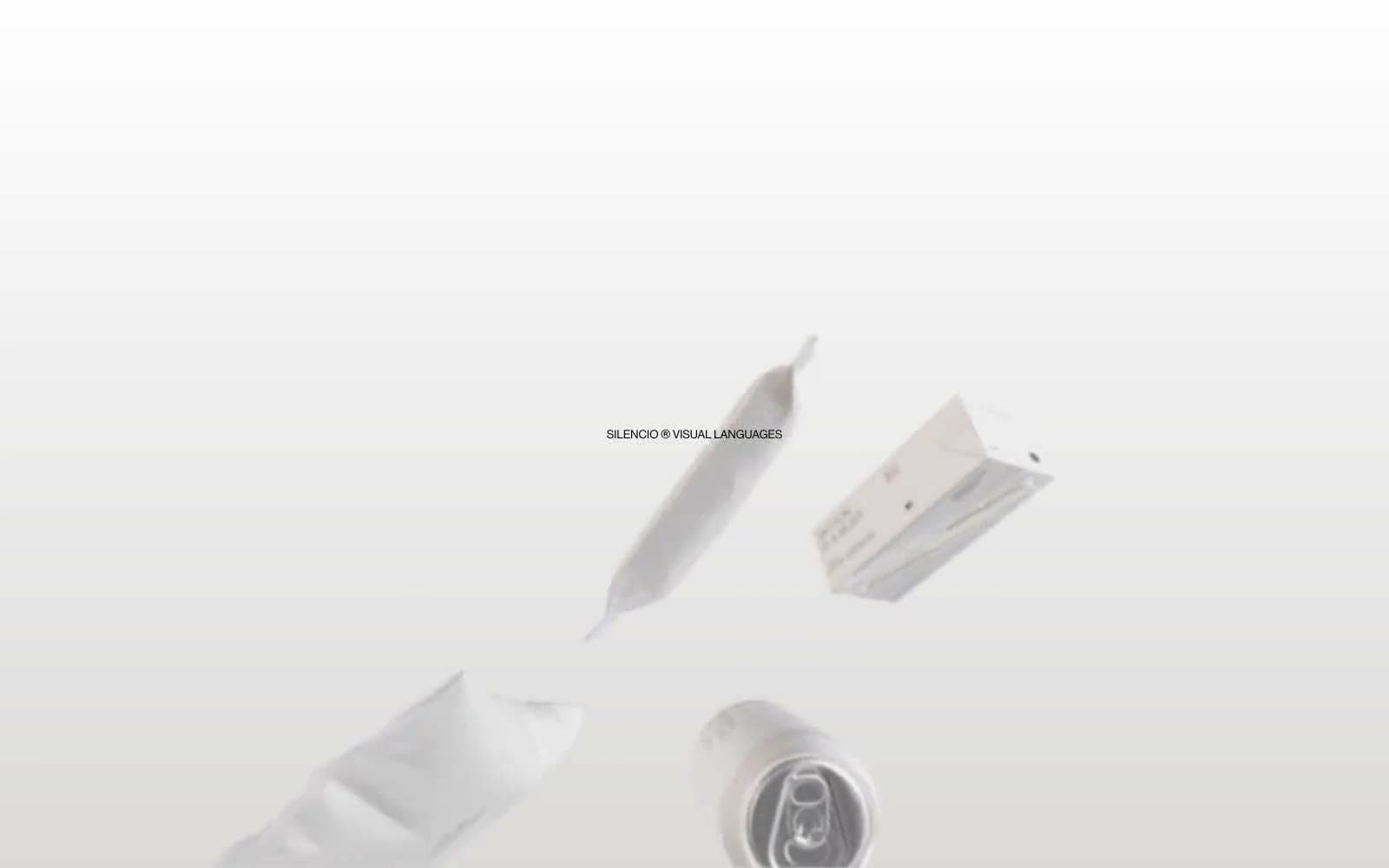
Silencio. White room with floating artifacts.
- Design tools
- Light theme
- 4 colors
- 3 typefaces
Silencio operates as a visual silence — a monochrome gallery where objects float on warm paper-white and typography does nearly all the talking. The system strips away every non-essential: no chromatic accents, no shadows, no decorative geometry; instead it relies on extreme type contrast (141px display whispers next to 9px metadata) and one warm gray (#dbdad9) as the only departure from pure black-on-white. Surfaces are paper-flat, separated by hairline rules and small radius (7.2px) rather than elevation. The brand voice reads like museum wall text: centered, brief, slightly italicized by silence, with monospaced labels (PT Mono, 11px) used as quiet signatures next to a custom Haas grotesque. Components feel like printed catalog pages more than web UI — buttons are full pill shapes (129.6px), cards have a single rounded corner, and the whole composition breathes with the confidence of a room with nothing on its walls.
Silencio design system

Neutrals4
Primary text, iconography, hairline rules, table borders — the only high-contrast element on the page
Subtle table dividers and secondary rule lines — used when #000000 would feel too heavy
Card surfaces, soft fills, the single chromatic departure from pure white, gentle gradient origin
Supporting palette color for small decorative accents when the core palette needs contrast.
Try a pairing
Pick any two colors from the palette to check whether text stays readable on top.
Aa
Bleach White on Ink Black
21.00 : 1 contrast
- Body textPasses AA 4.5
- Large textPasses AA 3
- StrictPasses AAA 7
More DESIGN.md files. Same web, different personalities.

099 SUPPLY
Design tools
70Materia
Design tools
Aaply
Design tools
Anacuna
Design tools
Andrei Rybin
Design tools
Artboard
Design tools
Awwwards
Design tools
B—Line
Design tools
Brand
Design tools
Canva
Design tools
Claude Type
Design tools
Control
Design tools


