
Ryan Stephen. The portfolio is the product, the UI is invisible.
- Design tools
- Light theme
- 4 colors
- 1 typeface
Ryan Stephen's portfolio is a quiet gallery wall on white plaster: nearly all black and white, with one warm gray doing the work of secondary text and link borders. The layout is content-first and image-dominant — a single bio block on the left, a 3-column photo grid on the right — with no chrome, no decoration, and no brand color competing with the work. The visual system is intentionally austere: system fonts, a single 10px image radius, generous whitespace, and zero shadows or gradients. Every interface element is reduced to its function so the photographs carry the page.
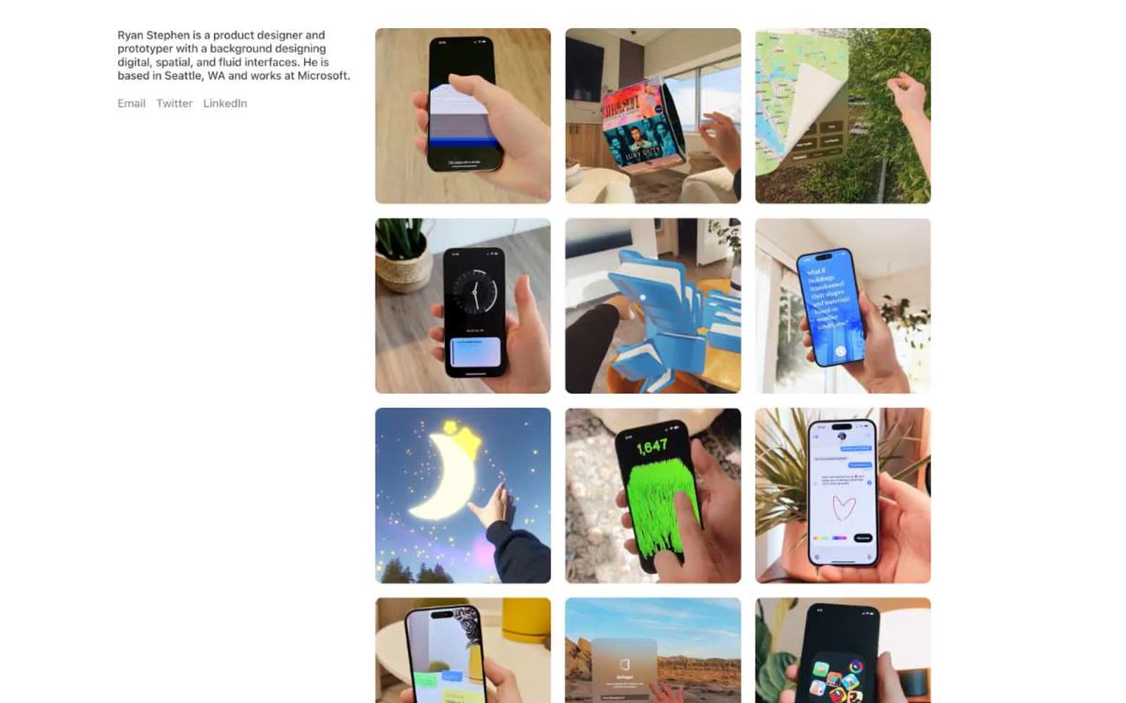
Ryan Stephen design system

Neutrals4
Primary text, image frame borders, structural lines
Secondary body text, subdued labels
Muted helper text, link borders, link text, decorative dividers
Page canvas, card surfaces, image backgrounds
Try a pairing
Pick any two colors from the palette to check whether text stays readable on top.
Aa
Plaster White on Ink Black
21.00 : 1 contrast
- Body textPasses AA 4.5
- Large textPasses AA 3
- StrictPasses AAA 7
More DESIGN.md files. Same web, different personalities.

099 SUPPLY
Design tools
70Materia
Design tools
Aaply
Design tools
Anacuna
Design tools
Andrei Rybin
Design tools
Artboard
Design tools
Awwwards
Design tools
B—Line
Design tools
Brand
Design tools
Canva
Design tools
Claude Type
Design tools
Control
Design tools


