
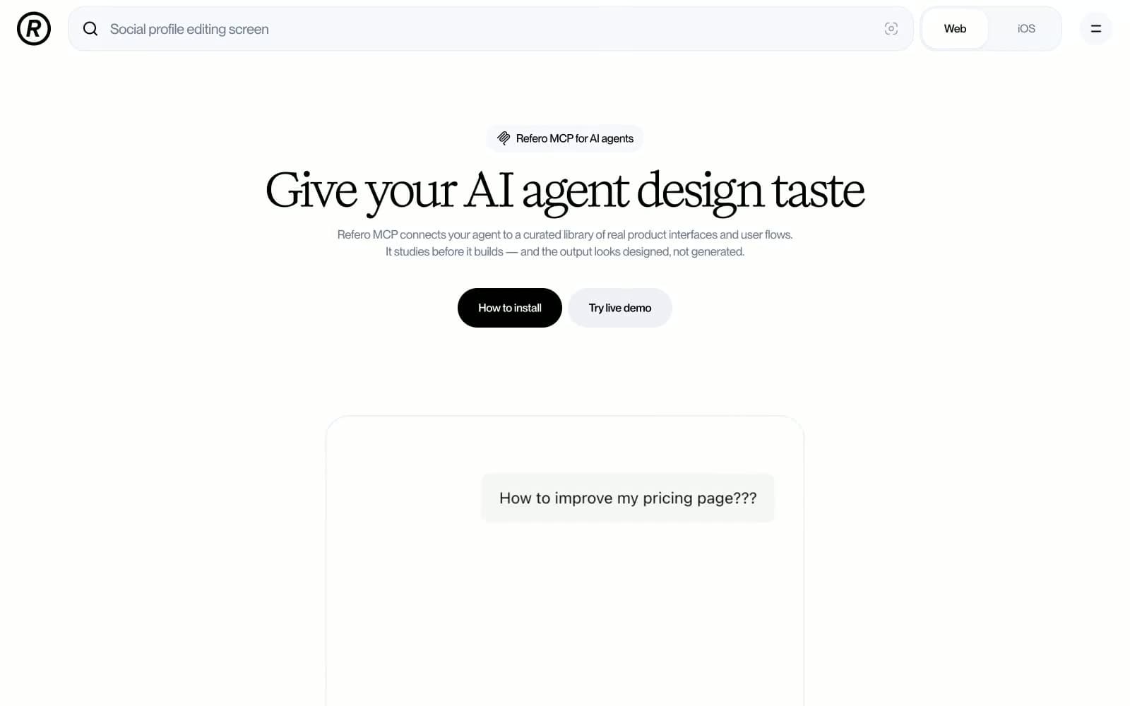
Refero. A typographer's product page where the serif headline IS the brand, and everything else stays out of its way.
- Design tools
- Light theme
- 9 colors
- 2 typefaces
Refero uses a white-canvas editorial language where a high-contrast serif headline font (Title) carries nearly all expressive weight against an otherwise achromatic UI. The page breathes with generous vertical rhythm, letting black-on-white hierarchy do the work that other systems hand to color. The single accent move is a filled black pill button against white — no gradients, no color splashes, just ink-weight contrast. Borders and muted grays form a quiet structural grid, while the inset blue-tinted shadow on surface elements is the only chromatic whisper in an otherwise monochrome system.
Refero design system

Accent1
Inset ring shadow on elevated cards/surfaces — blue-tinted at 7% opacity creates structural definition without neutral gray shadows
Neutrals8
Neutral form states, badge text, and quiet UI feedback where color should stay understated. Do not promote it to the primary CTA color
Near-black text for dense UI labels, active nav tab text
Navigation link text, secondary headings, mid-level labels
Tertiary text, supporting body copy, muted label text
Subdued body text, hairline borders, icon strokes, placeholder text — the dominant mid-gray in this system
Light borders, icon outlines, de-emphasized link borders, ghost UI outlines
Secondary surface, subtle background containers, nav pill background
Primary page background, modal/dialog background
Try a pairing
Pick any two colors from the palette to check whether text stays readable on top.
Aa
Pure Canvas on Modal Veil
13.40 : 1 contrast
- Body textPasses AA 4.5
- Large textPasses AA 3
- StrictPasses AAA 7
More DESIGN.md files. Same web, different personalities.

099 SUPPLY
Design tools
70Materia
Design tools
Aaply
Design tools
Anacuna
Design tools
Andrei Rybin
Design tools
Artboard
Design tools
Awwwards
Design tools
B—Line
Design tools
Brand
Design tools
Canva
Design tools
Claude Type
Design tools
Control
Design tools


