
Readymag. A restrained white shell around bold, magazine-grade color blocks.
- Design tools
- Light theme
- 14 colors
- 6 typefaces
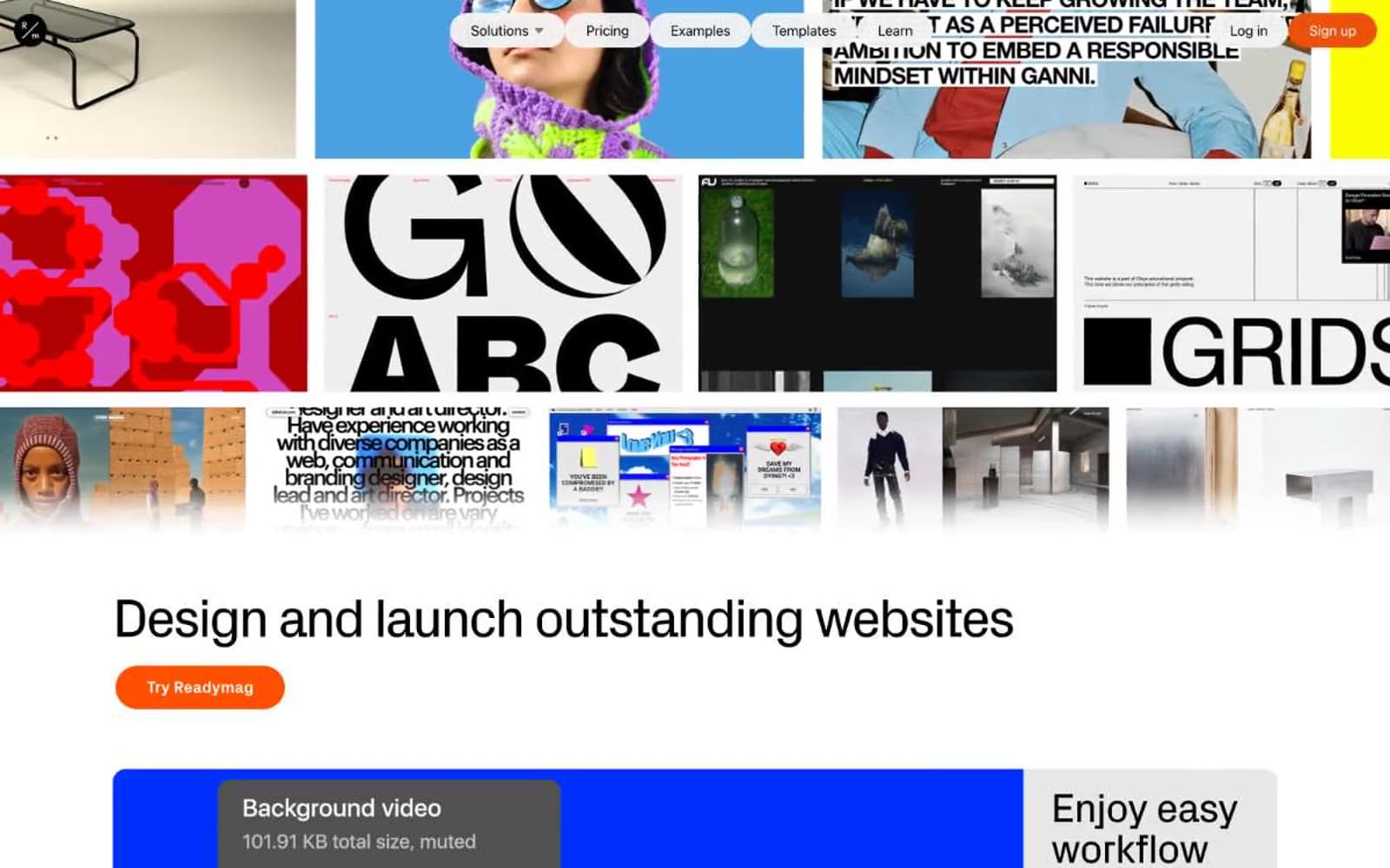
Readymag is a designer's editorial playground: a white-canvas product shell wrapped around an unmistakably bold, magazine-grade visual identity. The interface stays restrained — pure white background, near-black text, hairline borders — so the real work happens in feature blocks painted in saturated solid panels (electric violet, cobalt blue, ember orange, pure black, signal yellow). Typography carries enormous personality: a custom geometric display face at 30–80px with aggressively tight negative tracking does the heavy lifting for headlines, while a quieter workhorse sans handles body and UI. Components feel hand-set rather than templated — pill-shaped CTAs, thick section margins, and card surfaces that confidently fill their panels with color instead of nudging content forward with elevation. The result reads less like SaaS and more like a creative agency's homepage.
Readymag design system

Brand4
Headline accents, decorative strokes, feature callouts — vivid violet against the white canvas makes typographic moments feel electric and editorial rather than corporate
Secondary violet accent, decorative borders and outlines paired with the primary violet for layered brand moments
Orange supporting accent for decorative details and low-frequency emphasis. Do not promote it to the primary CTA color
Orange supporting accent for decorative details and low-frequency emphasis. Do not promote it to the primary CTA color
Accent2
Decorative full-bleed accent bands and section dividers — appears in few places but dominates attention where it does
Supporting palette color for small decorative accents when the core palette needs contrast. Do not promote it to the primary CTA color
Neutrals8
Pure black for solid feature card backgrounds and the strongest typographic moments — makes colored cards feel printed, not screen-painted
Heading text color — pushed darker than body for stronger hierarchy against the white canvas
Slightly deeper text tone used in specific body and border contexts for a richer near-black
Primary text color for body copy, links, and most UI text — the workhorse near-black that keeps reading comfortable without going full contrast
Muted helper text, icon stroke, and secondary metadata — sits between body text and true gray for ambient labels
Hairline borders, dividers, placeholder fills — the minimum-contrast separator
Subtle surface elevation for inputs, inactive controls, and the softest card backgrounds
Light supporting surface for subtle backgrounds and section separation. Do not promote it to the primary CTA color
Try a pairing
Pick any two colors from the palette to check whether text stays readable on top.
Aa
Paper White on Electric Violet
6.02 : 1 contrast
- Body textPasses AA 4.5
- Large textPasses AA 3
- StrictFails AAA 7
More DESIGN.md files. Same web, different personalities.

099 SUPPLY
Design tools
70Materia
Design tools
Aaply
Design tools
Anacuna
Design tools
Andrei Rybin
Design tools
Artboard
Design tools
Awwwards
Design tools
B—Line
Design tools
Brand
Design tools
Canva
Design tools
Claude Type
Design tools
Control
Design tools


