
Raw Materials. Brutalist editorial on warm cream.
- Design tools
- Light theme
- 25 colors
- 7 typefaces
Raw Materials operates as a typographic maximalist system: a warm cream canvas carrying display type that regularly exceeds 200px, with every major surface element given its own vivid color identity. The system abandons a single brand color in favor of seven section-marker hues (orange, violet, ink, cobalt, crimson, yellow, green) that label navigation and content blocks alike, creating a zine-like rhythm where the color tells you which chapter you're in. Surfaces are flat and rounded at 16px — no shadows, no gradients, no elevation. Typography does all the hierarchy work, jumping from 12px captions to 259px display headlines with a cast of four custom typefaces, all sharing the "ss02" stylistic alternate.
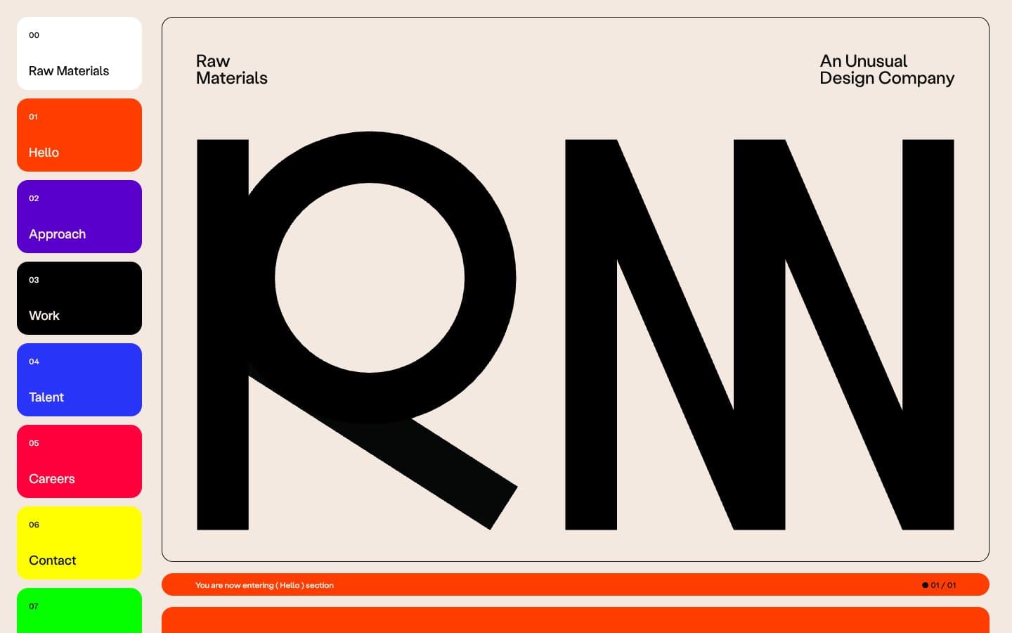
Raw Materials design system

Accent12
Orange supporting accent for decorative details and low-frequency emphasis
Violet supporting accent for decorative details and low-frequency emphasis.
Violet supporting accent for decorative details and low-frequency emphasis.
Red supporting accent for decorative details and low-frequency emphasis
Yellow supporting accent for decorative details and low-frequency emphasis.
Green supporting accent for decorative details and low-frequency emphasis
Headings and body text on cream, mid-saturation blue used in content
Headings and accent text, cool counterpoint to warm cream
Card fills, moderate green for body-level content blocks
Headings and body, brighter green counterpart to Voltage; Green supporting accent for decorative details and low-frequency emphasis
Card fills, warm orange variant for content blocks
Red supporting accent for decorative details and low-frequency emphasis. Use as a supporting accent, not as a status color
Neutrals13
Dark supporting neutral for text, icons, and strong contrast.
Dark surface fill, image overlays, secondary text on light
Dark purple section background, heading text on light
Dark warm section background, heading text on light
Dark green section background, heading text on light
Dark olive section background, secondary text
Tinted section background, warm pink wash
Tinted section background, cool blue wash, image-related surfaces
Tinted section background, warm green wash
Tinted section background, muted green wash
Tinted section background, warm yellow wash, card fill
Primary page canvas, nav text on color blocks, card surface
Active nav card, elevated card surface, input fields
Try a pairing
Pick any two colors from the palette to check whether text stays readable on top.
Aa
Ink on Ember Orange
5.44 : 1 contrast
- Body textPasses AA 4.5
- Large textPasses AA 3
- StrictFails AAA 7
More DESIGN.md files. Same web, different personalities.

099 SUPPLY
Design tools
70Materia
Design tools
Aaply
Design tools
Anacuna
Design tools
Andrei Rybin
Design tools
Artboard
Design tools
Awwwards
Design tools
B—Line
Design tools
Brand
Design tools
Canva
Design tools
Claude Type
Design tools
Control
Design tools


