
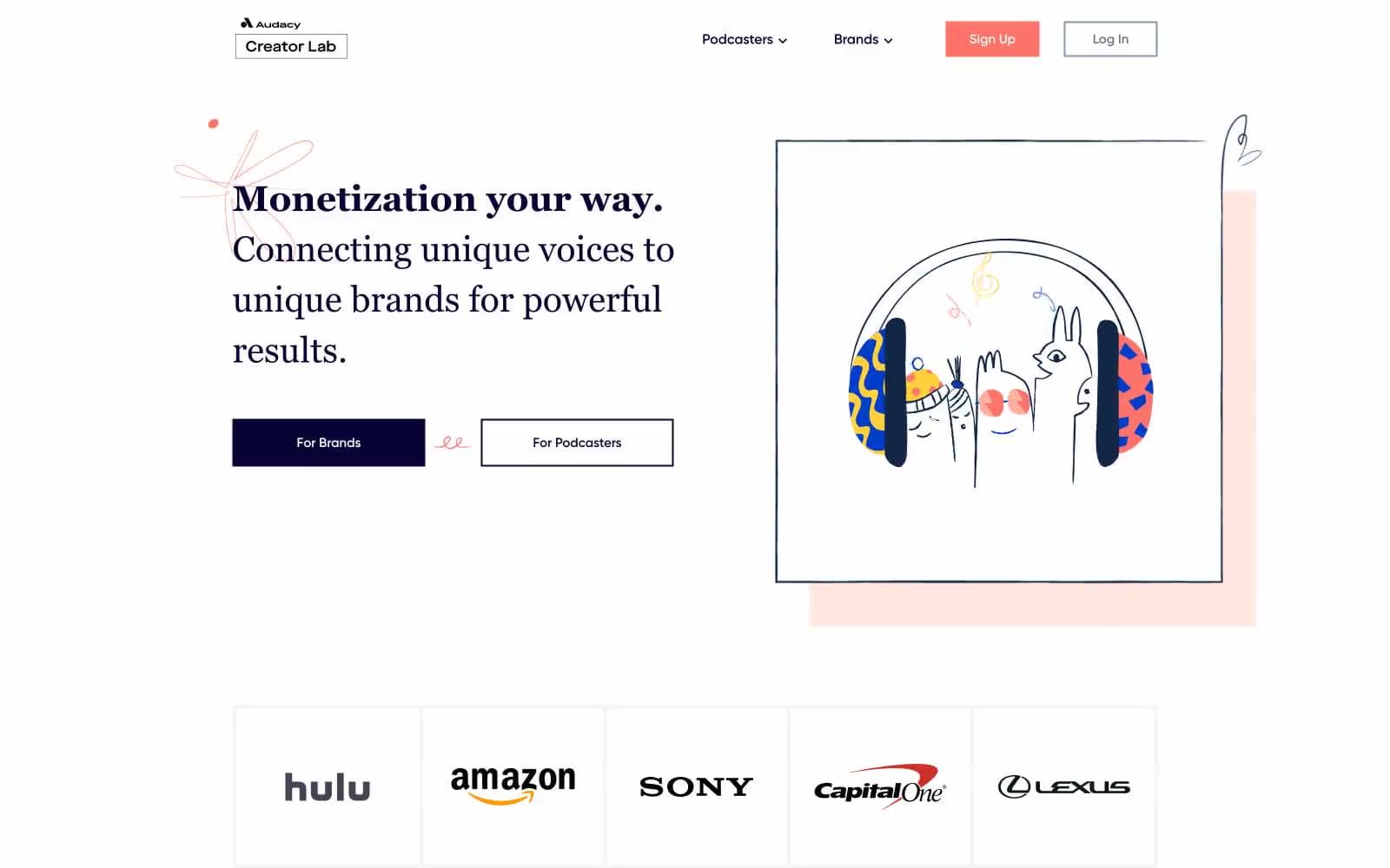
Podcorn. Indie magazine spread on warm blush paper.
- Media
- Light theme
- 10 colors
- 2 typefaces
Podcorn Creator Lab uses a warm editorial-creative language: a peach-cream canvas (#fff4f2) beneath pure white card surfaces, deep indigo (#090335) ink for nearly all typography, and a single coral (#fc736c) accent reserved exclusively for the primary call-to-action. The signature contrast is serif Georgia headings against geometric Gilroy body text — an editorial pairing that says 'crafted content platform' rather than 'SaaS dashboard'. Illustrations are hand-drawn, one-stroke linework with flat coral and navy fills, placed inside thin rectangular frames on the cream canvas. Everything sits generous and airy; borders are hairline-thin, corners are gently rounded but not pill-shaped, and elevation is achieved through whitespace and surface shifts rather than drop shadows.
Podcorn design system

Brand2
Primary text, headings, filled CTA buttons, nav links, hairline borders — the single dominant color of the entire interface; near-black with a violet undertone gives headings personality without abandoning readability
Illustration detail fill (SVG artwork) — cooler sibling of Ink Violet used inside drawings to add tonal range to the editorial illustrations
Accent2
Red wash for highlight backgrounds, decorative bands, and soft emphasis behind content. Do not promote it to the primary CTA color
Orange decorative accent for icons, marks, and small graphic details. Do not promote it to the primary CTA color
Neutrals6
Secondary nav text and nav borders — a softer alternative to Ink Violet for tertiary labels and dividers
Helper text and tertiary metadata
Muted nav borders and inactive control outlines
Hairline link underlines and subtle dividers
Page canvas — warm off-white that sets the editorial tone and makes the deep-indigo text read like printed ink on heavy paper
Card surfaces, nav background, button fills on light backgrounds — stacked above the cream canvas to create depth without shadow
Try a pairing
Pick any two colors from the palette to check whether text stays readable on top.
Aa
Pure White on Ink Violet
19.52 : 1 contrast
- Body textPasses AA 4.5
- Large textPasses AA 3
- StrictPasses AAA 7
More DESIGN.md files. Same web, different personalities.

Josh W. Comeau
Media
The Pudding
Media
2020
Media
amra
Media
Bluesky Social
Media
Cup of Couple
Media
Desktop.fm
Media
Dezeen
Media
DICE
Media
Epidemicsound
Media
Exhibition Magazine
Media
Flying Papers
Media


