
Pixso. Pristine designer's canvas flooded with morning light.
- Design tools
- Light theme
- 17 colors
- 1 typeface
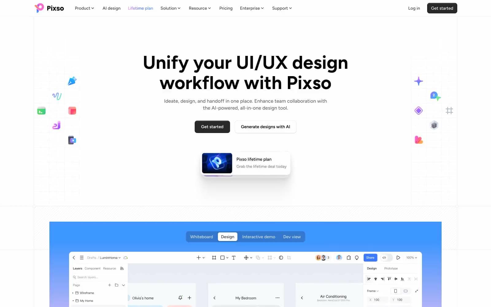
Pixso's marketing surface is a near-monochrome gallery: a warm-white canvas, hairline borders, and black headline type let the colorful product work and design kit thumbnails do the visual talking. Figtree carries the entire voice in a wide weight range — whispers at 400, confident at 600, and a wall of presence at 700 for the hero statement. The only chromatic punctuation is a single pale-blue wash and a purple-to-blue logo gradient; everything else earns its color by showing real product, not decoration. Components sit flat with very soft shadows and modest radii, so the page feels like a designer's tool laid out on a marble desk — the tools are quiet, the work is loud.
Pixso design system

Brand3
Brand logo gradient midpoint — the wordmark's signature purple-to-blue sweep
Brand logo gradient start — warm violet anchor of the wordmark sweep
Brand logo gradient end — cool blue terminus of the wordmark sweep
Accent1
Pale cool-blue background tint for highlighted cards and feature panels
Neutrals13
Primary text, heading type, dark icons, and the strongest foreground layer
Filled primary buttons, active nav state, dark surface fill
Deep surface fill for elevated dark blocks and image overlays
Secondary headings, button labels on light surfaces, heavy icon strokes
Navigation bar text and borders — the dark nav strip registers as a separate layer
Heavy body text where Obsidian feels too sharp, small caption emphasis
Body secondary text, helper copy, muted metadata
Tertiary text, disabled states, placeholder copy, subtle borders
Icon strokes on neutral surfaces, muted glyph color
Inactive icons, low-emphasis dividers, shadow tinting
Hairline borders, divider rules, button outlines, input borders
Card surfaces, secondary panels, subtle raised containers
Page canvas — barely-there warm/lavender tint that separates the site from pure white
Try a pairing
Pick any two colors from the palette to check whether text stays readable on top.
Aa
Obsidian on Orchid Edge
8.96 : 1 contrast
- Body textPasses AA 4.5
- Large textPasses AA 3
- StrictPasses AAA 7
More DESIGN.md files. Same web, different personalities.

099 SUPPLY
Design tools
70Materia
Design tools
Aaply
Design tools
Anacuna
Design tools
Andrei Rybin
Design tools
Artboard
Design tools
Awwwards
Design tools
B—Line
Design tools
Brand
Design tools
Canva
Design tools
Claude Type
Design tools
Control
Design tools


