
Pinterest. White walls, one bold red thumbtack, everything else quietly waiting to be discovered.
- Media
- Light theme
- 11 colors
- 1 typeface
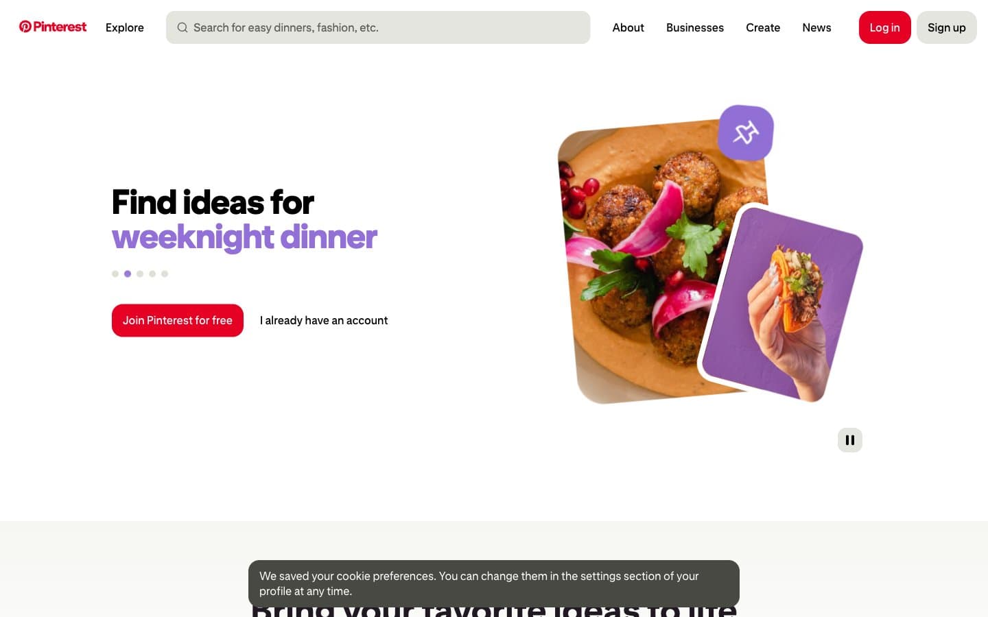
Pinterest operates as a bright, gallery-lit scrapbook: white canvas, near-black text in a custom geometric sans, and one unmistakable red that acts as the only functional signal in an otherwise quiet interface. The visual rhythm is built on oversized rounded corners (16-40px), generous breathing room between elements (16-32px gaps), and a typography attitude that uses size and italic weight — not color — to create hierarchy. Secondary hues (violet, orange, blue) appear as small decorative punctuation inside illustrated cards and image treatments, never on chrome or controls. Components feel lightweight and playful: tilted photo cards, pill-shaped search and filters, a flat red CTA, and a single high-contrast accent for emphasis. The system reads as approachable discovery, not utility — surfaces stay matte, elevation stays minimal, and personality comes from layout composition rather than decoration.
Pinterest design system

Brand2
Red supporting accent for decorative details and low-frequency emphasis. Do not promote it to the primary CTA color
Inline link text, focusable content links
Accent3
Highlight wash behind emphasis moments, sticker-style accent in illustrated cards
Decorative image accent, filter chip color, illustrated card warm fill
Decorative image accent, highlighted word in headlines, illustrated card cool fill — the secondary brand color that softens the red
Neutrals6
Dark supporting neutral for text, icons, and strong contrast. Do not promote it to the primary CTA color
Primary text, logo wordmark, filled dark buttons — a warm near-black that reads softer than pure #000
Secondary text, nav labels, icon strokes at rest, helper copy
Input placeholders, input borders, disabled hairlines
Subtle section bands, ghost button borders, soft surface tint for alternating blocks
Page canvas, card surfaces, button text on dark fills, search field background
Try a pairing
Pick any two colors from the palette to check whether text stays readable on top.
Aa
Gallery White on Pin Red
4.78 : 1 contrast
- Body textPasses AA 4.5
- Large textPasses AA 3
- StrictFails AAA 7
More DESIGN.md files. Same web, different personalities.

Josh W. Comeau
Media
The Pudding
Media
2020
Media
amra
Media
Bluesky Social
Media
Cup of Couple
Media
Desktop.fm
Media
Dezeen
Media
DICE
Media
Epidemicsound
Media
Exhibition Magazine
Media
Flying Papers
Media


