
Petertarka. Every card a framed print, every margin deliberate, every type weight a whisper.
- Design tools
- Light theme
- 5 colors
- 1 typeface
Petertarka presents a curated gallery aesthetic: a warm light gray canvas anchors a two-column grid where every project card feels like a framed print. Typography whispers at weight 200-300 in GT America — ultra-light headlines that gain authority through restraint rather than volume, a deliberate anti-convention against the SaaS standard of bold display type. Color is monastic: the system is almost entirely achromatic, with occasional full-bleed color blocks acting as project identifiers rather than brand expression. The signature move is a colorful 3D illustration that breaks the grid by overlapping card boundaries — one moment of visual exuberance against the quiet monochrome. Sharp corners (zero border-radius), 1px hairline borders, and 45px internal padding create an editorial, almost architectural feel — more museum wall than web page.
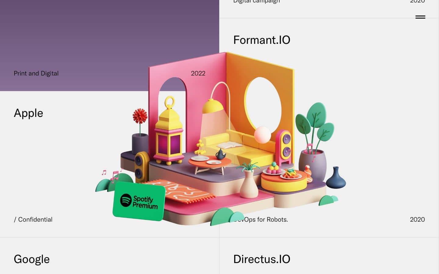
Petertarka design system

Neutrals5
All text, heading borders, and the top/bottom hairline rules that frame the page
1px card borders and dividers — structural, never decorative
Page canvas — the warm light gray that makes the whole gallery feel architectural rather than digital
Card surface — barely distinguishable from the canvas, creating the illusion of cards floating in space
Nav text and link borders — appears in the hamburger menu area and link underlines
Try a pairing
Pick any two colors from the palette to check whether text stays readable on top.
Aa
Paper on Obsidian
21.00 : 1 contrast
- Body textPasses AA 4.5
- Large textPasses AA 3
- StrictPasses AAA 7
More DESIGN.md files. Same web, different personalities.

099 SUPPLY
Design tools
70Materia
Design tools
Aaply
Design tools
Anacuna
Design tools
Andrei Rybin
Design tools
Artboard
Design tools
Awwwards
Design tools
B—Line
Design tools
Brand
Design tools
Canva
Design tools
Claude Type
Design tools
Control
Design tools


