
Paper. Warm paper notebook under studio lights.
- Design tools
- Light theme
- 16 colors
- 3 typefaces
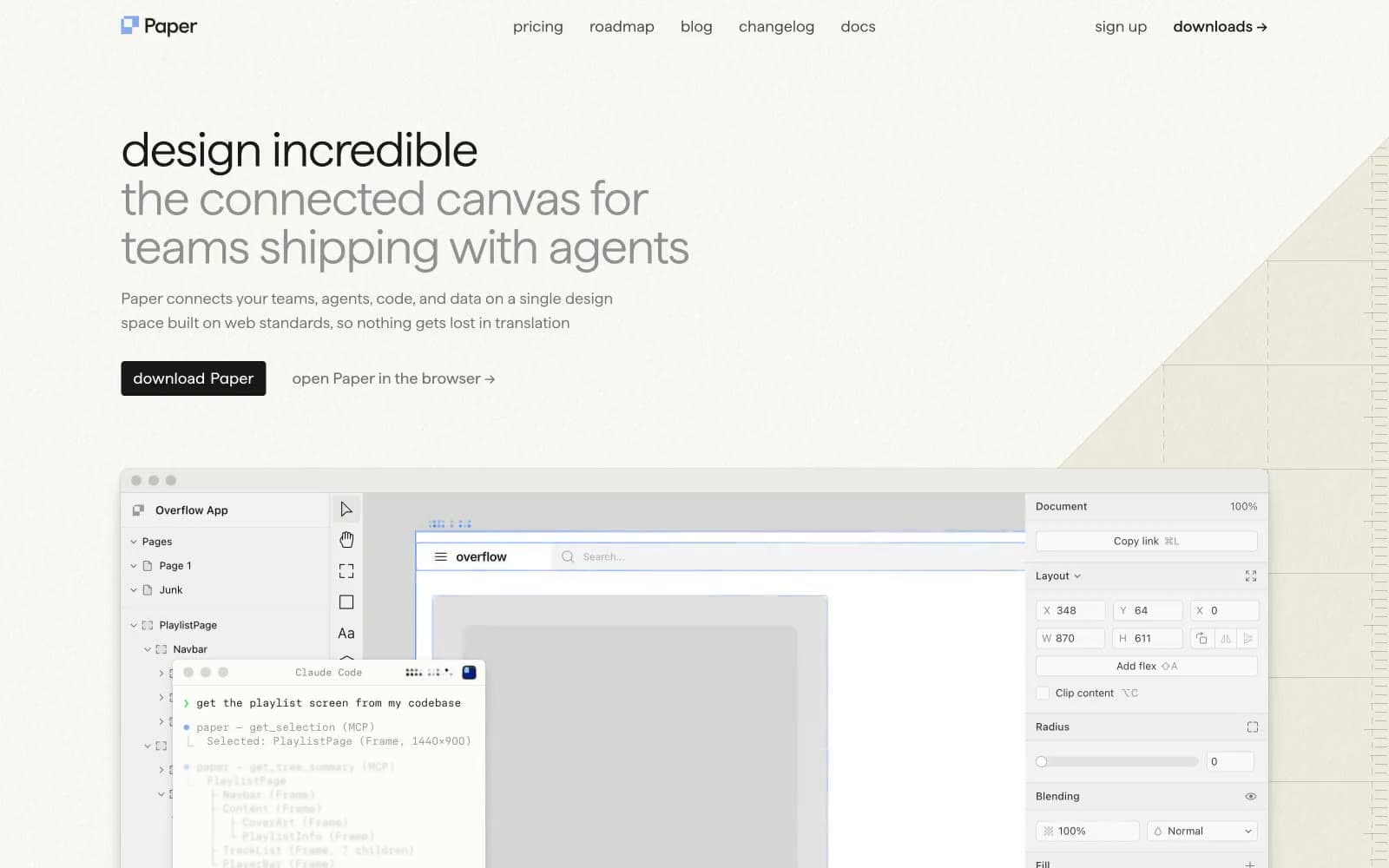
Paper uses a warm-paper-studio language: a cream ivory canvas instead of white, calm monochrome typography in a custom display face, and a single cool blue accent that does almost no UI work. The two-tone headline (dark first line, mid-gray continuation) is the signature move — it treats the hero copy as a composition of weights rather than a single block. Surfaces sit flat on the page with one barely-there card shadow, borders are hairline, and the product feels like a printed notebook page under cool studio light. Most of the chromatic energy lives inside the product screenshot; the marketing surface around it stays restrained, near-achromatic, and grid-quiet.
Paper design system

Brand2
Brand icon mark, decorative vector accent — cool blue against warm cream is the only chromatic tension in the marketing surface
Lighter blue used for soft body accents and nav underlines
Neutrals14
Primary text, nav active state, filled button background — neutral dark, not chromatic
Near-black used in nav chrome and high-contrast text
Near-black emphasis text, slightly softer than full ink for long reads
Helper text, metadata, tertiary copy
Subdued heading and link text, warm-gray captions
Secondary body text, the lighter half of the two-tone headline, heading accents
Icon strokes, low-priority borders, decorative vector fills
Secondary borders, diagram strokes, muted dividers
Hairline borders, card outlines, surface separators
Card backgrounds in denser sections, soft grouping surface
Page background — warm cream instead of white, the signature surface that makes the whole site feel like a notebook page
Subtle alternate band background, soft dividers in long pages
Primary page canvas and white card surfaces. Do not promote it to the primary CTA color
Pure white card surface for highest elevation, code panels, product chrome
Try a pairing
Pick any two colors from the palette to check whether text stays readable on top.
Aa
Ink on Studio Blue
5.24 : 1 contrast
- Body textPasses AA 4.5
- Large textPasses AA 3
- StrictFails AAA 7
More DESIGN.md files. Same web, different personalities.

099 SUPPLY
Design tools
70Materia
Design tools
Aaply
Design tools
Anacuna
Design tools
Andrei Rybin
Design tools
Artboard
Design tools
Awwwards
Design tools
B—Line
Design tools
Brand
Design tools
Canva
Design tools
Claude Type
Design tools
Control
Design tools


