
Pangram Pangram Foundry. Museum vitrine on white marble.
- Design tools
- Light theme
- 7 colors
- 16 typefaces
Pangram Pangram Foundry is a type foundry that lets the typefaces speak: an editorial canvas of near-pure grayscale, with one saturated orange-red acting as a hot accent. Hero sections are full-bleed photographic plates with massive display type overlaid in white — the type IS the product, so the UI recedes. Surfaces stay quiet (#fafafa and #ededed), borders are hairline black at 1px, and the only chromatic punctuation is the single #ff2f00 accent used for status badges, icons, and tag chrome. Components are lightweight: pill-shaped controls, ghost buttons, soft card containers, and almost no elevation. The overall effect is a curatorial print catalogue translated to screen — restrained, confident, type-first.
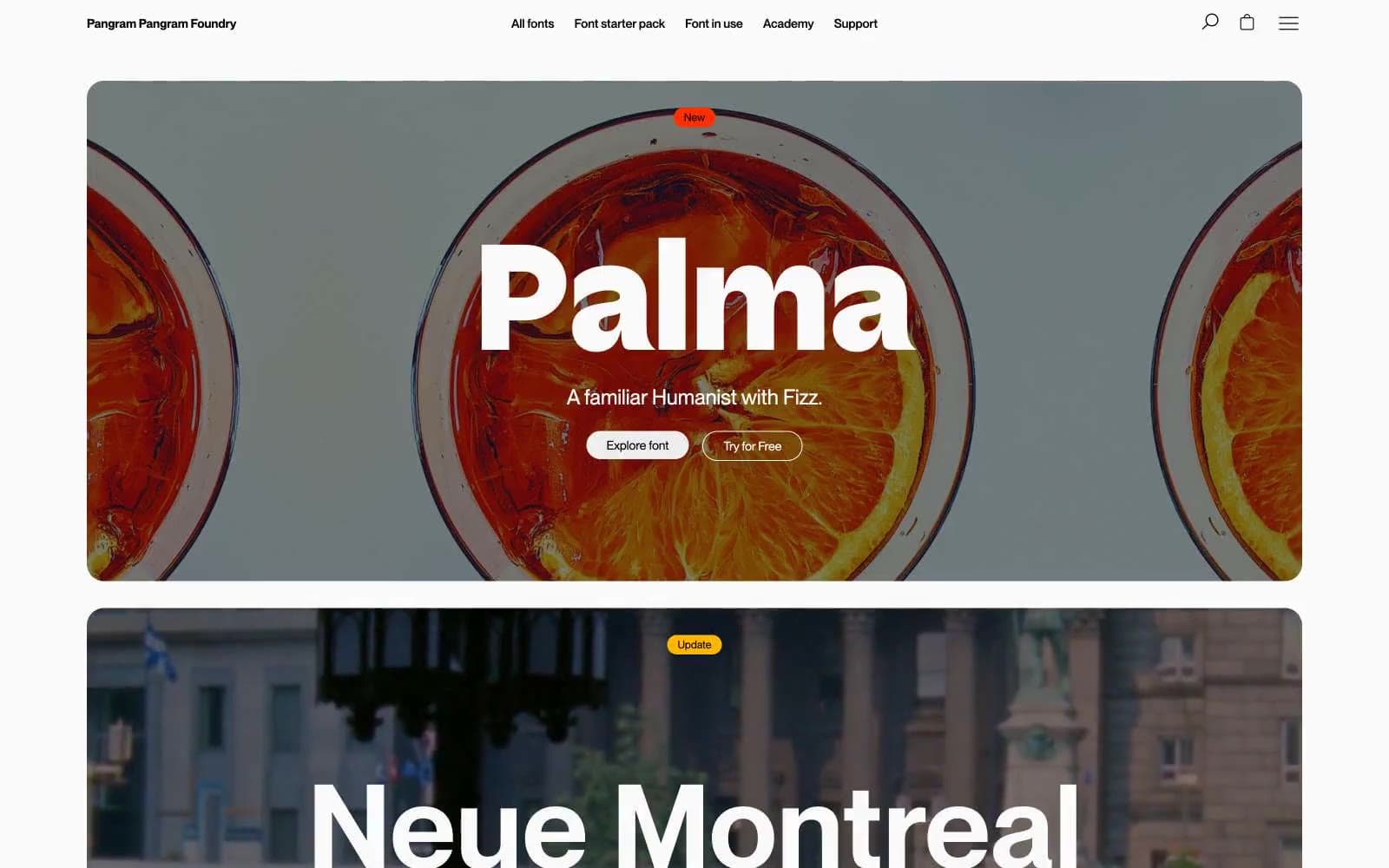
Pangram Pangram Foundry design system

Brand1
Orange action color for filled buttons, selected navigation states, and focused conversion moments.
Neutrals4
Primary text, all headings, hairline borders (cards, lists, badges, inputs), icons, navigation. The structural backbone — 1px borders everywhere define the system
Secondary text, link color, subdued metadata, helper text. Reads as muted black — never used for primary text or headings
Secondary surface for filled buttons, muted card backgrounds, image placeholder fills. One step deeper than Marble White to create gentle separation without contrast
Page canvas, card surfaces, input fields, default panel backgrounds. The dominant surface tone, barely off-white for warmth
semantic2
Yellow state accent for badges, validation surfaces, and short status labels.
Blue state accent for badges, validation surfaces, and short status labels.
Try a pairing
Pick any two colors from the palette to check whether text stays readable on top.
Aa
Ink Black on Ember Orange
5.66 : 1 contrast
- Body textPasses AA 4.5
- Large textPasses AA 3
- StrictFails AAA 7
More DESIGN.md files. Same web, different personalities.

099 SUPPLY
Design tools
70Materia
Design tools
Aaply
Design tools
Anacuna
Design tools
Andrei Rybin
Design tools
Artboard
Design tools
Awwwards
Design tools
B—Line
Design tools
Brand
Design tools
Canva
Design tools
Claude Type
Design tools
Control
Design tools


