
pampam.city. Old explorer's notebook on warm cream.
- Design tools
- Light theme
- 10 colors
- 3 typefaces
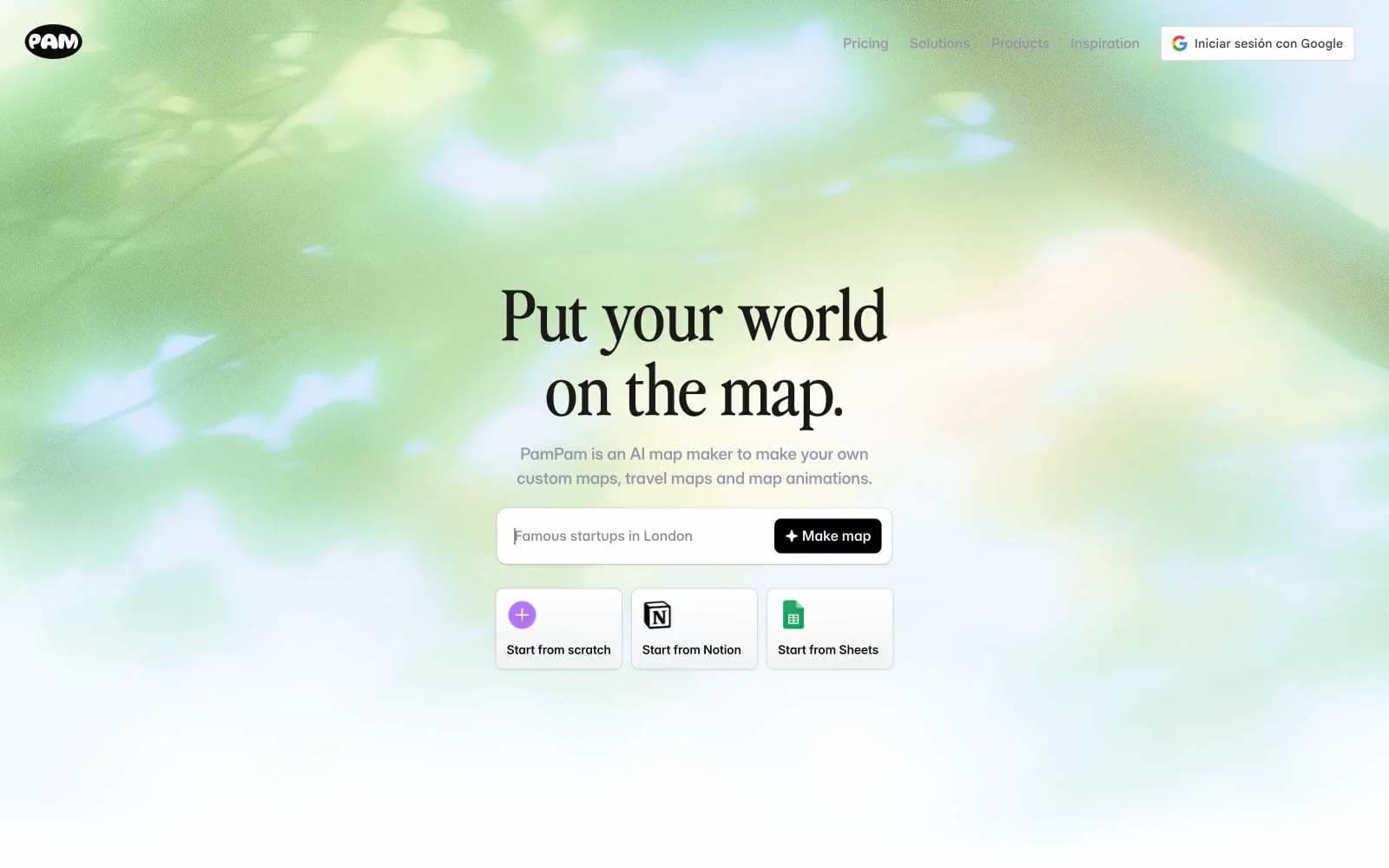
PamPam reads as a warm editorial travel journal translated into a modern app: a soft parchment-cream canvas (#faf2ec) carries the interface, with a custom display serif ('Nineties') giving headlines a vintage-magazine voice against a clean, workhorse Inter body. The palette is nearly monochromatic, leaning on a single muted lavender-gray (#9894a8) for borders, links, and hairlines, and reserving one vivid periwinkle blue (#4b72f3) for the one action that must feel switched on. Surfaces stay flat and paper-like — white cards float on cream, never the other way around, and shadows are whisper-quiet so the maps and illustrations can do the emotional work. Components are compact and confident: pill-ish buttons with generous 16px radii, 12px-radius cards, and tight 12–16px internal padding. Color and weight, not elevation, carry hierarchy.
pampam.city design system

Brand1
Violet wash for highlight backgrounds, decorative bands, and soft emphasis behind content. Do not promote it to the primary CTA color
Accent1
Violet outline accent for tags, dividers, and focused UI edges. Do not promote it to the primary CTA color
Neutrals8
Secondary text, icon strokes, and heavy dark surfaces (filled dark buttons, logo marks); used sparingly so Warm Ink remains the default reading color
Primary text and headline color — a near-black with a brown undertone that harmonizes with the cream canvas instead of fighting it
Input field text and dark-mode form borders on light surfaces
Muted helper text, tertiary metadata, and disabled labels
Default link color, hairline borders, tag outlines, and decorative strokes — the most-used chromatic neutral; soft enough to never compete with the blue accent
Section dividers, subtle background bands, and inactive surface washes
Page canvas — the warm, paper-like surface that everything sits on; cards and buttons float above it as white or charcoal
Card surfaces, input fields, and dark-on-light icon fills — the only true white in the system, reserved for elements that must lift off the cream
Try a pairing
Pick any two colors from the palette to check whether text stays readable on top.
Aa
Carbon on Periwinkle
5.00 : 1 contrast
- Body textPasses AA 4.5
- Large textPasses AA 3
- StrictFails AAA 7
More DESIGN.md files. Same web, different personalities.

099 SUPPLY
Design tools
70Materia
Design tools
Aaply
Design tools
Anacuna
Design tools
Andrei Rybin
Design tools
Artboard
Design tools
Awwwards
Design tools
B—Line
Design tools
Brand
Design tools
Canva
Design tools
Claude Type
Design tools
Control
Design tools


