
Palette Supply. Art-supply shelf in a sunlit studio.
- Design tools
- Light theme
- 19 colors
- 4 typefaces
Palette Supply operates on the principle that color IS the product — the interface recedes so that swatches can speak. A warm cream canvas (#f2f0e9) acts like a designer's worktable, with matte rectangular swatches scattered at varying sizes and aspect ratios, each one a distinct earthy hue from a curated palette. The UI chrome is deliberately quiet: a deep ink black (#141212) for text, a single saturated blue-violet (#3051a8) reserved exclusively for actions and links, and zero shadows — every boundary is a hairline border or a color edge. Typography is custom and confident: 'esbuild' stamps oversized 64px display titles with extremely tight tracking, while 'ppsupply' handles everything else at whisper-light weights (100 and 300) that make the page feel airy and unhurried. The result reads less like a web app and more like a well-organized stationery catalog — generous whitespace, tactile surfaces, no gradients, no glassmorphism, no decorative noise.
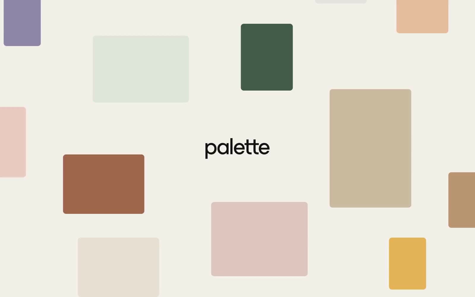
Palette Supply design system

Brand2
Primary action fill, active link color, and icon accents — the only saturated chromatic in the UI, used sparingly to make clicks feel decisive
Dark accent for premium swatches and select button variants — muted, almost black, recedes like aged leather
Accent11
Warm chromatic swatch accent — vivid orange that pops against the cream canvas, used as a featured palette member
Bright chromatic swatch — primary yellow, the most luminous accent in the palette set, draws the eye like a highlighter
Secondary blue swatch — brighter and more cyan than Cobalt Command, used as a palette swatch rather than UI action
Earth-red swatch accent — the deep burnt-orange that grounds warm palettes
Soft pink swatch — dusty rose that reads as warm, not saccharine
Warm brown swatch — mid-tone earthy orange, a bridge between terracotta and tan
Muted tan swatch — soft warm neutral that sits between cream and brown
Olive-yellow swatch — slightly green-shifted yellow, more sophisticated than pure butter
Muted yellow-green swatch — the sage-olive that ties natural palettes together
Soft pink-beige swatch — the lightest warm neutral in the chromatic range, like raw silk
Warm gray swatch — taupe with pink undertones, the bridge between cream and brown
Neutrals6
Primary text, heading strokes, and hairline borders — slightly warmer than pure black, pairs cleanly with the cream canvas
Muted secondary text and inactive borders, the only mid-gray in the neutral scale
Swatch surface — the neutral anchor card color used to display palette sets; warm, slightly green-tinged, reads as unpainted canvas
Soft tinted surface for tags, list rows, and secondary buttons — a barely-green neutral that adds warmth without committing to color
Page canvas — warm off-white ground that warms every color placed on it, the single largest surface in the system
Elevated card and surface layer, used when a swatch or content block needs to sit above the canvas
Try a pairing
Pick any two colors from the palette to check whether text stays readable on top.
Aa
Paper White on Cobalt Command
7.32 : 1 contrast
- Body textPasses AA 4.5
- Large textPasses AA 3
- StrictPasses AAA 7
More DESIGN.md files. Same web, different personalities.

099 SUPPLY
Design tools
70Materia
Design tools
Aaply
Design tools
Anacuna
Design tools
Andrei Rybin
Design tools
Artboard
Design tools
Awwwards
Design tools
B—Line
Design tools
Brand
Design tools
Canva
Design tools
Claude Type
Design tools
Control
Design tools


