
Overflow. Blueprint washed in indigo.
- Design tools
- Light theme
- 9 colors
- 1 typeface
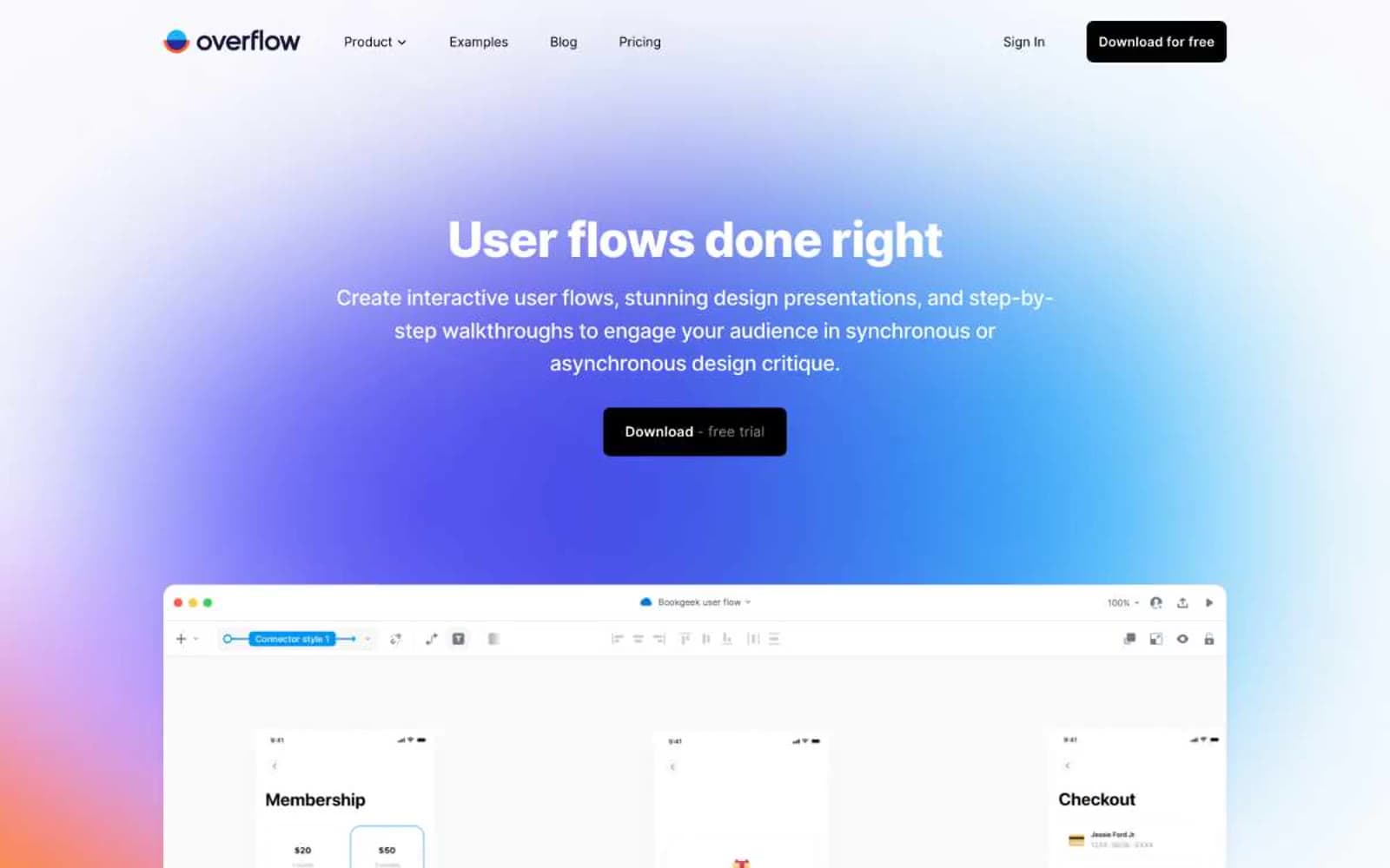
Overflow speaks in a near-whisper designer vernacular: a paper-cream canvas, one deep midnight-navy brand ink, a single sky-blue accent, and the rest rendered in honest monochrome. The page breathes — generous 80–120px section gaps, 24px card radii, 12px button radii, and very low-opacity shadows that barely register. Product UI is always shown in a macOS chrome frame floating over a soft indigo-to-sky gradient wash, signalling "this is a designer's tool for design people". Type is Inter at its tightest tracking — headings pull -0.025em, creating dense, confident blocks that sit beside lots of white space rather than filling it. The dark filled button is the only moment of full contrast on the page; everything else is quietly layered neutrals.
Overflow design system

Brand2
Headings, navigation wordmark, key emphasis — a desaturated indigo-black that reads as navy without screaming blue, anchoring the typographic system
Hero gradient start — a soft periwinkle that sets the dawn-wash atmosphere of the first viewport
Accent2
Blue supporting accent for decorative details and low-frequency emphasis. Do not promote it to the primary CTA color
Supporting palette color for small decorative accents when the core palette needs contrast. Do not promote it to the primary CTA color
Neutrals5
Dark supporting neutral for text, icons, and strong contrast. Do not promote it to the primary CTA color
Secondary body text, supporting copy, subdued metadata — readable but never competing with headings
Borders, dividers, card outlines — the thinnest structural line, only visible where it defines an edge
Alternate section background, input fields, subtle inset surfaces — the secondary canvas that separates bands without hard dividers
Page canvas, card surfaces, button text on dark — a barely-warm white that prevents the harsh clinical feel of pure #ffffff
Try a pairing
Pick any two colors from the palette to check whether text stays readable on top.
Aa
Paper White on Midnight Ink
16.73 : 1 contrast
- Body textPasses AA 4.5
- Large textPasses AA 3
- StrictPasses AAA 7
More DESIGN.md files. Same web, different personalities.

099 SUPPLY
Design tools
70Materia
Design tools
Aaply
Design tools
Anacuna
Design tools
Andrei Rybin
Design tools
Artboard
Design tools
Awwwards
Design tools
B—Line
Design tools
Brand
Design tools
Canva
Design tools
Claude Type
Design tools
Control
Design tools


