
Osmo. Developer museum on concrete gray.
- Design tools
- Light theme
- 12 colors
- 5 typefaces
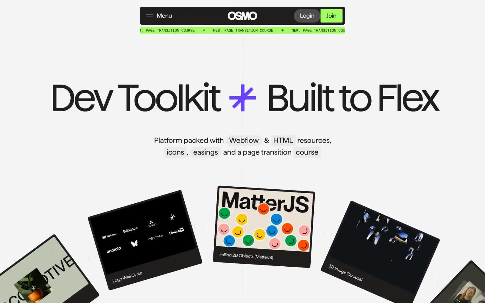
Osmo reads as a brutalist editorial platform for web craftspeople: a concrete-gray canvas stamped with oversized black display type, then punctuated by three surgical color punches — a radioactive lime for brand accents, a deep violet for featured cards, and a vermillion red for handwritten annotations. The system refuses the soft-SaaS default: corners split between surgical 2–5px precision and extreme 1600px pill rounding, creating visual tension between machine-precise content tiles and chunky lozenge controls. Typography does most of the talking through Haffer XH display cuts that can run to 150px with aggressive negative tracking, while a monospaced label font stamps technical metadata. Density is compact and content-led, with tilted product cards fanning out like a developer's portfolio pinned to a gallery wall.
Osmo design system

Brand2
Primary brand accent — badge fills, brand borders, featured highlights, success indicators. The radioactive lime that switches elements on
Featured card backgrounds, link accents, deep brand moments — used when content deserves a colored stage
Accent1
Annotation accent — handwritten callouts, emphasis text, icon highlights, never used as a fill or background
Neutrals9
Dark card surfaces, inverse text, maximum-contrast backgrounds
Primary text, heavy borders, dominant structural outlines — the workhorse near-black
Card borders, input strokes, mid-depth structural elements
Subdued borders and dividers where Steel feels too heavy
Secondary body text, helper labels, muted badges
Muted image borders, disabled-state outlines, badge borders
Subtle dividers, list separators, tertiary surface fill
Elevated surface layer, input fields, secondary card backgrounds
Page canvas, card surfaces, and most border work — the off-white that everything sits on
Try a pairing
Pick any two colors from the palette to check whether text stays readable on top.
Aa
Obsidian on Volt
14.98 : 1 contrast
- Body textPasses AA 4.5
- Large textPasses AA 3
- StrictPasses AAA 7
More DESIGN.md files. Same web, different personalities.

099 SUPPLY
Design tools
70Materia
Design tools
Aaply
Design tools
Anacuna
Design tools
Andrei Rybin
Design tools
Artboard
Design tools
Awwwards
Design tools
B—Line
Design tools
Brand
Design tools
Canva
Design tools
Claude Type
Design tools
Control
Design tools


