
Nathan Riley. Gallery wall in a black void.
- Design tools
- Light theme
- 4 colors
- 5 typefaces
Nathan Riley's portfolio is a monochrome art gallery rendered as a full-bleed image mosaic — a tight grid of atmospheric 3D renders that fills every pixel, with the artist's name floating in a single pale-rose card at the center. The palette is ruthlessly reduced to three values: pure black, pure white, and a warm dark gray, so all visual energy comes from the imagery itself rather than color. Typography is custom-serif, ultra-light at display weight, and stretched to a 238px hero that dominates the center card like a magazine masthead. The system has no rounded corners, no shadows, no gradients, and no button fills — navigation is a row of small pill-shaped text chips at the bottom, and the overall feel is that of a curated exhibition catalog printed on white paper with one large editorial title.
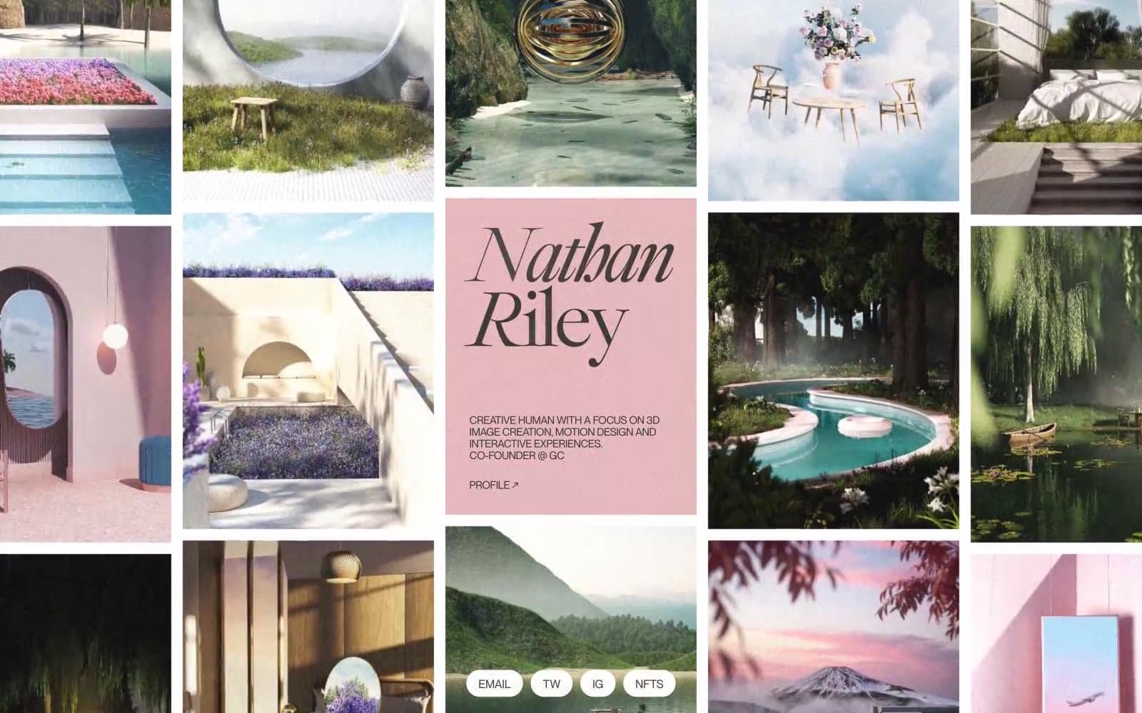
Nathan Riley design system

Accent1
Background of the central name card — the only chromatic accent, a dusty rose that warms the otherwise pure black-and-white system
Neutrals3
Text, image grid gutter borders, hairline dividers, nav chip outlines — the structural ink that defines the grid structure and typography
Central name card surface, secondary text, soft borders — the mid-tone that makes the pale-rose card read as a distinct layer without breaking the monochrome
Page canvas, nav chip backgrounds, card surface — the gallery wall behind everything
Try a pairing
Pick any two colors from the palette to check whether text stays readable on top.
Aa
Pure Black on Blush Card
13.09 : 1 contrast
- Body textPasses AA 4.5
- Large textPasses AA 3
- StrictPasses AAA 7
More DESIGN.md files. Same web, different personalities.

099 SUPPLY
Design tools
70Materia
Design tools
Aaply
Design tools
Anacuna
Design tools
Andrei Rybin
Design tools
Artboard
Design tools
Awwwards
Design tools
B—Line
Design tools
Brand
Design tools
Canva
Design tools
Claude Type
Design tools
Control
Design tools


