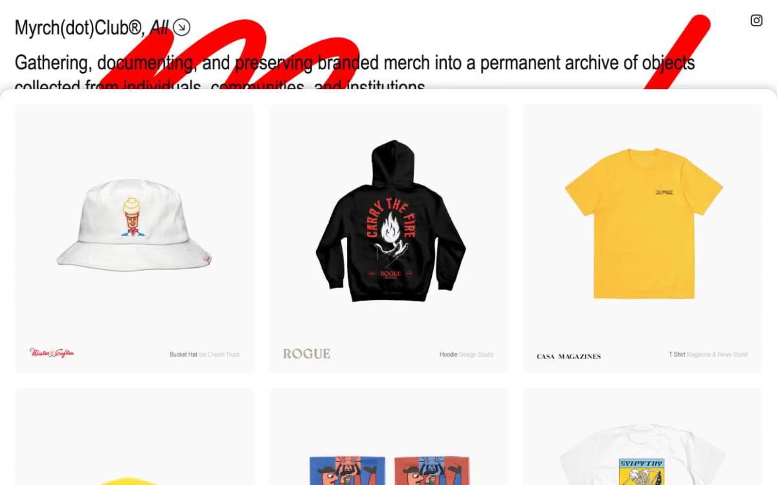
Myrch Club. Editorial serif labels floating in generous negative space, disrupted by a single red script signature.
- Media
- Light theme
- 7 colors
- 2 typefaces
Myrch Club operates as a typographic archive: a near-monochrome gallery where serif body type, narrow sans labels, and a single defiant red script wordmark define the entire visual identity. The interface is deliberately white-spaced and editorial — product photography sits in soft gray cards (#f9f9f9) on a pure white canvas, separated by hairline borders rather than heavy elevation. The red appears only in the oversized cursive logo bleeding through the header, functioning as a watermark of intent rather than a functional UI color. Everything else — navigation chips, filter tags, captions — is rendered in near-black (#111111) with thin borders, creating a catalog-of-objects feeling closer to a museum index than an e-commerce grid.
Myrch Club design system
Brand1
The wordmark only — a pure, unmoderated red used at oversized scale behind the header as a brand watermark; never used for buttons, links, or functional UI
Neutrals6
Hard borders and text where maximum contrast is needed
Primary text, filled filter chips, button borders, headings — the dominant interface color
Secondary text, metadata, timestamps, muted helper labels
Dividers, secondary borders, placeholder structure
Card and product tile backgrounds — sets objects apart from the page with a whisper of warmth
Page background, image surfaces, inverted text on dark chips
Try a pairing
Pick any two colors from the palette to check whether text stays readable on top.
Aa
True Black on Signature Red
5.25 : 1 contrast
- Body textPasses AA 4.5
- Large textPasses AA 3
- StrictFails AAA 7
More DESIGN.md files. Same web, different personalities.

Josh W. Comeau
Media
The Pudding
Media
2020
Media
amra
Media
Bluesky Social
Media
Cup of Couple
Media
Desktop.fm
Media
Dezeen
Media
DICE
Media
Epidemicsound
Media
Exhibition Magazine
Media
Flying Papers
Media


