
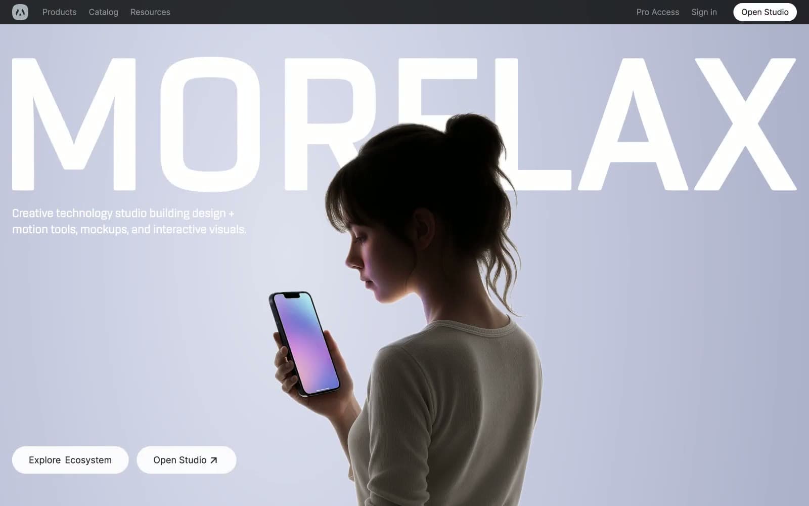
Morflax. A near-black nav bar hovers above a white room that briefly blushes lavender, while every action and border stays in grayscale until a single cobalt button confirms the moment.
- Design tools
- Light theme
- 11 colors
- 2 typefaces
Morflax reads as a monochrome showroom with a single blue beacon: a near-black navigation bar floats above a porcelain-white canvas that is briefly washed in soft lavender at the hero, then returns to a crisp neutral white for every content section. Color is rationed — vivid blue (#298ef5) earns its presence on exactly one filled action, while everything else (borders, body text, surfaces) is graded grays from #e5e7eb hairlines through #171718 ink. The typography pairs Inter's clinical neutrality at 400/500/600 with a wide-tracked display treatment (0.05em) reserved for the brand wordmark, and the hero exploits oversized type that bleeds off-canvas. Components are quiet and rounded: pill buttons, 16–24px card radii, soft 25px-blur shadows — the only visual noise comes from the 3D-rendered product cards, which carry the chromatic energy the interface refuses to.
Morflax design system

Brand1
Primary filled action, active states, brand accent — the sole chromatic voice in an otherwise monochrome system, so it must appear sparingly to retain its charge
Accent1
Hero background atmospheric tint — a radial gradient that briefly warms the monochrome with a cool violet glow
Neutrals9
Primary headings and body text — near-black with a barely-warm cast that softens against pure #000
Icon strokes, secondary text, UI graphics — a touch cooler than Ink for icon differentiation
Navigation background — dark anchor that frames the light canvas below
Muted helper text, secondary nav, inactive labels
Tertiary icon fills, disabled-state text, low-priority metadata
Soft shadow tint used in card and button drop-shadows to imply elevation without color
Hairline borders, card outlines, divider lines — the structural backbone of the grayscale system
Card surfaces, section backgrounds, subtle elevation — the off-white between pure white and Frost
Page canvas, button fills, card base — the default surface everything sits on
Try a pairing
Pick any two colors from the palette to check whether text stays readable on top.
Aa
Ink on Cobalt Spark
5.36 : 1 contrast
- Body textPasses AA 4.5
- Large textPasses AA 3
- StrictFails AAA 7
More DESIGN.md files. Same web, different personalities.

099 SUPPLY
Design tools
70Materia
Design tools
Aaply
Design tools
Anacuna
Design tools
Andrei Rybin
Design tools
Artboard
Design tools
Awwwards
Design tools
B—Line
Design tools
Brand
Design tools
Canva
Design tools
Claude Type
Design tools
Control
Design tools


