
Monotype.. Curated typography showcase on paper.
- Design tools
- Light theme
- 8 colors
- 5 typefaces
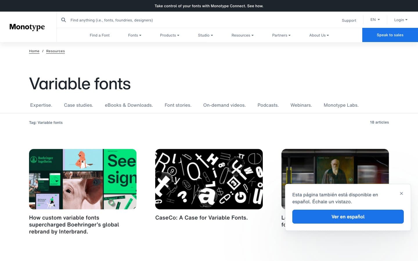
Monotype's design is an editorial type museum on white: the type is the artifact, the chrome recedes. The interface is overwhelmingly monochrome — near-black ink (#1e242c) on paper-white, with hairline gray dividers and a single saturated blue reserved exclusively for conversion. Components are low-elevation and flat: thin 1px borders instead of shadows, modest 8px radii on controls, generous 16-24px internal padding. Typography is the hero: a custom HelveticaNow family handles body, nav, and display, with a -0.02em tracking on bold labels that signals the brand's typographic pedigree. Layout breathes — comfortable 8px base grid, 16px element gaps, wide section spacing — letting featured type specimens and photography carry visual weight without competition from the UI.
Monotype. design system

Brand1
Blue action color for filled buttons, selected navigation states, and focused conversion moments.
Neutrals7
Icon fills, SVG strokes — true black reserved for graphic assets only, not text
Primary text, nav borders, icon strokes, card borders — near-black with a barely-there cool tint reads as a refined alternative to pure black
Secondary text, muted nav links, subtle borders — the workhorse mid-gray for everything that must be quieter than body copy
Button focus shadow, input hover rings — the mid-neutral for interaction feedback
Card borders, content block outlines — slightly darker than Mist for card-level separation
Nav dividers, subtle section separators — the lightest functional border
Page canvas, card surfaces, button text on filled controls — the dominant surface
Try a pairing
Pick any two colors from the palette to check whether text stays readable on top.
Aa
Coal on Signal Blue
4.66 : 1 contrast
- Body textPasses AA 4.5
- Large textPasses AA 3
- StrictFails AAA 7
More DESIGN.md files. Same web, different personalities.

099 SUPPLY
Design tools
70Materia
Design tools
Aaply
Design tools
Anacuna
Design tools
Andrei Rybin
Design tools
Artboard
Design tools
Awwwards
Design tools
B—Line
Design tools
Brand
Design tools
Canva
Design tools
Claude Type
Design tools
Control
Design tools


