
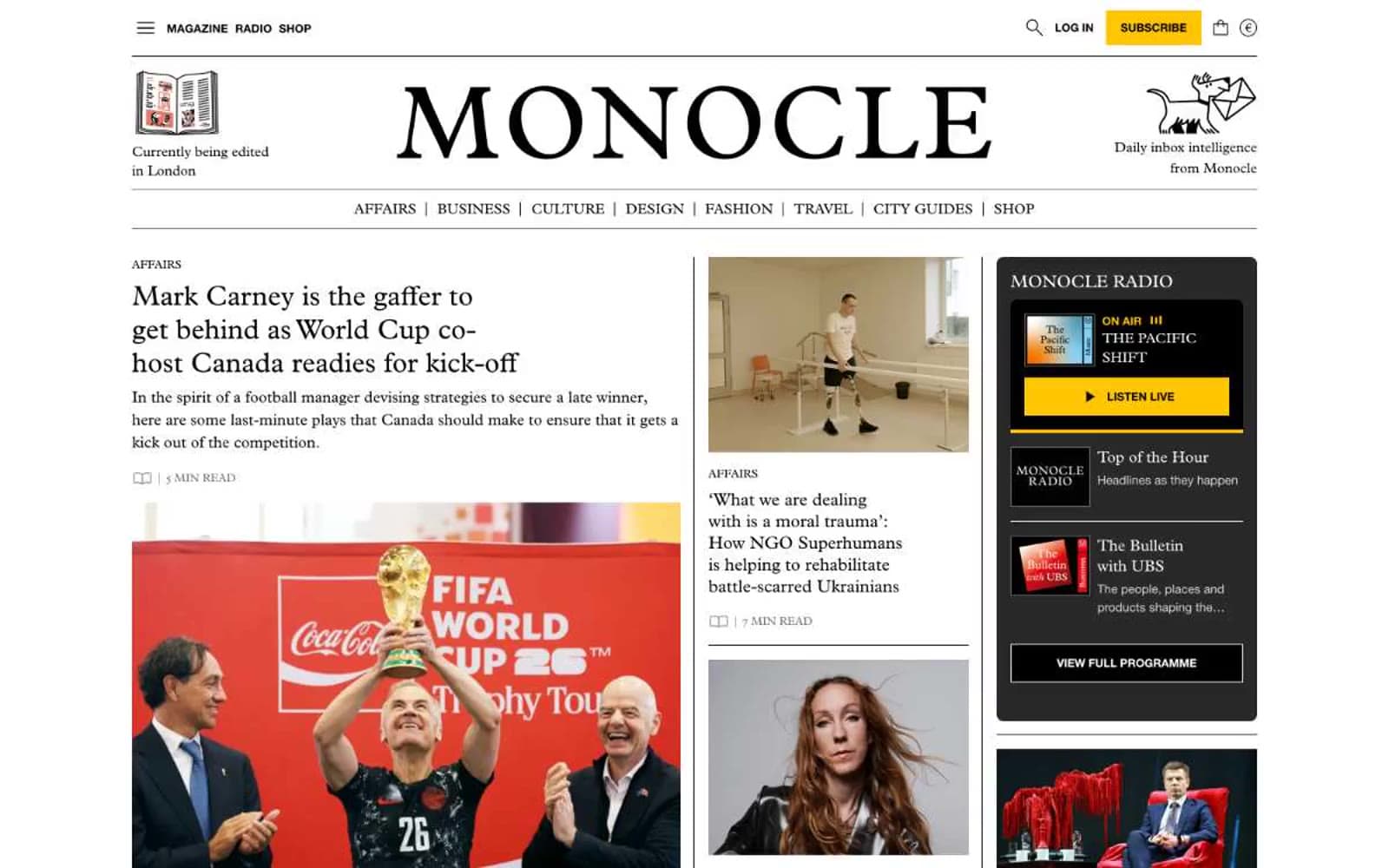
Monocle. Quality broadsheet on cream paper.
- Media
- Light theme
- 11 colors
- 3 typefaces
Monocle reads like a quality broadsheet translated to the web: a warm cream canvas, generous serif typography in Plantin, and a tightly-edited grid that borrows from print pagination rather than app conventions. The entire interface is monochrome — black text, warm whites, and one unmistakable signal yellow (#ffc500) that functions as the magazine's only accent, reserved for the subscribe action, the radio card, and editorial illustration. Layout leans editorial: section labels run as tracked uppercase sans-serif eyebrows, headlines set in Plantin with negative tracking, and body copy in the same serif at a measured 16–18px. Components feel archival — thin rules, minimal radii, no drop shadows, and a 3-column grid that mixes large feature photography, opinion cards, and a persistent sidebar of audio/promo blocks. Density is high but never cluttered because spacing is compact and structural, not decorative.
Monocle design system

Brand1
Yellow supporting accent for decorative details and low-frequency emphasis. Do not promote it to the primary CTA color
Accent1
Decorative illustration accent — appears inside editorial artwork, not in interface controls
Neutrals9
Primary text, headlines, nav items, icons, and 1px hairline rules — the ink of the page
Near-black warm border for buttons and decorative outlines where pure black feels too cold
Secondary text, metadata, read-time labels, byline captions, and muted UI labels
Tertiary text, disabled UI states, and low-emphasis nav accents
Borders, dividers between columns and sections, input outlines — the structural skeleton of the layout
Card backgrounds and muted panel fills where content needs to recede from the page cream
Subtle secondary surface — a slightly warmer yellow-tinted off-white used for featured/elevated blocks like the radio card
Page canvas — the warm off-white that keeps the interface from feeling clinical and signals print provenance
Card surfaces, feature panels, and inverted text on dark or yellow blocks
Try a pairing
Pick any two colors from the palette to check whether text stays readable on top.
Aa
Folio Black on Signal Yellow
13.24 : 1 contrast
- Body textPasses AA 4.5
- Large textPasses AA 3
- StrictPasses AAA 7
More DESIGN.md files. Same web, different personalities.

Josh W. Comeau
Media
The Pudding
Media
2020
Media
amra
Media
Bluesky Social
Media
Cup of Couple
Media
Desktop.fm
Media
Dezeen
Media
DICE
Media
Epidemicsound
Media
Exhibition Magazine
Media
Flying Papers
Media


