
Miranda. Newspaper editorial for the digital age.
- Design tools
- Light theme
- 6 colors
- 4 typefaces
A vintage broadsheet portfolio rendered on warm parchment stock. Near-black ink dominates text, borders, and large editorial banners; the cream canvas stays quiet and matte, never clinical. Display type is the brand: enormous custom serifs (Canopee, Germgoth) with negative tracking and sub-1.0 line-heights so letters collide and bleed into one another, mimicking woodblock print and 19th-century poster lettering. One warm ember-orange accent appears sparingly — a stamp, a star icon — like a hand-stamped seal. Components stay flat and borderless; depth comes from contrast, not shadow. Layout reads like a zine or newspaper spread: oversized headline banners intercut with tight three-column project grids and full-bleed illustrations.
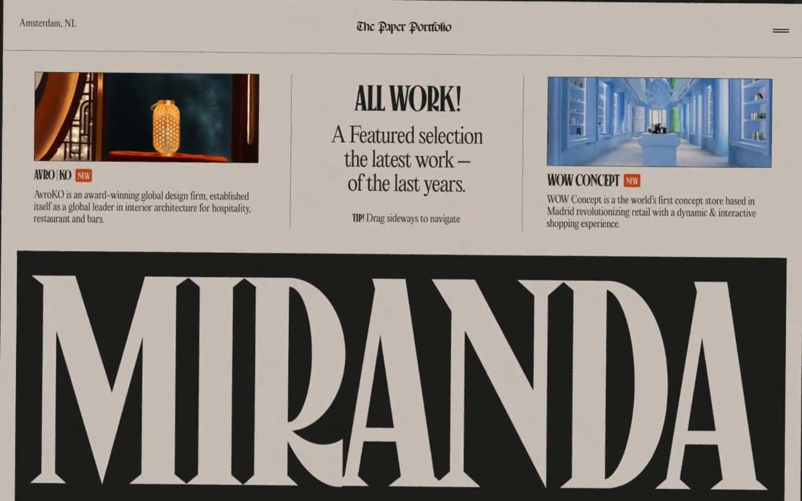
Miranda design system

Accent1
Stamp illustrations, star icon accent, occasional seal/sticker color — the single chromatic punctuation in an otherwise monochrome system
Neutrals5
Card outline emphasis, deepest fills, highest-contrast border work on cream surfaces
Body text, nav links, borders, large display banner fills, icon strokes — the near-black that carries every contrast-critical role
Muted secondary text, subdued borders, quiet typographic accents
Card surfaces, secondary panels, subtle inset backgrounds slightly darker than parchment
Page background, image matte areas — the warm stock everything else is printed on
Try a pairing
Pick any two colors from the palette to check whether text stays readable on top.
Aa
#fafafa on Ember Orange
5.08 : 1 contrast
- Body textPasses AA 4.5
- Large textPasses AA 3
- StrictFails AAA 7
More DESIGN.md files. Same web, different personalities.

099 SUPPLY
Design tools
70Materia
Design tools
Aaply
Design tools
Anacuna
Design tools
Andrei Rybin
Design tools
Artboard
Design tools
Awwwards
Design tools
B—Line
Design tools
Brand
Design tools
Canva
Design tools
Claude Type
Design tools
Control
Design tools


