
Medium. Cream-colored broadsheet at golden hour.
- Media
- Light theme
- 6 colors
- 7 typefaces
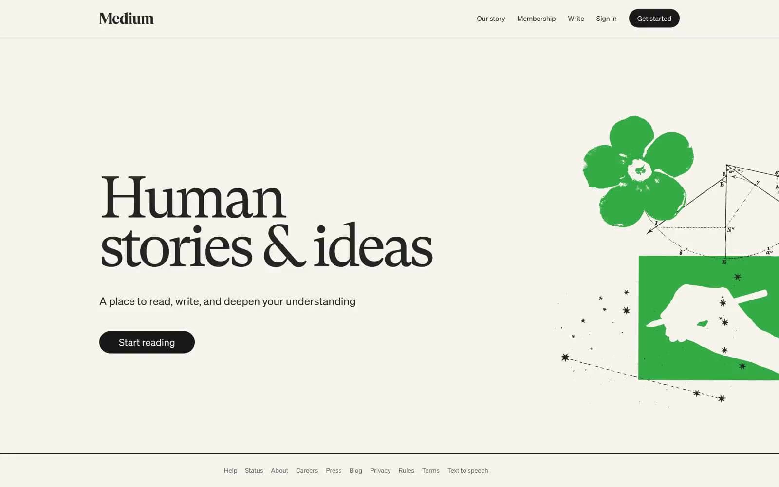
Medium operates as a literary reading room translated to the web: a warm cream canvas (#f7f4ed) replaces the sterile white common to SaaS, making long-form prose feel like a printed page. The visual system is aggressively monochromatic — nearly every UI surface, text, and border sits in a narrow band of warm grays from #242424 to #6b6b6b — so the reader's attention goes entirely to content. The single brand gesture is the serif hero headline (GT Super at 120px, weight 400, tracking -0.055em), a deliberate anti-trend choice: a transitional book serif at display scale with whisper weight, not a bold geometric sans, signals 'we publish books, not software.' Buttons are full pills in near-black, the only solid ink on the page.
Medium design system

Neutrals6
Supporting neutral for secondary UI, dividers, and muted labels. Do not promote it to the primary CTA color
Primary text, body copy, links, heading text — slightly warmer than pure black, sits comfortably on cream
Secondary text and default body color where slightly lighter than Ink is needed without losing contrast
Supporting neutral for secondary UI, dividers, and muted labels.
Page canvas, hero background, section backgrounds — the warm off-white that makes the entire interface feel printed rather than digital
Card surfaces, elevated panels, form inputs, and any surface that needs to lift off the cream canvas
Try a pairing
Pick any two colors from the palette to check whether text stays readable on top.
Aa
Paper White on Button Black
17.58 : 1 contrast
- Body textPasses AA 4.5
- Large textPasses AA 3
- StrictPasses AAA 7
More DESIGN.md files. Same web, different personalities.
Josh W. Comeau
Media
The Pudding
Media
2020
Media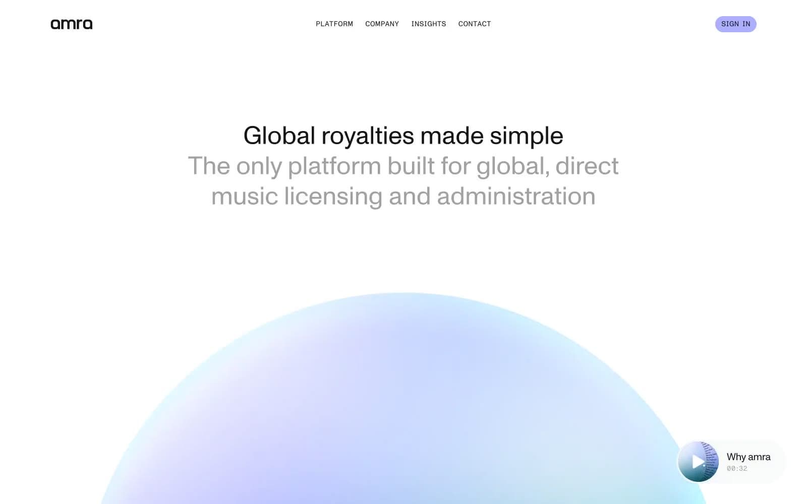
amra
Media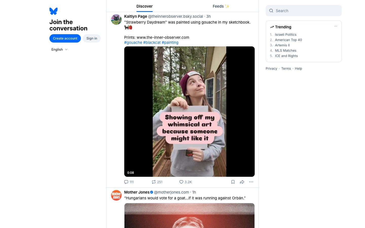
Bluesky Social
Media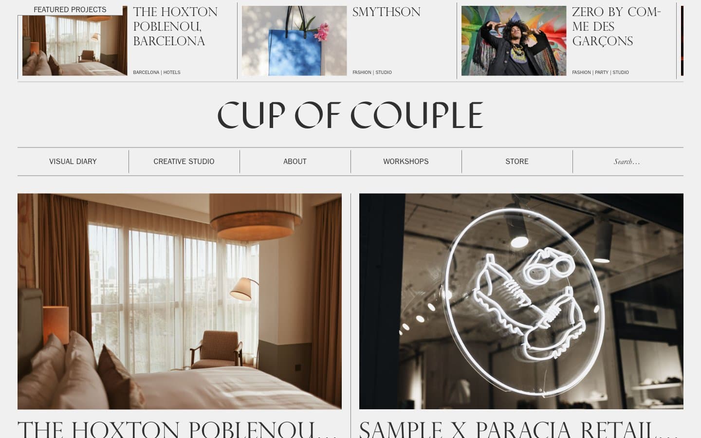
Cup of Couple
Media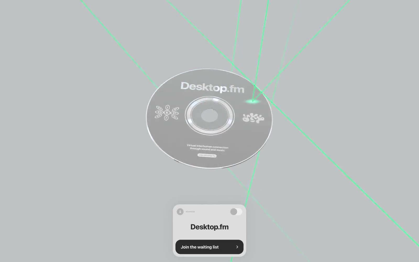
Desktop.fm
Media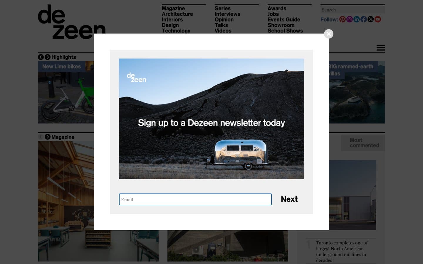
Dezeen
Media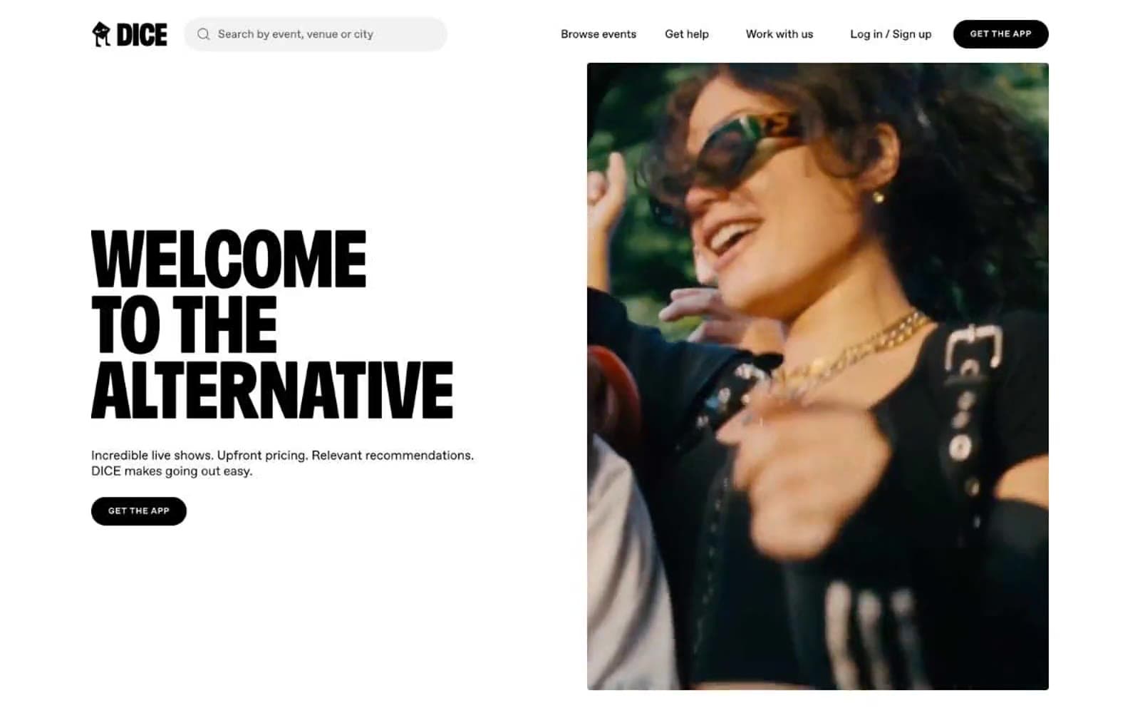
DICE
Media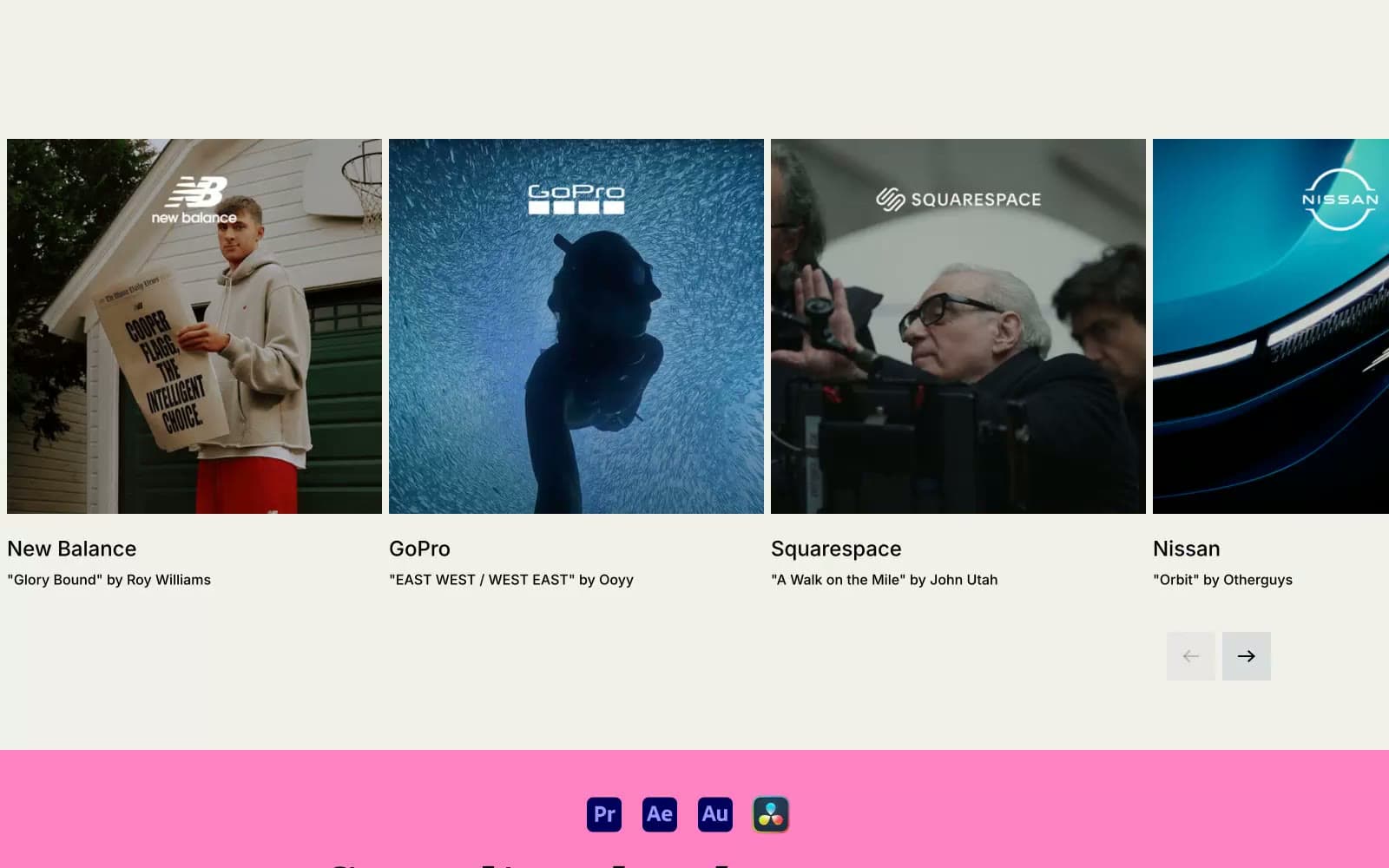
Epidemicsound
Media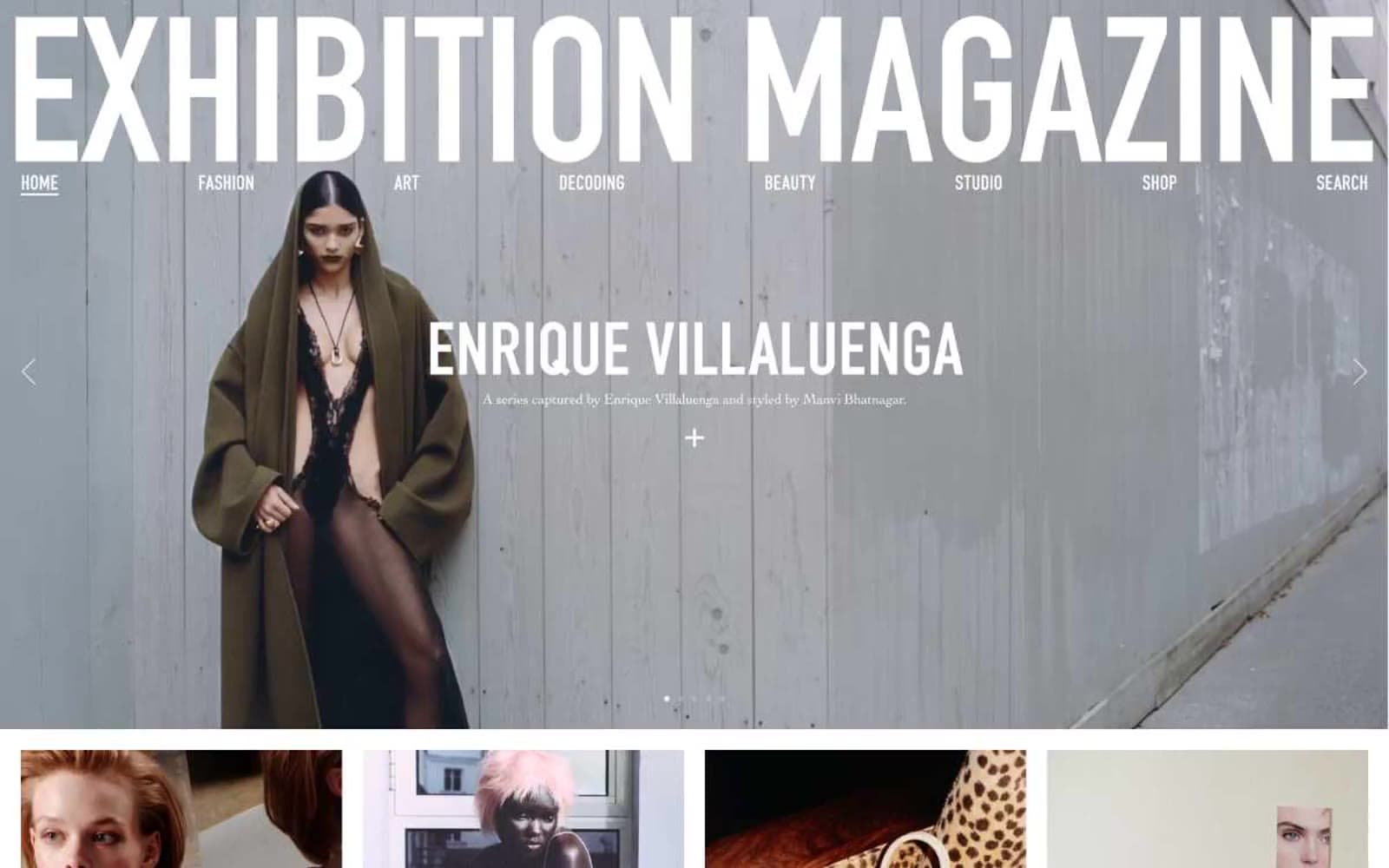
Exhibition Magazine
Media
Flying Papers
Media


