
Marco. A personal workspace where widgets float like sticky notes on warm paper.
- Design tools
- Light theme
- 19 colors
- 6 typefaces
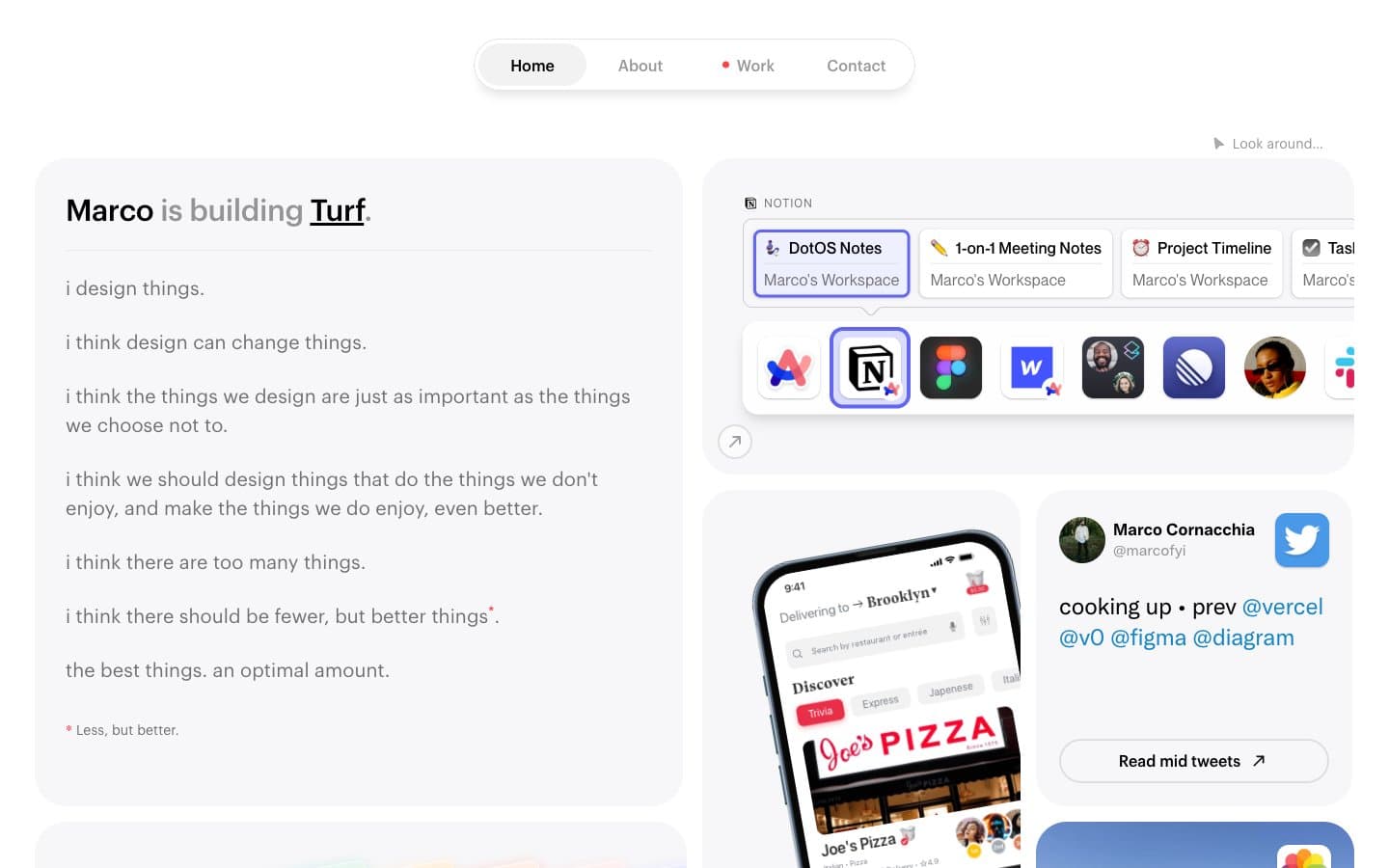
Marco's site reads like a personal workspace laid out on cool paper: a near-white canvas, furniture-soft cards, and dense but breathable type that feels like a Moleskine spread in morning light. The layout is a disciplined two-column grid — a long-form manifesto on the left, a stack of embedded widgets, app screenshots, and avatar cards on the right — held together by generous rounded corners and whisper-light shadows. Color is rationed: 99% of the page is neutral, with violet and coral-pink appearing only as tiny functional punctuation for active links, the 'Work' status dot, and one warm gradient card. Typography is the main voice — three custom geometric sans-serifs (Maison Neue, Graphik, Neue Montreal) layered with careful tracking shifts, wide on micro-labels and tightening on larger display sizes.
Marco design system

Brand2
Violet accent for outlined action borders, linked labels, and lightweight interactive emphasis.
Blue accent for outlined action borders, linked labels, and lightweight interactive emphasis. Do not promote it to the primary CTA color
Accent3
Red wash for highlight backgrounds, decorative bands, and soft emphasis behind content
Gradient start and secondary accent — used sparingly on warm cards and the pink-orange wash
Gradient end — the warm terminal of the coral-to-orange wash used on featured cards
Neutrals14
Headings, strong borders, icon fills — the heaviest text weight and the sharpest structural lines
Primary body text and the workhorse border color — appears more than any other color, forming the connective tissue of the layout
Secondary headings and muted borders
Body and helper text where lower contrast is acceptable
Subtle text and quiet borders
Tertiary text and disabled-leaning borders
Soft surface tints and the lightest structural dividers
Tinted shadow color for warm cards — a blush offset shadow that ties to the coral accent
Hairline borders, icon containers, and link outlines that need to recede
Active and hover wash — the soft halo behind selected links and cards
Secondary surface for nested elements and subtle backgrounds
Page canvas and the base of the surface stack
Warm accent card surface — the only place the system breaks from cool neutrals
Card surfaces and elevated content — sits one step above the page canvas
Try a pairing
Pick any two colors from the palette to check whether text stays readable on top.
Aa
Ink on Iris Glow
4.70 : 1 contrast
- Body textPasses AA 4.5
- Large textPasses AA 3
- StrictFails AAA 7
More DESIGN.md files. Same web, different personalities.

099 SUPPLY
Design tools
70Materia
Design tools
Aaply
Design tools
Anacuna
Design tools
Andrei Rybin
Design tools
Artboard
Design tools
Awwwards
Design tools
B—Line
Design tools
Brand
Design tools
Canva
Design tools
Claude Type
Design tools
Control
Design tools


