
Maneken. Editorial design studio on white paper.
- Design tools
- Light theme
- 9 colors
- 3 typefaces
Maneken's visual system is gallery-first: a near-white canvas lets photographic mockup work dominate while a single saturated blue acts as the only chromatic voice in the interface. Typography does the heavy lifting — a custom display face (TWKEverett) towers over the page in oversized 77–110px headlines with tight 1.0–1.2 leading, creating an editorial magazine feel rather than a typical SaaS dashboard. Inter handles everything functional at compact 14–18px sizes, creating a deliberate tension between theatrical display type and utilitarian UI. Surfaces stay flat with 10px radii, borders lean heavily on pure black hairlines, and elevation is reserved for the image content itself via soft, multi-layer drop shadows.
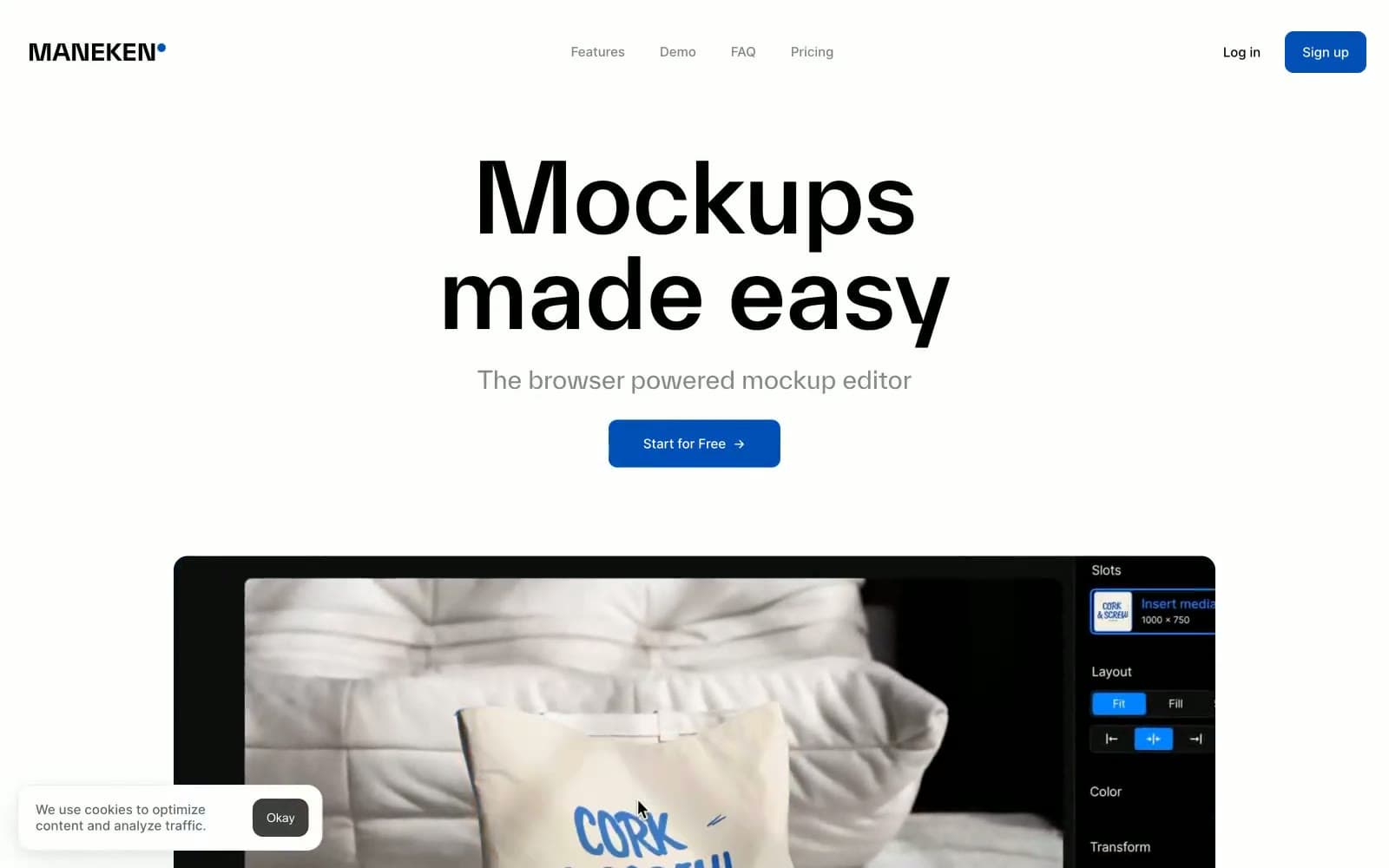
Maneken design system

Brand1
Primary action buttons, logo dot accent, active nav strokes — the only chromatic color in the system creates unmistakable focus against the monochrome frame
Neutrals8
Primary text, icon fills, hairline borders, image outlines — true black anchors the monochrome structure with maximum contrast (21:1 on white)
Dark surface backgrounds, body text on light cards, nav bar fills — near-black with a barely-perceptible blue undertone that warms the deep neutral
Alternate button background, dark UI surface variant — a warm dark gray for secondary filled actions when blue is too prominent
Muted subheadings, secondary metadata, heading accents — the mid-gray that steps text down without going fully gray
Nav background overlays, tertiary surface tint — lightest functional gray for layering context
Hairline dividers, subtle section borders, input outlines — sits between fog and white for the gentlest structural separation
Page canvas background, hero section fill, soft card surfaces — the warm off-white that separates page chrome from white content cards
Card surfaces, button text on dark, image backgrounds — the bright surface that makes photographic content pop
Try a pairing
Pick any two colors from the palette to check whether text stays readable on top.
Aa
Paper on Signal Blue
7.42 : 1 contrast
- Body textPasses AA 4.5
- Large textPasses AA 3
- StrictPasses AAA 7
More DESIGN.md files. Same web, different personalities.

099 SUPPLY
Design tools
70Materia
Design tools
Aaply
Design tools
Anacuna
Design tools
Andrei Rybin
Design tools
Artboard
Design tools
Awwwards
Design tools
B—Line
Design tools
Brand
Design tools
Canva
Design tools
Claude Type
Design tools
Control
Design tools


