
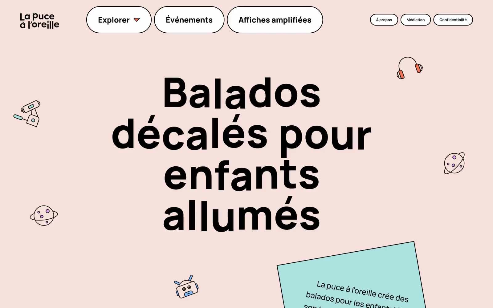
Lpalo. One slab-serif headline shouting through scattered crayon doodles.
- Media
- Light theme
- 11 colors
- 2 typefaces
La puce à l'oreille reads like a children's storybook spread across warm peach paper — a playful podcast platform where chunky black slab-serif headlines anchor the page while vivid color accents and floating line-art illustrations dance around them. The visual rhythm is generous and unhurried: a soft peach canvas (#f6e0db) holds scattered doodles, pill-shaped containers float with thick black borders, and a single oversized headline (Alfa Slab One at near-120px) does the heavy lifting for brand voice. Components feel handmade rather than engineered — black-outlined white cards, 47px pill radii, no shadows, no gradients. Color is treated as a palette of crayons pulled from a single box: every hue is saturated and flat, used as decorative punctuation on surfaces, icons, and section backgrounds rather than as functional UI states. The contrast between the type's serious slab-serif weight and the whimsical illustrations creates the site's identity tension — authoritative voice, childlike delivery.
Lpalo design system

Brand2
Decorative accent and warm card surfaces — a crayon-orange that carries the most frequency of any chromatic color across the UI
Decorative accent, nav highlight, and vivid card fills — a saturated fuchsia used as bold punctuation on the peach canvas
Accent6
Yellow wash for highlight backgrounds, decorative bands, and soft emphasis behind content
Decorative accent and soft card surface — a desaturated teal that cools the warm palette without breaking its energy
Decorative accent and card surface — a mid-saturation sky blue appearing in the largest non-black count (60 fills), used for illustration washes
Decorative accent and card surface — a soft pastel pink-violet that lightens the magenta without competing
Decorative accent — high-chroma green used sparingly as playful punctuation among illustrations
Decorative accent — a single vivid blue dot in the illustration palette
Neutrals3
Primary text, hairlines, card borders, nav outlines — the structural skeleton at 1400+ border occurrences
Page canvas — the warm pastel ground that makes every black border and colored accent pop
Primary page canvas and white card surfaces. Do not promote it to the primary CTA color
Try a pairing
Pick any two colors from the palette to check whether text stays readable on top.
Aa
Charcoal Ink on Ember Orange
7.19 : 1 contrast
- Body textPasses AA 4.5
- Large textPasses AA 3
- StrictPasses AAA 7
More DESIGN.md files. Same web, different personalities.

Josh W. Comeau
Media
The Pudding
Media
2020
Media
amra
Media
Bluesky Social
Media
Cup of Couple
Media
Desktop.fm
Media
Dezeen
Media
DICE
Media
Epidemicsound
Media
Exhibition Magazine
Media
Flying Papers
Media


