
Lottielab. Animation studio on bright paper.
- Design tools
- Light theme
- 13 colors
- 2 typefaces
Lottielab's visual language is a quiet, generous workspace built for creators: a near-white canvas, hairline borders, and a single vivid violet accent that appears only where attention is needed. The interface favors restraint over decoration — deep indigo-tinted text reads as authoritative without shouting, and components sit flat on the surface with almost no shadow, letting the product UI itself carry visual weight. Typography is geometric and contemporary, with tight negative tracking on large headlines and slightly open tracking on small labels, creating a confident vertical rhythm. Color is used surgically: brand violet highlights a keyword in headlines, fills the primary CTA, and marks active states; everything else stays neutral. The overall feel is an animation studio's digital sketchpad — spacious, tool-first, and engineered for flow.
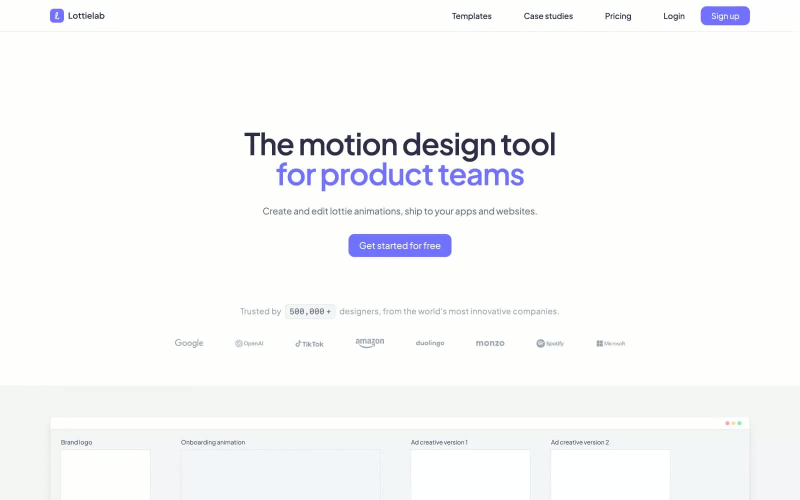
Lottielab design system

Brand2
Primary CTA buttons, active nav items, accent keywords in headlines, focus rings — the only chromatic element allowed to break the monochrome canvas, making every action feel switched on
Secondary accent for interactive highlights, selected states in tool surfaces, and inline brand emphasis where a cooler note is needed
Accent2
Decorative gradient endpoint for marketing visuals and showcase cards
Decorative gradient endpoint for showcase cards and hero illustration accents
Neutrals9
Heaviest text weight, section titles, and surface-dark contexts — a deeper step than Deep Indigo for maximum contrast moments
Primary text and headings — a near-black with a violet undertone that warms the monochrome palette and distinguishes the brand from flat-charcoal SaaS defaults
Secondary body text, descriptions, metadata — sits between Deep Indigo and Silver for layered reading hierarchy
Muted helper text, placeholder copy, disabled labels, and icon secondary tones
Icon strokes at rest, subtle surface borders, low-emphasis dividers
Primary hairline borders across cards, inputs, dividers, and component edges — the dominant structural neutral
Page canvas, section bands between white blocks, product mockup backgrounds, footer wash
Alternate surface for nested panels, input fills, quiet sections within white pages
Card surfaces, elevated panels, button text on violet fills, inverted icon strokes
Try a pairing
Pick any two colors from the palette to check whether text stays readable on top.
Aa
#111111 on Electric Violet
4.93 : 1 contrast
- Body textPasses AA 4.5
- Large textPasses AA 3
- StrictFails AAA 7
More DESIGN.md files. Same web, different personalities.

099 SUPPLY
Design tools
70Materia
Design tools
Aaply
Design tools
Anacuna
Design tools
Andrei Rybin
Design tools
Artboard
Design tools
Awwwards
Design tools
B—Line
Design tools
Brand
Design tools
Canva
Design tools
Claude Type
Design tools
Control
Design tools


