
Literal. A reading room where warm cream walls meet dark walnut shelves.
- Media
- Light theme
- 7 colors
- 2 typefaces
Literal is a literary reading room rendered in soft daylight: a near-monochrome canvas where the only chromatic note is a single forest green that marks the primary action. Headlines speak in a warm bookish serif (Libre Baskerville) while every functional element stays in clean geometric Inter, creating a quiet tension between editorial and digital. Surfaces are paper-like — soft warm gray canvas beneath pure white cards with hairline borders and almost no shadow. The whole experience is calm, spacious, and content-led, with book covers and product screenshots doing the visual work that color and ornament don't.
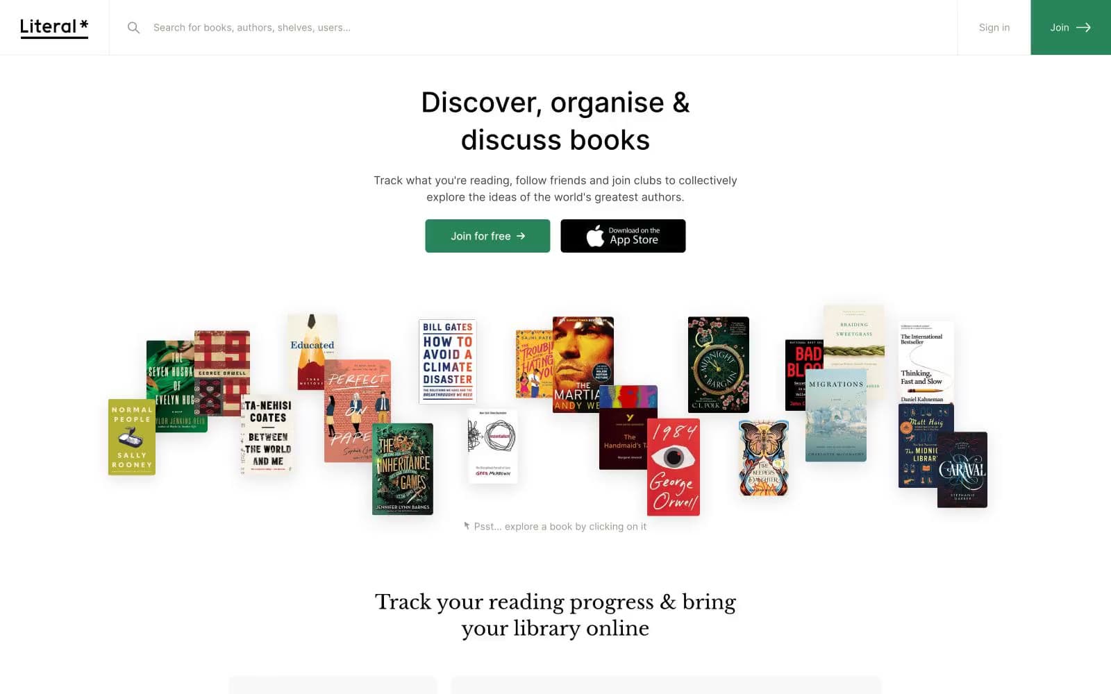
Literal design system

Brand1
Primary CTA fill, brand accent, star glyph in wordmark, active states — a single chromatic note anchoring an otherwise achromatic interface
Neutrals6
Heading text, dark secondary action fill (App Store button), heavy borders on featured headings
Primary body and UI text, icon strokes, default border outlines
Muted helper text, secondary metadata, list dividers, de-emphasized links
Card and component borders, subtle dividers between sections and list items
Page canvas and section backgrounds — warm off-white that makes white cards feel layered rather than floating
Card surfaces, button text, input fills — the elevated surface above the gray canvas
Try a pairing
Pick any two colors from the palette to check whether text stays readable on top.
Aa
Paper White on Forest Green
4.64 : 1 contrast
- Body textPasses AA 4.5
- Large textPasses AA 3
- StrictFails AAA 7
More DESIGN.md files. Same web, different personalities.

Josh W. Comeau
Media
The Pudding
Media
2020
Media
amra
Media
Bluesky Social
Media
Cup of Couple
Media
Desktop.fm
Media
Dezeen
Media
DICE
Media
Epidemicsound
Media
Exhibition Magazine
Media
Flying Papers
Media


