
Kinfolk. Generous margins, ink-black serif, and a single warm-paper accent for section breaks.
- Media
- Light theme
- 4 colors
- 5 typefaces
Kinfolk translates a printed art-magazine to the web: bone-white canvases, full-bleed editorial photography, and serif type that does the heavy lifting while the interface stays nearly invisible. The entire palette is monochromatic — black ink on warm off-white paper, with a single warm sage-gray (#dbded5) used as a paper-tinted section break. There are no accent colors, no filled buttons, no decorative gradients; hierarchy is built through typographic scale, whitespace, and the rhythm of image-to-text transitions. Display serif at 50–60px with -0.025em tracking carries the editorial gravitas; a single weight (400) across all families creates a deliberately quiet, consistent voice. The result is less a website than a gallery wall — the photographs and headlines are the exhibits, and the UI is the white wall around them.
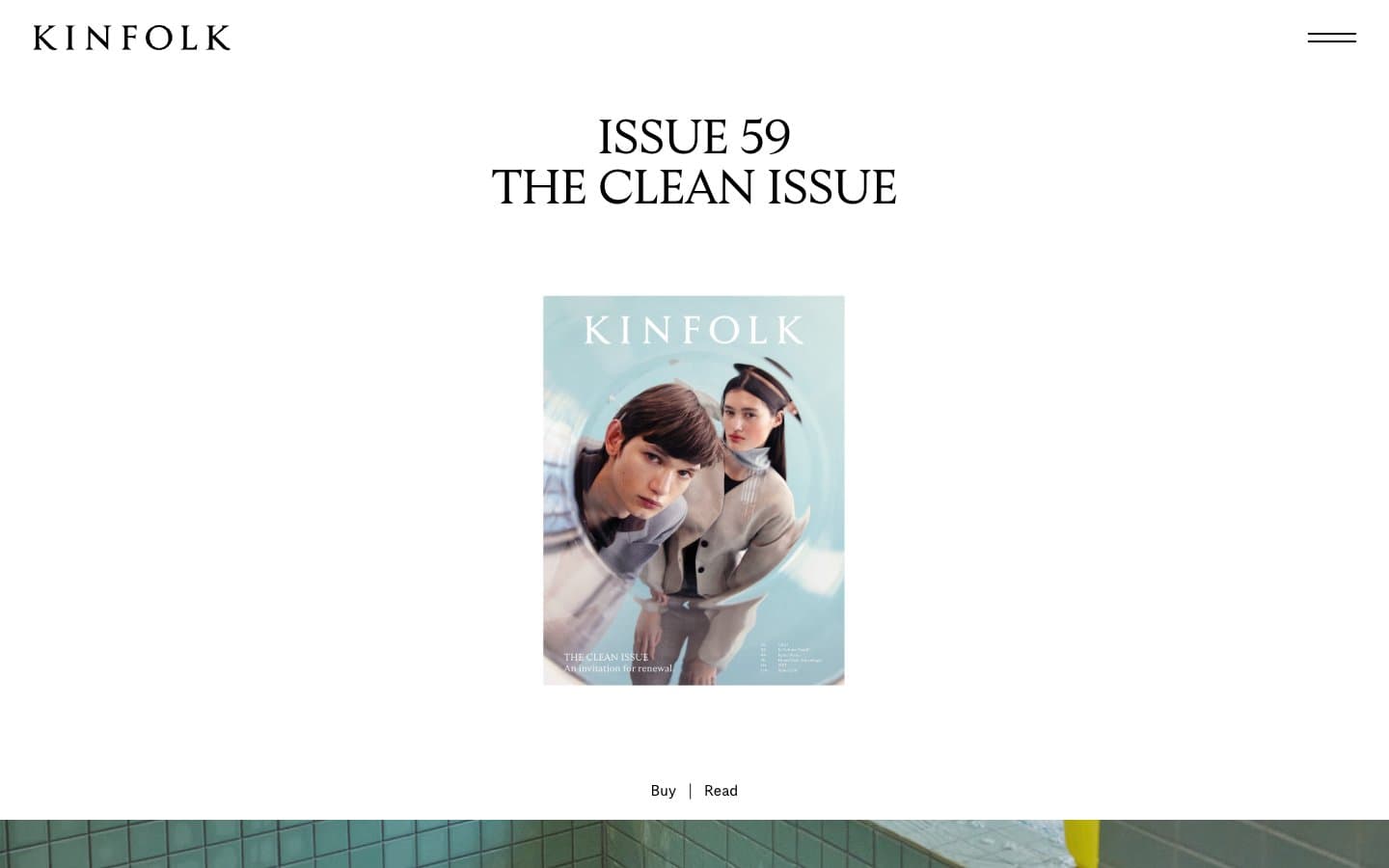
Kinfolk design system

Accent1
Warm greenish-gray paper tint used as a section-break wash and full-bleed band. Provides the only chromatic moment in the system without becoming a brand color
Neutrals3
Primary type, borders, icon strokes, and all hairline rules. The only foreground color in the system
Soft surface elevation for insets, input fields, and section backgrounds that need to step down from pure white without introducing a hue
Primary canvas, card surfaces, and reverse text on dark photo overlays
Try a pairing
Pick any two colors from the palette to check whether text stays readable on top.
Aa
Ink Black on Sage Paper
15.42 : 1 contrast
- Body textPasses AA 4.5
- Large textPasses AA 3
- StrictPasses AAA 7
More DESIGN.md files. Same web, different personalities.

Josh W. Comeau
Media
The Pudding
Media
2020
Media
amra
Media
Bluesky Social
Media
Cup of Couple
Media
Desktop.fm
Media
Dezeen
Media
DICE
Media
Epidemicsound
Media
Exhibition Magazine
Media
Flying Papers
Media


