
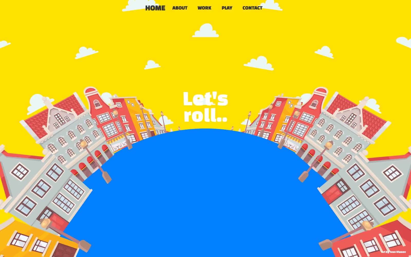
Karl. Pop-up storybook diorama on a sunny afternoon.
- Design tools
- Light theme
- 5 colors
- 2 typefaces
Karl's site is a motion-designer portfolio told entirely through hand-illustrated cartoon scenes — Dutch canal houses wrapping around a blue globe, white clouds drifting across a bright yellow sky, curved display text orbiting the composition. The chrome around the illustration is intentionally minimal: a single row of centered uppercase nav links in Arial, and one custom display face (Changa One) that carries every headline with stacked, almost overprinted weight. Surfaces are flat and saturated rather than shaded or elevated; the 1440px border-radius is used as a compositional device to carve circular/oval focal elements out of the yellow canvas, not as a card radius. The whole experience reads like a pop-up storybook spread — flat color, no shadows, no gradients, no UI density — where the illustration IS the interface and text is laid on top as playful signage.
Karl design system

Brand2
Full-bleed page and section background — the unbroken sunny sky that fills every viewport and frames all illustration. The yellow IS the canvas, not a surface sitting on a white page
Hero focal surface — the spherical focal element rising from the bottom of the viewport, and any large circular/oval composition element. White text sits directly on this blue
Accent1
Illustrated house roofs and accent fills within the hand-drawn scenes — decorative, never used on UI chrome
Neutrals2
All body text, nav link text, nav link borders, and the thin linework inside the illustrations. The single dark value the entire UI runs on
Display text overlaid on the blue globe, scattered cloud illustrations across the yellow sky, and window fills inside the house artwork. The only light value used structurally
Try a pairing
Pick any two colors from the palette to check whether text stays readable on top.
Aa
Charcoal Ink on Signal Yellow
9.97 : 1 contrast
- Body textPasses AA 4.5
- Large textPasses AA 3
- StrictPasses AAA 7
More DESIGN.md files. Same web, different personalities.

099 SUPPLY
Design tools
70Materia
Design tools
Aaply
Design tools
Anacuna
Design tools
Andrei Rybin
Design tools
Artboard
Design tools
Awwwards
Design tools
B—Line
Design tools
Brand
Design tools
Canva
Design tools
Claude Type
Design tools
Control
Design tools


