
jun.works. Black ink on bright white, nothing else.
- Design tools
- Light theme
- 3 colors
- 2 typefaces
jun.works is a monochrome editorial manifest — pure black ink on white paper, no accent colors, no gradients, no imagery. The entire visual identity collapses into two ideas: a custom display sans (Standard) set at 45–54px with aggressive negative tracking, and a system serif (Times) for body at small size, creating a headline-vs-zine tension. Every interactive element is a fully rounded pill (129.6px radius) with a 1px black border, giving the page the feeling of a printed page covered in adhesive labels. The layout is left-anchored and two-columned, generous but dense, treating the portfolio as a typographic specimen rather than a product page.
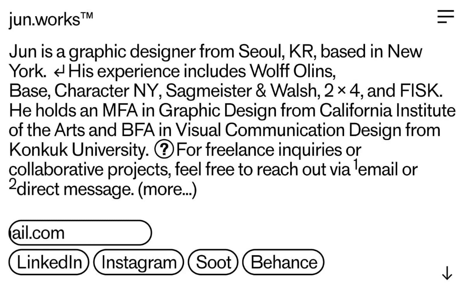
jun.works design system

Neutrals3
Body text, all borders, pill outlines, button strokes — the sole ink color, used at full opacity for every foreground element
Hairline dividers, muted outlines, secondary borders where a softer separation is needed
Page canvas, card surfaces, pill fills — the only surface color, creating maximum contrast against Press Black
Try a pairing
Pick any two colors from the palette to check whether text stays readable on top.
Aa
Bone White on Press Black
21.00 : 1 contrast
- Body textPasses AA 4.5
- Large textPasses AA 3
- StrictPasses AAA 7
More DESIGN.md files. Same web, different personalities.

099 SUPPLY
Design tools
70Materia
Design tools
Aaply
Design tools
Anacuna
Design tools
Andrei Rybin
Design tools
Artboard
Design tools
Awwwards
Design tools
B—Line
Design tools
Brand
Design tools
Canva
Design tools
Claude Type
Design tools
Control
Design tools


