
Jp. Quiet, editorial, pill-shaped.
- Design tools
- Light theme
- 11 colors
- 2 typefaces
Jp is a curated template gallery built on a near-monochrome canvas: a single white page, a single near-black accent, and pill-shaped geometry that reads like a museum wall of brand systems. Typography does the heavy lifting — PP Neue Montreal at restrained sizes and weights creates editorial calm, with the occasional 38px headline as the only moment of scale. Color is rationed: the UI itself stays grayscale, while small chromatic badges (violet, blue) act as category punctuation on the template thumbnails. The overall feel is a high-end stock-photo agency merged with a minimalist directory — every element earns its place through shape and whitespace, never decoration.
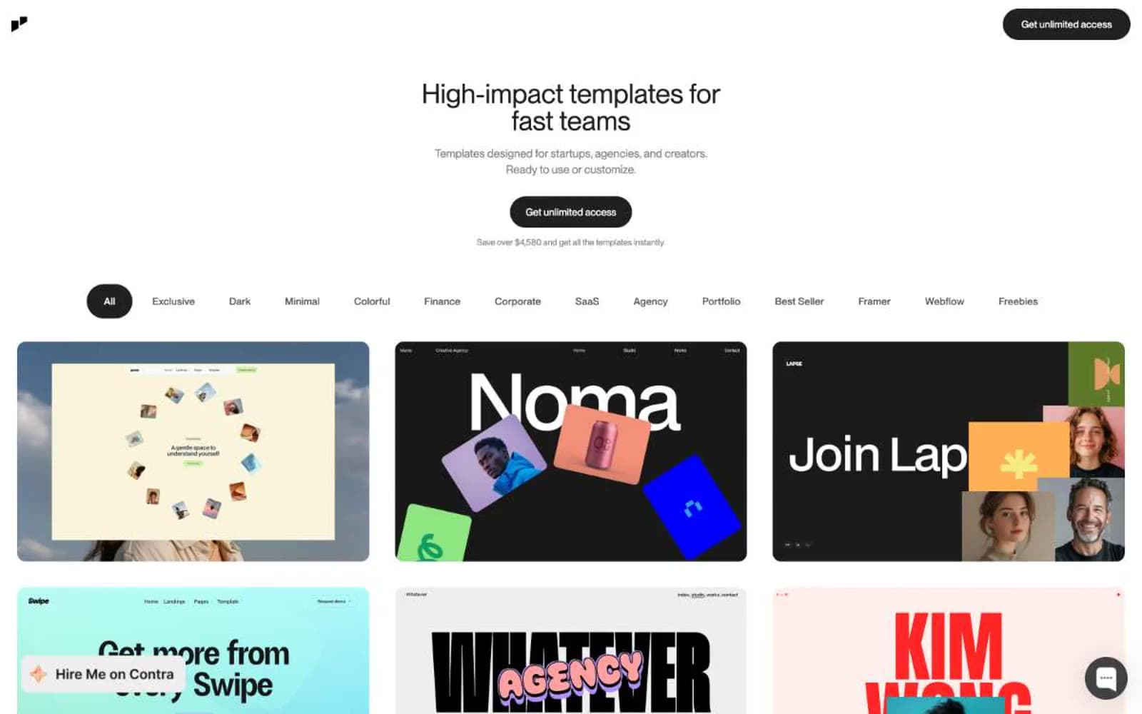
Jp design system

Accent2
Saturated category badge fill — the sole chromatic accent on chrome elements, used sparingly to tag template categories
Secondary category badge fill — lighter blue companion to Indigo Pulse for alternating category tags
Neutrals9
Supporting neutral for secondary UI, dividers, and muted labels. Do not promote it to the primary CTA color
Primary text, icons, card borders, structural lines — the default foreground across all body and heading content
Secondary dark surfaces, icon strokes, muted dark text on light surfaces
Tertiary text, secondary button borders, subdued labels
Body secondary text, helper copy, placeholder text
Disabled controls, very light icon strokes, decorative dot motifs
Inverted muted foreground — light text on Carbon-filled buttons and dark cards (replaces Paper when on dark surfaces)
Hairline borders, dividers, subtle separators, card outlines
Page canvas, card surfaces, button text, inverted foregrounds
Try a pairing
Pick any two colors from the palette to check whether text stays readable on top.
Aa
#111111 on Indigo Pulse
4.77 : 1 contrast
- Body textPasses AA 4.5
- Large textPasses AA 3
- StrictFails AAA 7
More DESIGN.md files. Same web, different personalities.

099 SUPPLY
Design tools
70Materia
Design tools
Aaply
Design tools
Anacuna
Design tools
Andrei Rybin
Design tools
Artboard
Design tools
Awwwards
Design tools
B—Line
Design tools
Brand
Design tools
Canva
Design tools
Claude Type
Design tools
Control
Design tools


