
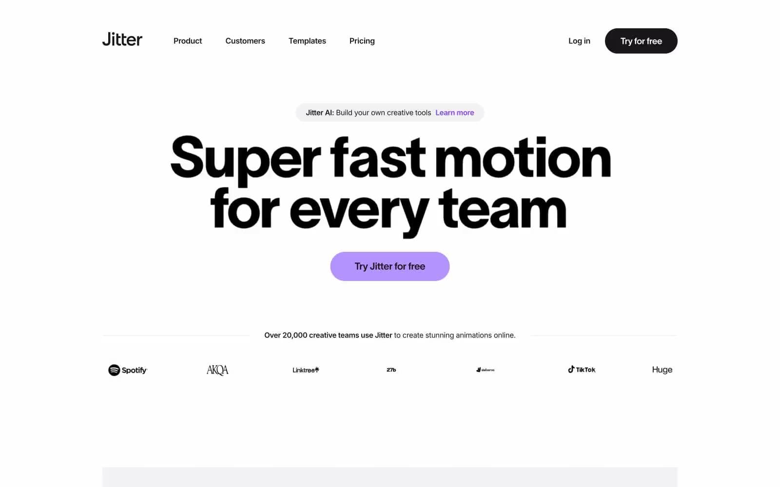
Jitter. Soft white surfaces, pill-shaped cards, and a violet spark firing on near-black ink.
- Design tools
- Light theme
- 15 colors
- 2 typefaces
Jitter reads as a kinetic playground rendered in Swiss-design precision. The canvas is a soft off-white (#f2f1f3) with bright white cards floating on it via diffuse, multi-layer shadows that bleed across more than 150px of vertical space. A near-black ink (#19171c) carries the majority of the UI — headlines, nav, buttons, body — with a deeply saturated violet (#7a40ed) acting as a brand spark for hero CTAs, tags, and feature highlights. Secondary punctuation comes from a vivid cyan-blue (#00b2ff) and an electric yellow-green (#f5ff63). Typography splits the work: TWK Lausanne (a custom geometric grotesque) takes the stage at 48–200px with aggressive negative tracking, while Inter handles everything 26px and below with quiet competence. The geometry is rounded to the point of pill-shaped — cards and buttons share 40–50px radii, so every surface feels like a soft cushion rather than a hard tile.
Jitter design system

Brand2
Violet supporting accent for decorative details and low-frequency emphasis. Do not promote it to the primary CTA color
Dark violet, near-black with purple cast — headings on light surfaces where an extra brand warmth is needed
Accent6
Violet supporting accent for decorative details and low-frequency emphasis. Do not promote it to the primary CTA color
Pale violet — secondary link backgrounds and highlight washes
Secondary accent — animated highlight rings, icon accents, card border highlights
Cool blue-tinted card backgrounds and soft highlight washes
Mid-saturation blue — decorative fills inside illustration and animated graphics
Green supporting accent for decorative details and low-frequency emphasis. Use as a supporting accent, not as a status color
Neutrals7
Icon fills, footer text, maximum-contrast dark surfaces
Supporting neutral for secondary UI, dividers, and muted labels. Do not promote it to the primary CTA color
Body copy in card contexts, secondary descriptive text
Muted secondary text and placeholder labels
Subtle borders, divider lines, and muted card backgrounds
Page canvas and recessed section backgrounds — the base layer on which every card and panel sits
Card surfaces, elevated panels, text on dark fills, button labels on filled buttons
Try a pairing
Pick any two colors from the palette to check whether text stays readable on top.
Aa
Pure White on Eclipse Violet
5.55 : 1 contrast
- Body textPasses AA 4.5
- Large textPasses AA 3
- StrictFails AAA 7
More DESIGN.md files. Same web, different personalities.

099 SUPPLY
Design tools
70Materia
Design tools
Aaply
Design tools
Anacuna
Design tools
Andrei Rybin
Design tools
Artboard
Design tools
Awwwards
Design tools
B—Line
Design tools
Brand
Design tools
Canva
Design tools
Claude Type
Design tools
Control
Design tools


