
Jakub Reis. Every screen is a quiet white room where only typography and photography exist.
- Design tools
- Light theme
- 4 colors
- 1 typeface
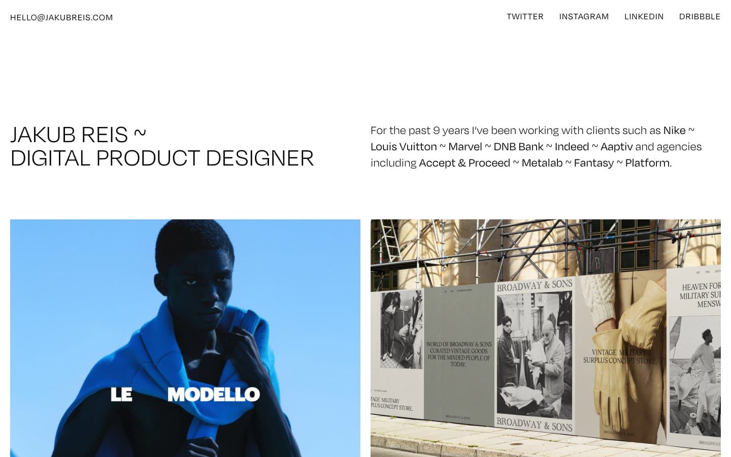
Jakub Reis is a type-driven portfolio: a bone-white canvas, a single custom sans-serif at whisper weights, and photographs that carry every drop of color the system refuses to supply. The site reads like a printed exhibition catalog — a name, a discipline, a grid of framed works, and nothing else. Hierarchy is built entirely from size, weight (300 vs 400 only), and the generous negative space between blocks; there are no buttons, no badges, no borders, no shadows, no gradients. The signature is restraint: even the separator between client names in the intro paragraph is a tilde (~) instead of a dot, pipe, or comma — a typographic personality choice that the entire UI leans into. Components are essentially text labels attached to full-bleed images; the design system exists to disappear so the work can speak.
Jakub Reis design system

Neutrals4
Primary text, project titles, navigation links, all body copy — the only ink the system ever uses
Secondary text, near-identical to Carbon for AAA contrast on Bone — exists for accessibility, not visual contrast
Muted UI surface for disabled controls, low-emphasis panels, and placeholder blocks. Do not promote it to the primary CTA color
Page canvas, the only background tone — a warm off-white that keeps the page from feeling clinical
Try a pairing
Pick any two colors from the palette to check whether text stays readable on top.
Aa
Bone on Carbon
19.77 : 1 contrast
- Body textPasses AA 4.5
- Large textPasses AA 3
- StrictPasses AAA 7
More DESIGN.md files. Same web, different personalities.

099 SUPPLY
Design tools
70Materia
Design tools
Aaply
Design tools
Anacuna
Design tools
Andrei Rybin
Design tools
Artboard
Design tools
Awwwards
Design tools
B—Line
Design tools
Brand
Design tools
Canva
Design tools
Claude Type
Design tools
Control
Design tools


