
Itsnicethat. Art-school broadsheet on a desk.
- Media
- Light theme
- 11 colors
- 3 typefaces
It's Nice That operates as a quiet editorial newsroom: a near-white canvas with a single violet pulse. Almost every surface is achromatic — warm off-white, pure white, near-black text — and color is rationed like ink, appearing only as functional punctuation on the search button, on hover, or in full-bleed editorial photography. Typography does the heavy lifting: a wide-tracked display face (LabilVariable) floats generous air around every headline and label, creating a magazine-like cadence, while Bradford sets compact body and UI text tight to the grid. Components are deliberately flat and compact — no shadows, pill-shaped controls at 75px radius, tight 10–20px padding — so the colorful illustration and photography content always reads as the hero. The result feels like flipping through a printed art-school broadsheet: restrained chrome, loud art.
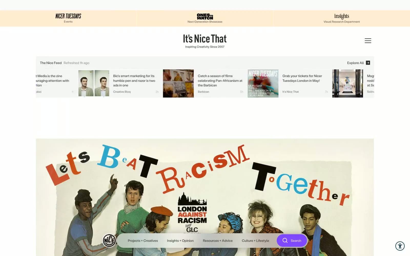
Itsnicethat design system

Brand2
Violet supporting accent for decorative details and low-frequency emphasis. Do not promote it to the primary CTA color
Pressed/hover state of Signal Violet, chromatic text emphasis, link text in article contexts. Sits one step darker on the same hue
Accent1
Yellow supporting accent for decorative details and low-frequency emphasis. Do not promote it to the primary CTA color
Neutrals8
Primary text, body copy, headings, icons, link defaults. Slightly softer than pure black, warming the type against the off-white canvas
Tertiary text, image captions, disabled-adjacent labels
Secondary text, metadata (dates, bylines), footer labels, muted descriptions
Placeholder text, low-emphasis labels, very muted helper copy
Hairline dividers, subtle borders between feed items and card edges
Top promotional bar background, soft warm callouts. The only non-violet warmth in the system
Page canvas — the warm off-white that holds the entire site. Cards and content float on top of this
Card surfaces, input fields, elevated panels — the brighter layer stacked above Page Mist
Try a pairing
Pick any two colors from the palette to check whether text stays readable on top.
Aa
Card White on Signal Violet
4.91 : 1 contrast
- Body textPasses AA 4.5
- Large textPasses AA 3
- StrictFails AAA 7
More DESIGN.md files. Same web, different personalities.

Josh W. Comeau
Media
The Pudding
Media
2020
Media
amra
Media
Bluesky Social
Media
Cup of Couple
Media
Desktop.fm
Media
Dezeen
Media
DICE
Media
Epidemicsound
Media
Exhibition Magazine
Media
Flying Papers
Media


