
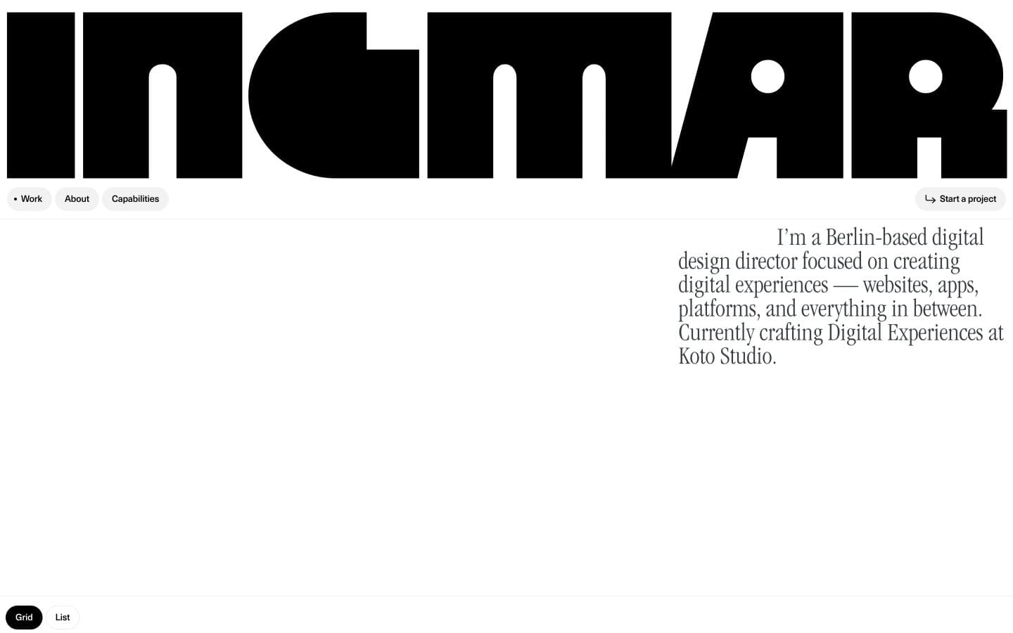
Ingmar Coenen. A 295px geometric letterform pressed against a vast white wall, with tiny serif footnotes and pill-shaped navigation floating below.
- Design tools
- Light theme
- 6 colors
- 4 typefaces
Ingmar Coenen's portfolio operates as an editorial gallery wall: a single colossal Megazoid wordmark dominates the top of the page like a magazine masthead, then the system retreats into ruthless white-space and tiny Swiss-type UI. The entire color palette is binary — pure black on pure white with one warm stone-gray for ghost controls — because the work itself is supposed to carry the color. Typography is the brand: a 295px geometric display face (Megazoid) for monumental headings, ITC Garamond Light Condensed for reflective serif body copy, and Neue Haas Unica Pro at 12-13px with negative tracking for all interface chrome. Components are minimal and rounded — 100px pill buttons, 12px cards — creating a tension between the heavy display voice and the soft, almost cartoonish corner radii. Density is compact at the UI level (4-14px gaps) but generous in layout (80-120px section breathing room).
Ingmar Coenen design system

Neutrals6
Primary text, logo wordmark, filled pill buttons, hairline borders — the structural ink that holds every element together
Secondary text, link color, body copy, subtle borders — slightly softened black for hierarchy below the primary text level
Muted helper text, low-emphasis borders, disabled states
Lightest border tone, placeholder outlines, decorative strokes
Ghost button and segmented toggle background — the only non-white surface, used for inactive controls like the Grid/List switcher
Page background, card surfaces, button text on dark fills — the paper everything sits on
Try a pairing
Pick any two colors from the palette to check whether text stays readable on top.
Aa
Canvas White on Pure Black
21.00 : 1 contrast
- Body textPasses AA 4.5
- Large textPasses AA 3
- StrictPasses AAA 7
More DESIGN.md files. Same web, different personalities.

099 SUPPLY
Design tools
70Materia
Design tools
Aaply
Design tools
Anacuna
Design tools
Andrei Rybin
Design tools
Artboard
Design tools
Awwwards
Design tools
B—Line
Design tools
Brand
Design tools
Canva
Design tools
Claude Type
Design tools
Control
Design tools


